解剖图
下图显示了组成一个图的几个matplotlib元素的名称。
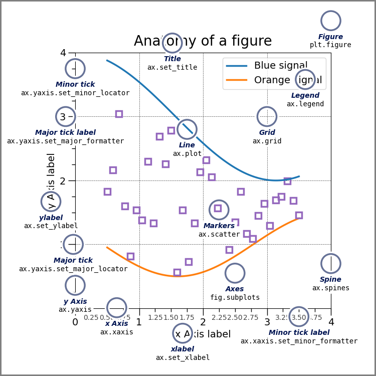
import numpy as npimport matplotlib.pyplot as pltfrom matplotlib.ticker import AutoMinorLocator, MultipleLocator, FuncFormatternp.random.seed(19680801)X = np.linspace(0.5, 3.5, 100)Y1 = 3+np.cos(X)Y2 = 1+np.cos(1+X/0.75)/2Y3 = np.random.uniform(Y1, Y2, len(X))fig = plt.figure(figsize=(8, 8))ax = fig.add_subplot(1, 1, 1, aspect=1)def minor_tick(x, pos):if not x % 1.0:return ""return "%.2f" % xax.xaxis.set_major_locator(MultipleLocator(1.000))ax.xaxis.set_minor_locator(AutoMinorLocator(4))ax.yaxis.set_major_locator(MultipleLocator(1.000))ax.yaxis.set_minor_locator(AutoMinorLocator(4))ax.xaxis.set_minor_formatter(FuncFormatter(minor_tick))ax.set_xlim(0, 4)ax.set_ylim(0, 4)ax.tick_params(which='major', width=1.0)ax.tick_params(which='major', length=10)ax.tick_params(which='minor', width=1.0, labelsize=10)ax.tick_params(which='minor', length=5, labelsize=10, labelcolor='0.25')ax.grid(linestyle="--", linewidth=0.5, color='.25', zorder=-10)ax.plot(X, Y1, c=(0.25, 0.25, 1.00), lw=2, label="Blue signal", zorder=10)ax.plot(X, Y2, c=(1.00, 0.25, 0.25), lw=2, label="Red signal")ax.plot(X, Y3, linewidth=0,marker='o', markerfacecolor='w', markeredgecolor='k')ax.set_title("Anatomy of a figure", fontsize=20, verticalalignment='bottom')ax.set_xlabel("X axis label")ax.set_ylabel("Y axis label")ax.legend()def circle(x, y, radius=0.15):from matplotlib.patches import Circlefrom matplotlib.patheffects import withStrokecircle = Circle((x, y), radius, clip_on=False, zorder=10, linewidth=1,edgecolor='black', facecolor=(0, 0, 0, .0125),path_effects=[withStroke(linewidth=5, foreground='w')])ax.add_artist(circle)def text(x, y, text):ax.text(x, y, text, backgroundcolor="white",ha='center', va='top', weight='bold', color='blue')# Minor tickcircle(0.50, -0.10)text(0.50, -0.32, "Minor tick label")# Major tickcircle(-0.03, 4.00)text(0.03, 3.80, "Major tick")# Minor tickcircle(0.00, 3.50)text(0.00, 3.30, "Minor tick")# Major tick labelcircle(-0.15, 3.00)text(-0.15, 2.80, "Major tick label")# X Labelcircle(1.80, -0.27)text(1.80, -0.45, "X axis label")# Y Labelcircle(-0.27, 1.80)text(-0.27, 1.6, "Y axis label")# Titlecircle(1.60, 4.13)text(1.60, 3.93, "Title")# Blue plotcircle(1.75, 2.80)text(1.75, 2.60, "Line\n(line plot)")# Red plotcircle(1.20, 0.60)text(1.20, 0.40, "Line\n(line plot)")# Scatter plotcircle(3.20, 1.75)text(3.20, 1.55, "Markers\n(scatter plot)")# Gridcircle(3.00, 3.00)text(3.00, 2.80, "Grid")# Legendcircle(3.70, 3.80)text(3.70, 3.60, "Legend")# Axescircle(0.5, 0.5)text(0.5, 0.3, "Axes")# Figurecircle(-0.3, 0.65)text(-0.3, 0.45, "Figure")color = 'blue'ax.annotate('Spines', xy=(4.0, 0.35), xycoords='data',xytext=(3.3, 0.5), textcoords='data',weight='bold', color=color,arrowprops=dict(arrowstyle='->',connectionstyle="arc3",color=color))ax.annotate('', xy=(3.15, 0.0), xycoords='data',xytext=(3.45, 0.45), textcoords='data',weight='bold', color=color,arrowprops=dict(arrowstyle='->',connectionstyle="arc3",color=color))ax.text(4.0, -0.4, "Made with http://matplotlib.org",fontsize=10, ha="right", color='.5')plt.show()
下载这个示例

若有收获,就点个赞吧
0 人点赞
