条形图
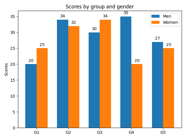
这是简单的条形图,在单个条形图上带有误差条形图和高度标签。
 ;
;
import numpy as npimport matplotlib.pyplot as pltmen_means, men_std = (20, 35, 30, 35, 27), (2, 3, 4, 1, 2)women_means, women_std = (25, 32, 34, 20, 25), (3, 5, 2, 3, 3)ind = np.arange(len(men_means)) # the x locations for the groupswidth = 0.35 # the width of the barsfig, ax = plt.subplots()rects1 = ax.bar(ind - width/2, men_means, width, yerr=men_std,color='SkyBlue', label='Men')rects2 = ax.bar(ind + width/2, women_means, width, yerr=women_std,color='IndianRed', label='Women')# Add some text for labels, title and custom x-axis tick labels, etc.ax.set_ylabel('Scores')ax.set_title('Scores by group and gender')ax.set_xticks(ind)ax.set_xticklabels(('G1', 'G2', 'G3', 'G4', 'G5'))ax.legend()def autolabel(rects, xpos='center'):"""Attach a text label above each bar in *rects*, displaying its height.*xpos* indicates which side to place the text w.r.t. the center ofthe bar. It can be one of the following {'center', 'right', 'left'}."""xpos = xpos.lower() # normalize the case of the parameterha = {'center': 'center', 'right': 'left', 'left': 'right'}offset = {'center': 0.5, 'right': 0.57, 'left': 0.43} # x_txt = x + w*offfor rect in rects:height = rect.get_height()ax.text(rect.get_x() + rect.get_width()*offset[xpos], 1.01*height,'{}'.format(height), ha=ha[xpos], va='bottom')autolabel(rects1, "left")autolabel(rects2, "right")plt.show()
下载这个示例

若有收获,就点个赞吧
0 人点赞
