使用线、日期、文本创建时间轴图
如何使用Matplotlib发布日期创建简单的时间轴。
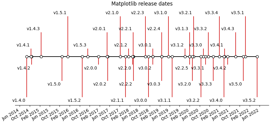
可以使用日期和文本的集合创建时间轴。在本例中,我们将展示如何使用Matplotlib最新版本的日期创建一个简单的时间轴。首先,我们将从GitHub中提取数据。
import matplotlib.pyplot as pltimport numpy as npimport matplotlib.dates as mdatesfrom datetime import datetime# A list of Matplotlib releases and their dates# Taken from https://api.github.com/repos/matplotlib/matplotlib/releasesnames = ['v2.2.2', 'v2.2.1', 'v2.2.0', 'v2.1.2', 'v2.1.1', 'v2.1.0', 'v2.0.2','v2.0.1', 'v2.0.0', 'v1.5.3', 'v1.5.2', 'v1.5.1', 'v1.5.0', 'v1.4.3','v1.4.2', 'v1.4.1', 'v1.4.0']dates = ['2018-03-17T03:00:07Z', '2018-03-16T22:06:39Z','2018-03-06T12:53:32Z', '2018-01-18T04:56:47Z','2017-12-10T04:47:38Z', '2017-10-07T22:35:12Z','2017-05-10T02:11:15Z', '2017-05-02T01:59:49Z','2017-01-17T02:59:36Z', '2016-09-09T03:00:52Z','2016-07-03T15:52:01Z', '2016-01-10T22:38:50Z','2015-10-29T21:40:23Z', '2015-02-16T04:22:54Z','2014-10-26T03:24:13Z', '2014-10-18T18:56:23Z','2014-08-26T21:06:04Z']dates = [datetime.strptime(ii, "%Y-%m-%dT%H:%M:%SZ") for ii in dates]
接下来,我们将遍历每个日期并将其绘制在水平线上。我们将为文本添加一些样式,以便重叠不那么严重。
请注意,Matplotlib将自动绘制日期时间输入。
levels = np.array([-5, 5, -3, 3, -1, 1])fig, ax = plt.subplots(figsize=(8, 5))# Create the base linestart = min(dates)stop = max(dates)ax.plot((start, stop), (0, 0), 'k', alpha=.5)# Iterate through releases annotating each onefor ii, (iname, idate) in enumerate(zip(names, dates)):level = levels[ii % 6]vert = 'top' if level < 0 else 'bottom'ax.scatter(idate, 0, s=100, facecolor='w', edgecolor='k', zorder=9999)# Plot a line up to the textax.plot((idate, idate), (0, level), c='r', alpha=.7)# Give the text a faint background and align it properlyax.text(idate, level, iname,horizontalalignment='right', verticalalignment=vert, fontsize=14,backgroundcolor=(1., 1., 1., .3))ax.set(title="Matplotlib release dates")# Set the xticks formatting# format xaxis with 3 month intervalsax.get_xaxis().set_major_locator(mdates.MonthLocator(interval=3))ax.get_xaxis().set_major_formatter(mdates.DateFormatter("%b %Y"))fig.autofmt_xdate()# Remove components for a cleaner lookplt.setp((ax.get_yticklabels() + ax.get_yticklines() +list(ax.spines.values())), visible=False)plt.show()
下载这个示例

若有收获,就点个赞吧
0 人点赞
