简单的图轴标记
标记图的轴。
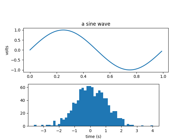
import numpy as npimport matplotlib.pyplot as pltfig = plt.figure()fig.subplots_adjust(top=0.8)ax1 = fig.add_subplot(211)ax1.set_ylabel('volts')ax1.set_title('a sine wave')t = np.arange(0.0, 1.0, 0.01)s = np.sin(2*np.pi*t)line, = ax1.plot(t, s, color='blue', lw=2)# Fixing random state for reproducibilitynp.random.seed(19680801)ax2 = fig.add_axes([0.15, 0.1, 0.7, 0.3])n, bins, patches = ax2.hist(np.random.randn(1000), 50,facecolor='yellow', edgecolor='yellow')ax2.set_xlabel('time (s)')plt.show()
参考
此示例中显示了以下函数,方法,类和模块的使用:
import matplotlibmatplotlib.axes.Axes.set_xlabelmatplotlib.axes.Axes.set_ylabelmatplotlib.axes.Axes.set_titlematplotlib.axes.Axes.plotmatplotlib.axes.Axes.histmatplotlib.figure.Figure.add_axes
下载这个示例

若有收获,就点个赞吧
0 人点赞
