颜色差异体现数值大小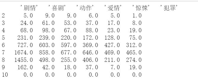
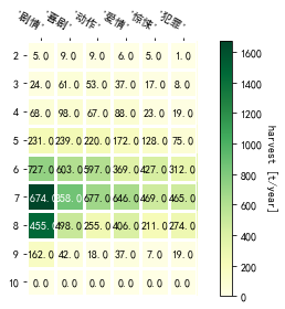
import numpy as npimport matplotlibimport matplotlib.pyplot as plt # 导入库import pandas_def as pdefmatplotlib.rcParams['font.sans-serif'] = ['SimHei']matplotlib.rcParams['font.family']='sans-serif'#解决负号'-'显示为方块的问题matplotlib.rcParams['axes.unicode_minus'] = Falsedef heatmap(data, row_labels, col_labels, ax=None,cbar_kw={}, cbarlabel="", **kwargs):"""Create a heatmap from a numpy array and two lists of labels.Parameters----------dataA 2D numpy array of shape (N, M).row_labelsA list or array of length N with the labels for the rows.col_labelsA list or array of length M with the labels for the columns.axA `matplotlib.axes.Axes` instance to which the heatmap is plotted. Ifnot provided, use current axes or create a new one. Optional.cbar_kwA dictionary with arguments to `matplotlib.Figure.colorbar`. Optional.cbarlabelThe label for the colorbar. Optional.**kwargsAll other arguments are forwarded to `imshow`."""if not ax:ax = plt.gca()# Plot the heatmapim = ax.imshow(data, **kwargs)# Create colorbarcbar = ax.figure.colorbar(im, ax=ax, **cbar_kw)cbar.ax.set_ylabel(cbarlabel, rotation=-90, va="bottom")# We want to show all ticks...ax.set_xticks(np.arange(data.shape[1]))ax.set_yticks(np.arange(data.shape[0]))# ... and label them with the respective list entries.ax.set_xticklabels(col_labels)ax.set_yticklabels(row_labels)# Let the horizontal axes labeling appear on top.ax.tick_params(top=True, bottom=False,labeltop=True, labelbottom=False)# Rotate the tick labels and set their alignment.plt.setp(ax.get_xticklabels(), rotation=-30, ha="right",rotation_mode="anchor")# Turn spines off and create white grid.for edge, spine in ax.spines.items():spine.set_visible(False)ax.set_xticks(np.arange(data.shape[1] + 1) - .5, minor=True)ax.set_yticks(np.arange(data.shape[0] + 1) - .5, minor=True)ax.grid(which="minor", color="w", linestyle='-', linewidth=3)ax.tick_params(which="minor", bottom=False, left=False)return im, cbardef annotate_heatmap(im, data=None, valfmt="{x:.2f}",textcolors=("black", "white"),threshold=None, **textkw):"""A function to annotate a heatmap.Parameters----------imThe AxesImage to be labeled.dataData used to annotate. If None, the image's data is used. Optional.valfmtThe format of the annotations inside the heatmap. This should eitheruse the string format method, e.g. "$ {x:.2f}", or be a`matplotlib.ticker.Formatter`. Optional.textcolorsA pair of colors. The first is used for values below a threshold,the second for those above. Optional.thresholdValue in data units according to which the colors from textcolors areapplied. If None (the default) uses the middle of the colormap asseparation. Optional.**kwargsAll other arguments are forwarded to each call to `text` used to createthe text labels."""if not isinstance(data, (list, np.ndarray)):data = im.get_array()# Normalize the threshold to the images color range.if threshold is not None:threshold = im.norm(threshold)else:threshold = im.norm(data.max()) / 2.# Set default alignment to center, but allow it to be# overwritten by textkw.kw = dict(horizontalalignment="center",verticalalignment="center")kw.update(textkw)# Get the formatter in case a string is suppliedif isinstance(valfmt, str):valfmt = matplotlib.ticker.StrMethodFormatter(valfmt)# Loop over the data and create a `Text` for each "pixel".# Change the text's color depending on the data.texts = []for i in range(data.shape[0]):for j in range(data.shape[1]):kw.update(color=textcolors[int(im.norm(data[i, j]) > threshold)])text = im.axes.text(j, i, valfmt(data[i, j], None), **kw)texts.append(text)return textsif __name__ == '__main__':# 获取数据:获取数量最多的前六位电影类型标签+评分区间 -> 电影数量data = pdef.genre_rates_tj(6)print(data)# 绘制图表fig, ax = plt.subplots()# 评分rates = data.index.tolist()genres = data.columns.tolist()values = data.valuesim, cbar = heatmap(values, rates, genres, ax=ax,cmap="YlGn", cbarlabel="harvest [t/year]")texts = annotate_heatmap(im, valfmt="{x:.1f}")fig.tight_layout()plt.show()

若有收获,就点个赞吧
0 人点赞
