一种非常方便的布局方式。
在容器中记住4个样式即可。
display: flex; flex布局flex-direction: row; 规定主轴的方向:row/columnjustify-content: space-around; 元素在主轴方向上的排列方式:flex-start/flex-end/space-around/space-betweenalign-items: center; 元素在副轴方向上的排列方式:flex-start/flex-end/space-around/space-between
示例
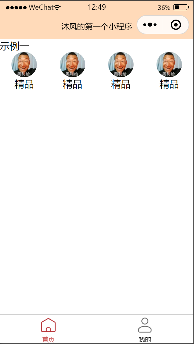
<!--pages/index/index.wxml--><view>示例一</view><view class="menu-1"><view class="item"><image src="/static/hg.jpg"></image><text>精品</text></view><view class="item"><image src="/static/hg.jpg"></image><text>精品</text></view><view class="item"><image src="/static/hg.jpg"></image><text>精品</text></view><view class="item"><image src="/static/hg.jpg"></image><text>精品</text></view></view>
/* pages/index/index.wxss */.menu-1{display: flex;flex-direction: row;justify-content: space-around; /* 间隔排放 */}.menu-1 .item{display: flex;flex-direction: column;align-items: center;}image {width: 100rpx;height: 100rpx;border-radius: 50rpx; /* 圆角 */}

若有收获,就点个赞吧
0 人点赞
