准备一个div
<div class="loading"></div>
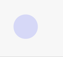
涟漪效果
.loading {position: relative;width: 100px;height: 100px;}.loading::before, .loading::after {content: '';position: absolute;left: 0;top: 0;bottom: 0;right: 0;margin: auto;background: #b4b8f9;border-radius: 50%;animation: wave 1.5s infinite linear;}.loading::after {animation-delay: 0.75s;}@keyframes wave {0% {width: 0; height: 0; opacity: 1;}100% {width: 100px; height: 100px; opacity: 0;}}
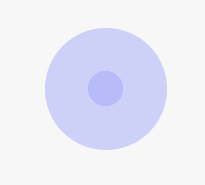
呼吸效果
.loading {position: relative;width: 200px;height: 200px;}.loading::before, .loading::after {content: '';position: absolute;left: 0;top: 0;bottom: 0;right: 0;margin: auto;background: #b4b8f9;border-radius: 50%;animation: wave 1.5s infinite linear;}.loading::after {animation-direction: reverse;}@keyframes wave {0% {width: 0; height: 0; opacity: 1;}100% {width: 100px; height: 100px; opacity: 0.5;}}
svg 动画
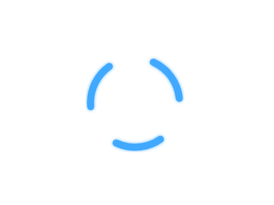
<div id="container"><svg viewBox="0 0 100 100"><defs><filter id="shadow"><feDropShadow dx="0" dy="0" stdDeviation="1.5"flood-color="#40a9ff"/></filter></defs><circle id="spinner" style="fill:transparent;stroke:#40a9ff;stroke-width: 7px;stroke-linecap: round;filter:url(#shadow);" cx="50" cy="50" r="45"/></svg></div>
div {position: absolute;top: 50%;left: 50%;transform: translate(-50%,-50%);}#container {width: 200px;height: 200px;}@keyframes animation {0% {stroke-dasharray: 1 98;stroke-dashoffset: -105;}50% {stroke-dasharray: 80 10;stroke-dashoffset: -160;}100% {stroke-dasharray: 1 98;stroke-dashoffset: -300;}}#spinner {transform-origin: center;animation-name: animation;animation-duration: 1.2s;animation-timing-function: cubic-bezier;animation-iteration-count: infinite;}

若有收获,就点个赞吧
0 人点赞
