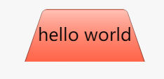
如果直接rotate, 内容也会跟着变形,所以用伪元素
div {width: 100px;height: 50px;margin-left: 100px;line-height: 50px;text-align: center;position: relative;}div::before{content:'';position: absolute;left:0;top:0;right:0;bottom:0;background: tomato;z-index: -1;border-radius: 5px 5px 0 0;background-image: linear-gradient(hsla(0,0%,100%,.6),hsla(0,0%,100%,0));border: 1px solid rgba(0,0,0,.4);border-bottom: none;transform: scale(1.1, 1.4) perspective(10px) rotateX(5deg);transform-origin: bottom;}
- scale(x, y)分别放大x和y方向,对应的有scaleX()和scaleY()
perspective()设置透视点到屏幕的距离,值越小,变化越明显,小于0看不到变化
也可以给父元素设置 perspective: 10px 属性, 作用于全部子元素
rotateX沿X轴转动
- transform-origin设置原点位置
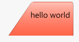
将transform-origin改成left或right,效果如下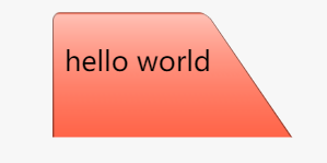

若有收获,就点个赞吧
0 人点赞
