CSS创建三角形原理
利用盒子的均分原理,盒子都是矩形或者正方形从形状的中心,向4个上下左右划分4个部分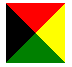
<div class="box"></div><style>.box{width: 0;height: 0;margin: 100px auto;border: 100px solid #000;border-top-color: red;border-right-color: yellow;border-bottom-color: green;}</style>
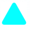
圆角三角形
/** 圆角三角形 */<div class="rounded-triangle"></div><style>.rounded-triangle {width: 50px;height: 50px;border-top-right-radius: 30%;background-color: cyan;transform: rotate(-60deg) skewX(-30deg) scale(1,.866);}.rounded-triangle:before,.rounded-triangle:after {content: '';position: absolute;background-color: inherit;width: 50px;height: 50px;border-top-right-radius: 30%;}.rounded-triangle:before {transform: rotate(-135deg) skewX(-45deg) scale(1.414, .707) translate(0,-50%);}.rounded-triangle:after {transform: rotate(135deg) skewY(-45deg) scale(.707, 1.414) translate(50%);}</style>

若有收获,就点个赞吧
0 人点赞
