Python 可视化
在一些学术论文中,经常会看到用「相关性矩阵(correlation matrix)」 去表示数据集中每队数据变量间的关系,可以实现对数据集大致情况的一个快速预览,常常用于探索性分析。
R绘制相关性矩阵
在R中有很多可视化包可以绘制相关性矩阵图,如R-ggcorrplot、R-ggstatsplot和R-corrplot。
R-ggcorrplot
R-ggcorrplot包作为ggplot2的拓展包,首先进行介绍,具体内容如下:
- 官网
R-ggcorrplot包的官网如下:https://rpkgs.datanovia.com/ggcorrplot/
- 样例介绍 R-ggcorrplot包主要提供
ggcorrplot()和cor_pmat()两个绘图函数,具体例子如下(这里都做了主题等细节设置):「样例一」:默认情况
```r library(tidyverse) library(ggtext) library(hrbrthemes) library(wesanderson) library(LaCroixColoR) library(ggsci) library(ggcorrplot)
data(mtcars) corr <- round(cor(mtcars), 1) p.mat <- cor_pmat(mtcars) colors = c(“#B2182B”, “white”, “#4D4D4D”)
plot01 <- ggcorrplot(corr,colors = colors, ggtheme=hrbrthemes::theme_ipsum(base_family = “Roboto Condensed”))
plot01_cus <- plot01 +
labs(x=””,y=””,
title = “Example of ggcorrplot charts makes“,
subtitle = “processed charts with ggcorrplot()“,
caption = “Visualization by DataCharm“) +
theme(
plot.title = element_markdown(hjust = 0.5,vjust = .5,color = “black”,
size = 25, margin = margin(t = 1, b = 12)),
plot.subtitle = element_markdown(hjust = 0,vjust = .5,size=20),
plot.caption = element_markdown(face = ‘bold’,size = 15))
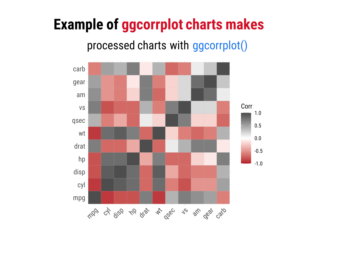<br />Example01 of ggcorrplot<a name="tqv8c"></a>### 「样例二」:圆形下半面```rplot02 <- ggcorrplot(corr,colors = colors,method = "circle",outline.color = "black",lab = TRUE,type = "lower",lab_size = 4,ggtheme=hrbrthemes::theme_ipsum(base_family = "Roboto Condensed"))plot02_cus <- plot02 +labs(x="",y="",title = "Example of <span style='color:#D20F26'>ggcorrplot charts makes</span>",subtitle = "processed charts with <span style='color:#1A73E8'>ggcorrplot()</span>",caption = "Visualization by <span style='color:#0057FF'>DataCharm</span>") +#hrbrthemes::theme_ipsum(base_family = "Roboto Condensed") +theme(plot.title = element_markdown(hjust = 0.5,vjust = .5,color = "black",size = 25, margin = margin(t = 1, b = 12)),plot.subtitle = element_markdown(hjust = 0,vjust = .5,size=20),plot.caption = element_markdown(face = 'bold',size = 15))

「样例三」:上半面
plot03 <- ggcorrplot(cor(mtcars),colors = colors,outline.color = "black",lab = TRUE,type = "upper",p.mat = p.mat,digits = 2,ggtheme=hrbrthemes::theme_ipsum(base_family = "Roboto Condensed"))plot03_cus <- plot03 +labs(x="",y="",title = "Example of <span style='color:#D20F26'>ggcorrplot charts makes</span>",subtitle = "processed charts with <span style='color:#1A73E8'>ggcorrplot()</span>",caption = "Visualization by <span style='color:#0057FF'>DataCharm</span>") +#hrbrthemes::theme_ipsum(base_family = "Roboto Condensed") +theme(plot.title = element_markdown(hjust = 0.5,vjust = .5,color = "black",size = 25, margin = margin(t = 1, b = 12)),plot.subtitle = element_markdown(hjust = 0,vjust = .5,size=20),plot.caption = element_markdown(face = 'bold',size = 15))

Example03 of ggcorrplot
以上就是ggcorrplot包绘制的基本情况(基本上重要的参数设置都介绍完了)。
R-ggstatsplot
主要介绍里面的ggcorrmat() 绘图函数,可通过如下例子进行介绍:
「样例一」:基础样例
ggstatsplot01 <- ggcorrmat(data = mtcars,colors = c("#B2182B", "white", "#4D4D4D"),title = "Correlalogram Example of ggstatsplot charts makes",subtitle = "processed charts with ggcorrmat()",caption = "Visualization by DataCharm",ggtheme = hrbrthemes::theme_ipsum(base_family = "Roboto Condensed"),) +theme(plot.title = element_text(hjust = 0.5,vjust = .5,color = "black",size = 18, margin = margin(t = 1, b = 12)),plot.subtitle = element_text(hjust = 0,vjust = .5,size=16),plot.caption = element_text(face = 'bold',size = 12))

「样例二」:定制化操作
ggstatsplot02 <- ggcorrmat(data = mtcars,matrix.type = "upper",ggcorrplot.args = list(lab_col = "black",lab_size = 4,tl.srt = 90,pch.col = "red",pch.cex = 10),title = "Correlalogram Example of ggstatsplot charts makes",subtitle = "Processed charts with ggcorrmat()",caption = "Visualization by DataCharm",ggtheme = hrbrthemes::theme_ipsum(base_family = "Roboto Condensed"),) +theme(plot.title = element_text(hjust = 0.5,vjust = .5,color = "black",size = 18, margin = margin(t = 1, b = 12)),plot.subtitle = element_text(hjust = 0,vjust = .5,size=16),plot.caption = element_text(face = 'bold',size = 12))

Example02 of ggstatsplot
此外,ggstatsplot还有针对分组数据的的相关性矩阵绘制方法。
R-corrplot
介绍完基于ggplot2绘图体系的相关性矩阵图表绘制方法之后,再介绍R-corrplot包的绘制方法。详细内容如下:
- 官网 R-corrplot包的使用方法可参考如下网址:https://cran.r-project.org/web/packages/corrplot/vignettes/corrplot-intro.html
- 样例介绍 R-corrplot包由于其自身的绘图语法,这里只列举两个小例子做比较,其他详细内容,可以参考官网:
「样例一」:
opar <- par(family = "Roboto Condensed")col1 <- colorRampPalette(c("#B2182B", "white", "#4D4D4D"))corrplot(M, type = "upper",method = "ellipse",col =col1(100),order = "hclust", addrect = 2,tl.col = "black", tl.srt = 45)mtext(text = "Example Of Corrplot", side = 1, line = -4,col = "black", font = 4, adj = 0.05, cex = 2)mtext(text = "Visualization by DataCharm", side=1,line = - 1, col = "black", font = 3, adj = 0.05, cex = 1)
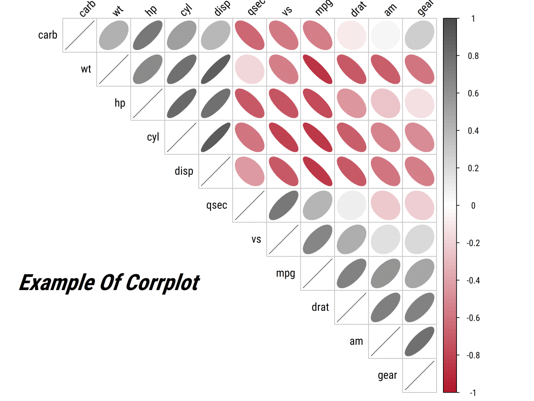
Example01 of corrplot「样例二」:组合样式
corrplot.mixed(M, lower = "ellipse", upper = "circle",tl.col = "black", tl.srt = 45)
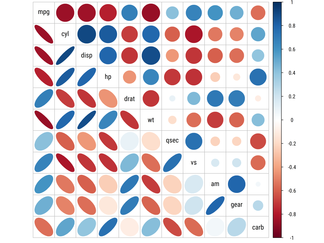
Example02 of corrplotPython 绘制相关性矩阵
在介绍完R绘制相关性矩阵图的方法后,再简单介绍下如何使用Python进行绘制,这里直接列出例子即可:from string import ascii_lettersimport numpy as npimport pandas as pdimport seaborn as snsimport matplotlib.pyplot as pltsns.set_theme(style="white")rs = np.random.RandomState(33)d = pd.DataFrame(data=rs.normal(size=(100, 26)),columns=list(ascii_letters[26:]))corr = d.corr()mask = np.triu(np.ones_like(corr, dtype=bool))f, ax = plt.subplots(figsize=(11, 9))cmap = sns.diverging_palette(230, 20, as_cmap=True)sns.heatmap(corr, mask=mask, cmap=cmap, vmax=.3, center=0,square=True, linewidths=.5, cbar_kws={"shrink": .5})
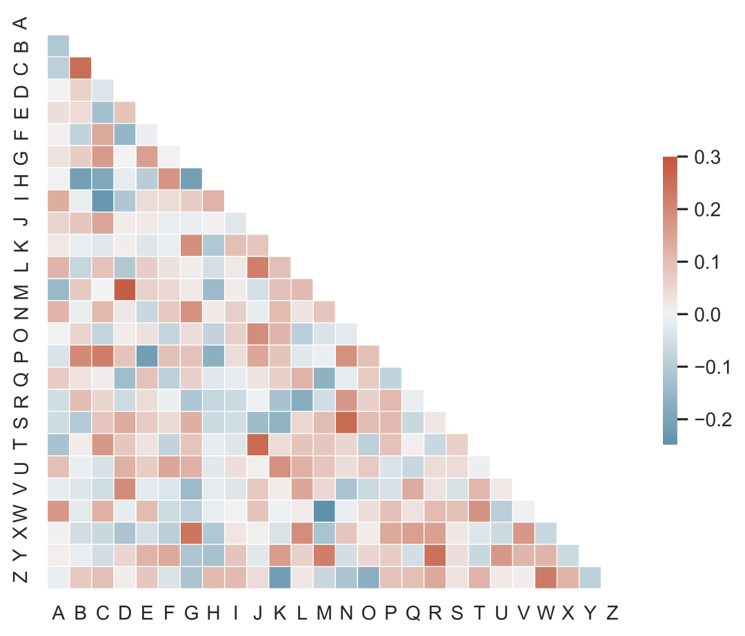
Example of seaborn.heatmap

若有收获,就点个赞吧
0 人点赞
