R-geomtextpath 简介
在常见的绘图过程中,一般的文本绘制都是短的、笔直的并且与轴一致。但有时弯曲的文本注释在绘图过程中也十分重要,特别是在极坐标系下的一些图表绘制。R-geomtextpath包就是R语言中实现弯曲文本注释功能的优秀第三方包,且基于ggplot2绘图体系,学习成本大大降低。
R-geomtextpath 示例样式
样例一:geom_textpath()
t <- seq(5, -1, length.out = 1000) * pispiral <- data.frame(x = sin(t) * 1000:1,y = cos(t) * 1000:1)rhyme <- paste("Like a circle in a spiral, like a wheel within a wheel,","never ending or beginning on an ever spinning reel")p <- ggplot(spiral, aes(x, y, label = rhyme)) +coord_equal(xlim = c(-1000, 1000), ylim = c(-1000, 1000))p + geom_textpath(size = 4)
")
样例二:geom_labelpath()
p + geom_labelpath(size = 4, textcolour = "#E41A1C", boxcolour = "#377eb8",fill = "#ffff99", boxlinetype = "dotted", linewidth = 1,boxlinewidth = 0.5) +hrbrthemes::theme_ipsum(base_family = "Roboto Condensed")
")
样例三:geom_textdensity()
i <- ggplot(iris, aes(x = Sepal.Length, colour = Species, label = Species)) +ylim(c(0, 1.3))i + geom_textdensity(size = 5, vjust = -0.2, hjust = "ymax") +labs(subtitle = "hjust = \"ymax\"")+hrbrthemes::theme_ipsum(base_family = "Roboto Condensed")
")
样例四:coord_curvedpolar()
df <- data.frame(Temperature = c(4.4, 4.6, 6.3, 8.7, 11.6, 14.1, 15.9, 15.5,13.1, 9.7, 6.7, 4.3, 3.6, 3.9, 6.4, 9.7, 13.2,15.8, 18, 17.8, 15.1, 11.2, 7.2, 4.4),City = rep(c("Glasgow", "Amsterdam"), each = 12),Month = factor(rep(month.name, 2), month.name))p <- ggplot(df, aes(Month, Temperature)) +geom_col(aes(fill = City), position = position_dodge(width = 1)) +geom_vline(xintercept = 1:13 - 0.5, color = "gray90") +geom_hline(yintercept = 0:3 * 5, color = "gray90") +scale_fill_manual(values = c("darkorange", "dodgerblue4")) +ggtitle("Average monthly temperature in Amsterdam and Glasgow") +theme_bw() +theme(panel.border = element_blank(),axis.text.x = element_text(size = 14),axis.title.x = element_blank(),panel.grid.major = element_blank())p + coord_curvedpolar()
")
样例五:Stat layers 绘制
ggplot(iris, aes(Sepal.Width, Sepal.Length, colour = Species)) +geom_point(alpha = 0.3) +stat_ellipse(aes(label = Species),geom = "textpath", hjust = 0.25,) +hrbrthemes::theme_ipsum(base_family = "Roboto Condensed") +theme(legend.position = "none")

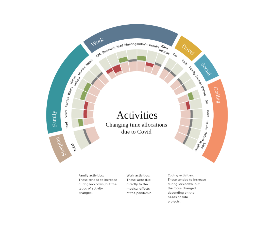
样例六:Covid effects on life activities
ggplot(covidpie$df, aes(xvals, yvals)) +geom_col(width = 1.05, aes(fill = cols)) +geom_vline(colour = "white", xintercept = sep, size = 3) +geom_segment(data = data.frame(x = 0.5 + 1:24, y = 0, yend = 1),aes(x = x, y = 0, yend = 1, xend = x), colour = "white",inherit.aes = FALSE) +geom_textpath(data = covidpie$sublabels,mapping = aes(x, y, label = z, group = id), size = 3.8,upright = FALSE, text_only = TRUE, hjust = 0,color = "white", family = "Times New Roman") +geom_text(x = 32, y = -2, label = "Activities", check_overlap = TRUE,size = 7, family = "Times New Roman") +geom_text(x = 32, y = -1.4, label= "Changing time allocations\ndue to Covid",lineheight = 1, check_overlap = TRUE, family = "Times New Roman") +geom_textpath(data = covidpie$df_text, aes(x, y, label = text),upright = FALSE, size = 2, rich = TRUE, text_only = TRUE,halign = "left") +geom_text(x = 36.5, y = 1.8, label = covidpie$label1, hjust = 0,size = 2, check_overlap = TRUE, vjust = 1) +geom_text(x = 32.8, y = 0.75, label = covidpie$label2, vjust = 1, hjust = 0,size = 2, check_overlap = TRUE) +geom_text(x = 28.8, y = 1.04, label = covidpie$label3, hjust = 0,size = 2, check_overlap = TRUE, vjust = 1) +scale_y_continuous(limits = c(-2, 2.2)) +scale_fill_manual(values = covidpie$fills) +scale_x_continuous(expand = c(0.2, 1)) +coord_polar(start = -pi) +theme_void() +theme(legend.position = "none")
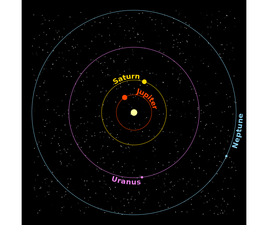
样例七:Planetary orbits
set.seed(1)planets <- c("Jupiter", "Saturn", "Uranus", "Neptune")t <- seq(0, pi * 2, len = 500)AU <- c(5.203, 9.539, 19.18, 30.06)df <- data.frame(x = as.vector(outer(cos(t), AU)),y = as.vector(outer(sin(t), AU)),Planet = rep(planets, each = 500),position = rep(c(0.75, 0.2, 0.4, 0.1)))ggplot(df, aes(x, y, color = Planet)) +geom_point(inherit.aes = FALSE,data = data.frame(x = runif(1000, -30, 30),y = runif(1000, -30, 30),intens = runif(1000)/2),mapping = aes(x, y, alpha = intens), color = "white", size = 0.2) +geom_textpath(aes(label = Planet), linewidth = 0.3,hjust = rep(c(0, 0.25, 0.75, 1), each = 500),vjust = 1.1, size = 5, upright = TRUE, fontface = 2) +geom_point(data = df[c(170, 600, 1385, 1965),], size = c(4, 3.5, 1.5, 1.5)) +geom_point(x = 0, y = 0, size = 5, color = "#FFFFA0", inherit.aes = FALSE) +scale_alpha_identity() +scale_color_manual(values = c(Jupiter = "orangered",Uranus ="violet",Neptune = "skyblue",Saturn = "gold")) +coord_equal() +theme_void() +theme(plot.background = element_rect(fill = "black"),legend.position = "none")

若有收获,就点个赞吧
0 人点赞
