CSS 层叠样式表
- CSS 指层叠样式表 (_C_ascading _S_tyle _S_heets)
- 样式定义如何显示 HTML 元素
- 样式通常存储在样式表中
- 把样式添加到中,是为了解决内容与表现分离的问题
- 外部样式表可以极大提高工作效率
- 外部样式表通常存储在 CSS 文件中
- 多个样式定义可层叠为一
1. 如何写CSS样式表
在网页中书写CSS有多种方式:
行内样式
通过标签的style属性书写CSS样式
<span style="样式名称:样式值; 样式名称:样式值;">Content</span>
案例
<span style="font-size:24px; color:red; "></span>
样式名称与样式值的关系其实就是
key:value键值对,属性名与属性值之间 使用:分隔,多组样式使用;隔开
PS: 考虑一下如果我们要对网页中 100 个 span 添加这个样式 , 会产生什么问题?
内部样式表
通过嵌入到HTML文件的
<head>标签中书写样式<head><style>选择器{属性:属性值;属性:属性值;属性:属性值;}</style></head>
案例
<head><style>span{color:red;font-size:24px;}</style></head><body><span>看看有什么变化?</span></body>
PS: 这个样式只能在当前页面中使用,如果我想创建多页面共享的样式,通过内部样式显然做不到
- 外部样式表
- 使用链接引入后缀名为.css的文件
<head><!-- rel 代表链接文件与当前文档关系 指定为 stylesheet 代表样式表文件 --><!-- type 指定链接的文档类型是 CSS样式表--><!-- href 链接的文件路径是什么 --><link rel="stylesheet" type="text/css" href="./style.css" /></head>
- 使用链接引入后缀名为.css的文件
2. CSS选择器
标签选择器
/*签选择器 可以把某一类标签全部选择出来 统一加上样式*/h3{color:yellow;}p{color:blue;}
PS: 如果页面中有部分h3 标签想使用别的样式就不太方便了
类选择器
使用英文 . 符号进行表示
.类名{属性:属性值;}
- 案例
<!DOCTYPE html><html lang="en"><head><meta charset="UTF-8"><meta name="viewport" content="width=device-width, initial-scale=1.0"><title>Document</title><style>.f16{color:blue;font-size: 16px;}.f20{color:red;font-size: 20px;}.f24{color:orange;font-size: 24px;}.f28{color:green;font-size: 28px;}.f32{color:yellow;font-size: 32px;}</style></head><body><span class="f16">哈</span><span class="f20">哈</span><span class="f24">哈</span><span class="f28">哈</span><span class="f32">哈</span></body></html>
标签中的类名可以指定多个
大家可以想一下,上面的我们定义的类其实包含了 font-size 与 color 两个样式的定义,假设我们有一个需求是希望设计中的字体大小是统一的但颜色不一样,颜色是不一样的应该怎么去设计者类
font30{font-size:30px;}.red{color:red;}.blue{color:blue;}.orange{color:orange;}.green{color:green;}.yellow{color:yellow;}/*此时我们在使用时就可以分别取指定 , 这么设计我们的CSS应用会更广泛*/<span class="red font30">哈</span><span class="blue font30">哈</span><span class="orange font30">哈</span><span class="green font30">哈</span><span class="yellow font30">哈</span>
Id选择器
- id 选择器使用 # 符号标识,后面是ID名称
- id 在同一个页面中是唯一的 而 class 可以被重复使用
#sp{属性名:属性值;}<span id="sp">content</spam>
后代选择器
- 通过指定祖宗与子孙关系的选择器
父级 后代 {属性:属性值;}
<style>/** 代表 该DIV下所有的span 都会被影响 **/div span{color:green;}</style></head><body><!-- 考虑一下 如果下面的不喜欢吃 如果也包裹上了 div 怎么解决呢? --><div><h2>我喜欢吃:</h2><span>香蕉</span><span>苹果</span><span>荔枝</span><span>西瓜</span><span>桃子</span></div><h2>我不喜欢吃:</h2><span>榴莲</span><span>臭豆腐</span></body>
下面的例子 会被后代选择器影响吗
<style>div span{color:green;}<style><div><h2>我喜欢吃:</h2><span>香蕉</span><span>苹果</span><p><span>我会被选择器选中吗?</span></p></div>
子代选择器
- 子代选择器只会影响父选择器的直接子选择器
<style>.likes>span{color:green;}</style><div class="likes"><h2>我喜欢吃:</h2><span>香蕉</span><span>苹果</span><p><span>我会被选择器选中吗?</span></p></div>
交集选择器
-交集选择器相当于 并且的关系
<style>span.red{color:red;}</style><!-- 要保证 是 span 标签 并且 class 是 red --><span class="red">红色</span><span class="red">红色</span><span class="red">红色</span><p class="red">红色</p><div class="red">红色</div><span class="blue">蓝色</span>
并级选择器
- 并级选择器 相当于 和的关系 使用逗号分隔
A和B都是什么... - 并级选择器 可以是 类 ID 标签 选择器
<!-- div 和 p 标签的文本颜色都是绿色--><style>p,div{color:green;}</style><div>绿色吗?</div><p>绿色吗?</p>
通配符选择器
*号标识选择所有标签,匹配页面中所有的元素
*{margin:0;padding:0;}
链接伪类选择器
- 伪类选择器 使用 选择器 : link|visited|hover|active
- 顺序尽量不要颠倒 按照 lvha 的顺序
/*未访问的链接*/a:link{color:red;}/* 已访问的链接 */a:visited:{color:green;}/* 鼠标移动到链接上 */a:hover{color:yellow;}/*鼠标按下选定不放开时*/a:active{color:blue;}
常见单位
| 长度单位 | 说明 |
|---|---|
| px | 像素 (绝大部分 使用px) |
| em | 相对于当前对象内文本的字体尺寸 |
3.字体样式
3.1 字体大小 font-szie
span{font-size:20px;}
3.2 字体类型 font-family
/*1.字体间用逗号隔开2.中文字体需要加英文引号3.字体名称 包含空格 $等符号需要加英文符号 如: "Microsoft Yahei"*/span{font-family: Arial,"黑体","微软雅黑";}
3.3 字体粗细 font-weight
/* 数值 或 normal bold*/span{font-weight: 700; /*100~900之间 normal == 400 bold == 700*/}
3.4 字体风格 font-style
span{font-style: italic; /* italic = 倾斜字体 normal=默认 标准风格*/}
4. 文本属性
4.1 文本颜色 color
/*颜色值可以是预定义的文本颜色如 red 也可以是十六进制的值,或RBG筏值*/span{color:[red|green|#FF0000|rgb(255,0,0)]}
4.2 文本水平对齐 text-align
div{text-align:[left|right|center] /*左 中 右 自选其一*/}
4.3 行高 line-height
- 是指两行文字基线之间的距离
- 什么是基线?
基线、底线、顶线、中线
- 行高 = 上边距 + 内容高度 + 下边距

- 如果行高与容器高度相同 文字会垂直居中(单行文字)

- 行高 = 上边距 + 内容高度 + 下边距
div{font-size:16px;width:100px;height:40px;line-height:40px;}<div> 垂直居中了 </div>
4.4 首行缩进 text-indent
p{text-indent:2em; /*1em就是一个字的大小*/}
4.5 文本装饰 text-decoration
a{text-decoration: [none|underline] /*常用的属性 是none 去除连接的下划线 */}
5. 显示模式
display
- 块级标签
- 独占一行
- 可以设置高度与宽度 , 内外边距可控
- 如果不给宽度,则宽度是父容器宽度的100%
- 块级标签相当于是一个盒子容器,可以容纳其他块级标签与行内标签
display:block /*块级标签,dispaly==block 一行只占一个标签 如 div h系列 P ul ol li */
- 案例
<style>.main{width:200px;height:200px;background-color:#ccc; /*设置背景颜色为 浅灰*/}</style><body><div class="main">大家好!</div></body>
PS: 需要注意的是,P标签 与 h系列标签属于文本块级标签,内部不要包含其他块级元素否则浏览器会解析错误
<p><div>看看浏览器最终会解析成什么样子? F12打开调试器查看</div></p>
- 行内标签
- 一行可以并排显示多个行内标签
- 行内标签设置宽高属性无效
- 行内标签的宽度是内容的宽度
- 行内标签中只能容纳文本或其他行内标签
display:inline /*span a strong b i u ... 都是行内标签*/
<style>span{width:400px;height:400px;background-color:red;}</style><body><span>我的宽高改变了吗?</span></body>
- 行内块标签
- 行内块标签一行可以显示多个
- 其高度宽度与内外边距均可控制
- 默认宽度是内容的宽度
display:inline-block /* img input td 都属于行内块标签*/
- 案例
<style>img{width:300px;height:300px;}</style><body><img scr="./logo.png" /></body>
- 显示模式转变
- 块模式转行内模式 `display:inline
- 行类模式转块模式
display:block - 行内模式 or 块模式 转行内块模式
display:inline
<style>.sp1{display:inline-block;width:100px;height:100px;background-color:red;}.ablock{display:block;width:200px;height: 100px;background-color:blue;}.div1{display:inline;width:400px;height:300px;background-color:yellow;}</style><body><!-- 行内转行内快 --><span class="sp1">你好啊!</span> <span class="sp1">好好!</span><!-- 行内转块模式 --><a href="#" class="ablock">我要走出去</a><!-- 块模式转行内 --><div class="div1">我还有宽高吗?</div></body>
- 简易导航栏案例
<!DOCTYPE html><html lang="en"><head><meta charset="UTF-8"><meta name="viewport" content="width=device-width, initial-scale=1.0"><title>Document</title><style>a{display:inline-block;width: 150px;height: 45px;background-color:deepskyblue;color: white;font-weight: 700;font-size: 16px;text-decoration: none;line-height: 45px;text-align: center;}a:link,a:invalid{background-color: deepskyblue;}a:hover{background-color:dodgerblue;}</style></head><body><a href="#">门户导航</a><a href="#">担保系统</a><a href="#">精易产品</a></body></html>
6.背景
6.1背景颜色(color)
background-color:颜色值; /*默认是透明背景*/
6.2背景图片(image)
background-image: url(图片路径) /*默认为none 路径不要加双引号*/
6.3 背景平铺
/* repeat x轴Y轴平铺 no-repeat 不平铺 repeat-x 水平平铺 repeat-y 纵向平铺 */background-repeat : repeat | no-repeat | repeat-x | repeat-y
6.4 背景位置
background-position: X Ybackground-position : [top|center|bottom|left|right]
7. 盒模型
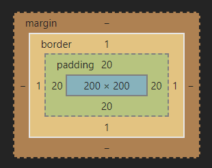
盒子模型,英文即box model。无论是div、span、还是a都是盒子。
当你的浏览器展现一个元素时,这个元素会占据一定的空间。这个空间由四部分组成。
中间是Content(内容)呈现内容的区域。这个区域的外面是 padding (内边距)。再外面是 border(边框)。最外面的是margin(外边距),外边距将该元素与其它元素分开。

内边距(padding),边框(border)和外边距(margin)在元素的上(top)、右(right)、下(bottom)、左(left)都可以有不同的大小。所有这些大小值都可以为0。
7.1 边框(border)
用 border 属性给元素四周指定统一的边框。在属性值中指定边框的宽度(通常是以显示到屏幕上的像素为单位), 样式, 还有颜色。
边框包含的属性: [ border-width (粗细)] || [ border-style(样式) ] || [ border-color(颜色) ]
样式包括(border-style):
solid |
dotted |
dashed |
double |
|---|---|---|---|
inset |
outset |
ridge |
groove |
h3 {border-top-style: solid;border-top-width: 4px;border-top-color: #7c7; /* 增加 中绿 *//* border-top: 4px solid #7c7; 合起来这么写 */background-color: #efe; /* 浅绿 */color: #050; /* 深绿 */}
结果如下:

案例 (输入框)
<!DOCTYPE html><html lang="en"><head><meta charset="UTF-8"><meta name="viewport" content="width=device-width, initial-scale=1.0"><title>Document</title><style>input{border:none;border-bottom: 1px solid #ccc;}</style></head><body>用户名称: <input type="text" name="" id=""> <br />用户密码: <input type="text" name="" id=""> <br /></body></html>
7.2 内边距 (padding)
padding属性设置一个元素的内边距,padding 区域指一个元素的内容和其边界之间的空间,该属性不能为负值。
语法:
/* 应用于四个边 */padding: 1px;/* 垂直方向| 水平方向*/padding: 5px 10px;/* 顶部| 水平方向| 底部*/padding: 10px 20px 30px;/* 顶部| 右边| 底部| 左边 顺时针*/padding: 10px 20px 30px 40px;
案例:
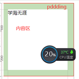
<!DOCTYPE html><html lang="en"><head><meta charset="UTF-8"><meta name="viewport" content="width=device-width, initial-scale=1.0"><title>Document</title><style>.div1{width: 200px;height: 200px;border: 1px solid red;padding: 20px;}</style></head><body><div class="div1">学海无涯</div></body></html>
ps: 测量一下添加padding 后div的宽度
案例 : 盒子如果没有宽度 则 padding 不会撑开盒子
<!DOCTYPE html><html lang="en"><head><meta charset="UTF-8"><meta name="viewport" content="width=device-width, initial-scale=1.0"><title>Document</title><style>.div1{width: 200px;height: 200px;border: 1px solid red;}.div2{background-color: blanchedalmond;padding: 20px;}</style></head><body><div class="div1"><div class="div2">学海无涯</div></div></body></html>
7.3 外边距(margin)
margin属性为给定元素设置所有四个(上下左右)方向的外边距属性。这是四个外边距属性设置的简写。四个外边距属性设置分别是: margin-top, margin-right, margin-bottom 和 margin-left 。指定的外边距允许为负数。
margin的top和bottom属性对内联元素无效,例如<span>和<code>。
语法:
- 只有一个 值时,这个值会被指定给全部的 四个边.
- 两个 值时,第一个值被匹配给 上和下, 第二个值被匹配给 左和右.
- 三个 值时,第一个值被匹配给 上, 第二个值被匹配给 左和右, 第三个值被匹配给 下.
- 四个 值时,会依次按 上、右、下、左 的顺序匹配 (即顺时针顺序).
margin: 10px /*单值语法 所有方向 */margin: 10px 20px /*二值语法 纵向 横向 */margin: 10px 20px 30px /*三值语法 上 横向 下*/margin: 10px 2px 5px 10px /*四值语法 上 右 下 左*/

<!DOCTYPE html><html lang="en"><head><meta charset="UTF-8"><meta name="viewport" content="width=device-width, initial-scale=1.0"><title>Document</title><style>.div1{width: 200px;height: 200px;background-color: red;margin-left:100px}</style></head><body><div class="div1"></div></body></html>
盒子居中的办法
div1{width:600px;height:300px;margin: 0 auto;/*让margin 水平位置 自动 即可居中,但盒子必须有宽度*//*原理可以注释左右两边的auto试试便知margin-left:auto;margin-right:auto;*/}
清除元素的默认 外边距 与内边距
*{padding:0;margin:0;}
外边距合并
<!DOCTYPE html><html lang="en"><head><meta charset="UTF-8"><meta name="viewport" content="width=device-width, initial-scale=1.0"><title>Document</title><style>div{width: 200px;height: 200px;background-color: red;}.div1{margin-bottom: 20px;}.div2{margin-top: 10px;}</style></head><body><div class="div1"></div><div class="div2"></div></body></html>
嵌套元素垂直外边距合并(塌陷)

<!DOCTYPE html><html lang="en"><head><meta charset="UTF-8"><meta name="viewport" content="width=device-width, initial-scale=1.0"><title>Document</title><style>.div1{width: 300px;height: 200px;background-color:black;}.div2{width: 200px;height: 100px;background-color: red;margin-top: 50px;}</style></head><body><div class="div1"><div class="div2"></div></div></body></html>
解决方案
.div{/*给父元素添加顶部边框*/border: 1px solid transparent;/*添加overflow*/overflow:hidden;/*给父元素添加 顶部内边距*/padding-top:1px;}
8.浮动(float)
CSS提供了3种模式来设置盒子在网页中如何摆放
- 标准流
- 块级元素 独占一行
- 行内元素 一行可以显示多个
- 浮动
- 让盒子脱离标准流,可以控制让多个块级盒子在一行中显示
- 定位
- 通过不用的定位模式可以将盒子定位在网页的任意位置
浮动与inline-block有啥区别?
inline-block 的确可以实现将多个盒子并排在一行显示,但 `inline-block` 带有默认样式,在并排的盒子之间会有间隔,这个间隔不太容易去除,而且局限性很大
浮动案例
- 我们会发现div1 脱离文档流后 div2 会自动占据div1在标准流中的位置,这就是脱标的含义可以将脱离文档流的元素浮动在标准流的上方,脱标后的元素不会占据标准文档流的位置所以下面的盒子会自动的顶上这个位置
- 浮动的元素要指定浮动的位置 只有2种位置 分别是 left(左) right(右) 两个方向
<!DOCTYPE html><html lang="en"><head><meta charset="UTF-8"><meta name="viewport" content="width=device-width, initial-scale=1.0"><title>Document</title><style>div{width: 200px;height: 200px;}.div1{float:left;background-color: #ccc;}.div2{background-color: red;}</style></head><body><div class="div1"></div><div class="div2"></div></body></html>
- 脱离文档流的元素浮动在标准文档流的上面,那么如果多个元素脱离文档流会怎么样呢
<!DOCTYPE html><html lang="en"><head><meta charset="UTF-8"><meta name="viewport" content="width=device-width, initial-scale=1.0"><title>Document</title><style>div{width: 200px;height: 200px;}.div1{float:left;background-color: #ccc;}.div2{background-color: red;}</style></head><body><div class="div1"></div><div class="div2"></div></body></html>
- 由于div2 浮动也是靠左,所以这时2个div同时靠左依次排列

- 如果希望元素这么排列该怎么做?

ps: 将一个元素向左浮动,一个元素向右浮动即可 - 如果前面的盒子不浮动后面的盒子浮动会怎么样?(动手试一试)
- 由于前面的盒子没有浮动所以按照标准文档流一个块级元素占一行,下面浮动的元素也是不会上去的
- 浮动元素只会影响后面标准流的盒子 ,不会影响前面的
- 父盒子的边框 与 内边距对浮动子元素是否有效?
- 父盒子的边框 与 内边距均有效

.parent{width: 300px;height: 300px;background-color: #ccc;border:10px solid black;padding: 20px;;}.son{width: 100px;height: 100px;background-color: red;float: right;}
- 父盒子的边框 与 内边距均有效
一个布局案例

<!DOCTYPE html><html lang="en"><head><meta charset="UTF-8"><meta name="viewport" content="width=device-width, initial-scale=1.0"><title>Document</title><style>.goods{width: 1190px;height: 370px;margin: 0 auto;}.goods>div{width: 290px;height: 370px;margin-right: 10px;}.div1{float: left;background-color: #f00;}.div2{float: left;background-color: #0f0;}.div3{float:left;background-color: #00f;}.goods .div4{float:left;margin: 0;background-color:#00f;}.top{height: 180px;background-color:darkcyan;margin-bottom: 10px;}.bm{height: 180px;background-color:darkcyan;}</style></head><body><div class="goods"><div class="div1"></div><div class="div2"></div><div class="div3"><div class="top"></div><div class="bm"></div></div><div class="div4"><div class="top"></div><div class="bm"></div></div></div></body></html>
清除浮动
先看一个案例
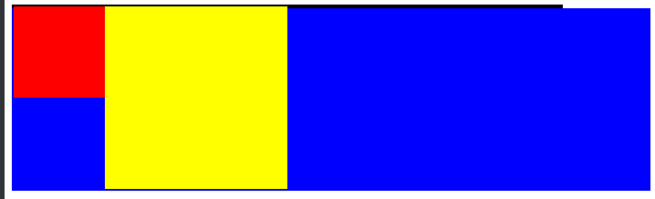
<!DOCTYPE html><html lang="en"><head><meta charset="UTF-8"><meta name="viewport" content="width=device-width, initial-scale=1.0"><title>Document</title><style>.parent{width: 600px;background-color: #ccc;border:2px solid black;}.son1{width: 100px;height: 100px;background-color: red;float: left;}.son2{width: 200px;height: 200px;background-color: yellow;float: left;}.div2{width: 700px;height: 200px;background-color:blue;}</style></head><body><div class="parent"><div class="son1"></div><div class="son2"></div></div><div class="div2"></div></body></html>
- 如果我没有给浮动元素的父元素加高度,这时父元素不会检测浮动元素的高度,因此父元素将没有高度,此时后面的第元素将直接顶上来影响布局
解决办法
在最后一个浮动元素后添加一个新元素并清除浮动,这时父元素会自动检测高度
<div style=”clear:both”></div>
父级添加overflow属性方法
.parent { overflow:hidden; }
使用after伪元素清除浮动 ```css .clearfix:after { content: “”; display: block; height: 0; clear: both; visibility: hidden; }
.clearfix {zoom: 1;} / 兼容低版本IE */ ```

若有收获,就点个赞吧
0 人点赞
