点击查看【bilibili】
可视化第一步:
导入pandas库,加载数据可视化数据包
import pandas as pd #加载pandas库import matplotlib.pyplot as plt #加载数据可视化包%matplotlib inline #可视化直接展示在页面,仅限用于Jupyter Notebook中plt.style.use('ggplot') #更改设计风格df=pd.read_csv('DataAnalyst.csv',encoding='utf8') #加载数据
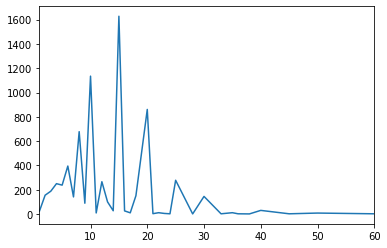
折线图 plot()
#绘制折线图,plot()df.salary.value_counts().sort_index().plot()
out:
柱形图 bar()
#绘制柱形图,bar()df.salary.value_counts().sort_index().plot.bar(figsize=(15,8))
out: 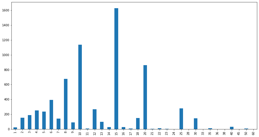
堆积柱状图 bar(stacked=True)
#堆积柱形图,bar(stacked=True)df.pivot_table(index='city',columns='education',values='salary',aggfunc='count').plot.bar(stacked=True)#没汉字的字体,图中的标签会显示为“日”。
out: 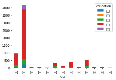
条形图(柱状图横过来)barh
#条形图(水平柱状图),barh()df.pivot_table(index='city',columns='education',values='salary',aggfunc='count').plot.barh(stacked=True)
out: 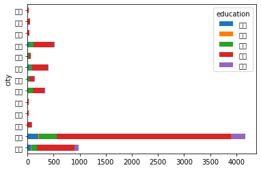

若有收获,就点个赞吧
0 人点赞
