盒子模型
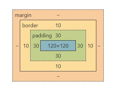
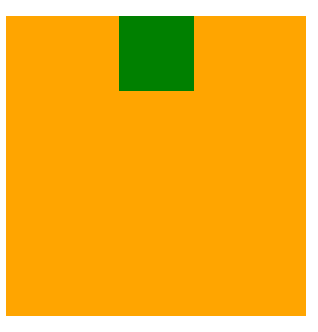
盒子模型 box model盒子=容器1、宽高所划分的区域2、边框3 内边距4 外边距<style>/* .outer-box可视区域200+50+50+10+10=320width+padding+border*/.outer-box {width: 200px;height: 200px;border: 10px solid green ;padding: 50px;margin: 50px;}.outer-box .inner-box {width: 100px;height: 100px;background-color: orange;}</style><div class="outer-box"><div class="inner-box"></div></div>
居中
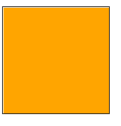
方案1
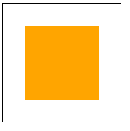
<style>.box {width: 100px;height: 100px;border: 1px solid #000;}.box .box1{width: 100px;height: 100px;background-color: orange;}</style><div class="box"><div class="box1"></div></div>
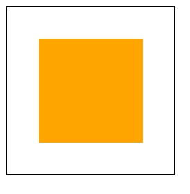
子元素与父元素大小一致,父元素设置padding扩大可视区域
<style>.box {width: 100px;height: 100px;padding: 30px;border: 1px solid #000;}.box .box1{width: 100px;height: 100px;background-color: orange;}</style><div class="box"><div class="box1"></div></div>
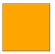
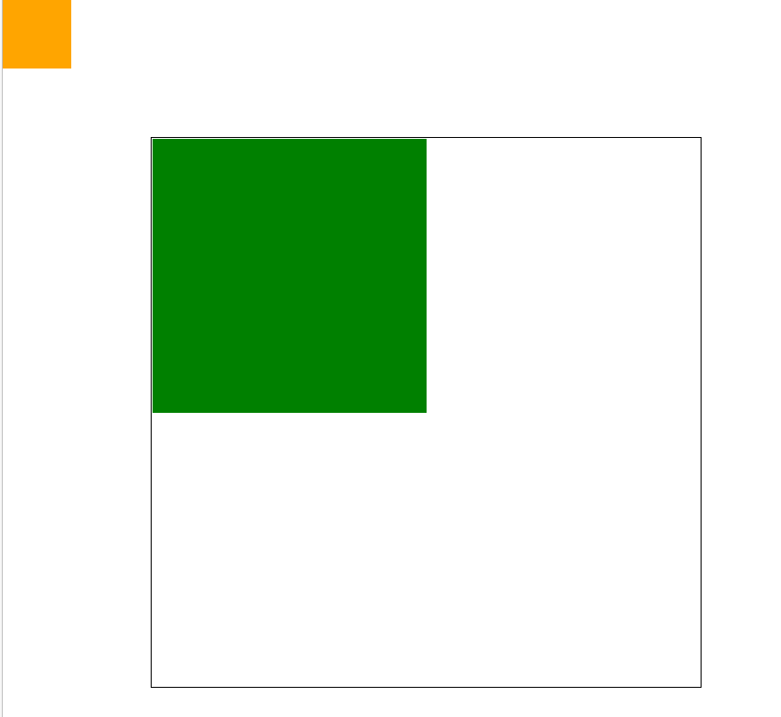
方案2
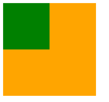
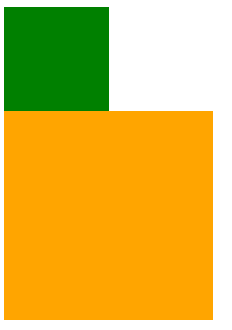
<style>.box {width: 100px;height: 100px;border: 1px solid #000;}.box .box1{width: 100%;height: 100%;background-color: orange;}</style><div class="box"><div class="box1"></div></div>
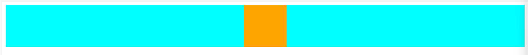
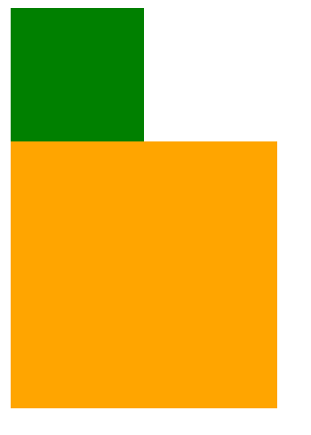
<style>.box {width: 100px;height: 100px;border: 1px solid #000;padding: 30px;/* overflow: hidden; */}.box .box1{width: 100%;height: 100%;background-color:aqua;}.box .box2{width: 100%;height: 100%;background-color:aliceblue;}</style><div class="box"><div class="box1"></div><div class="box2"></div></div>
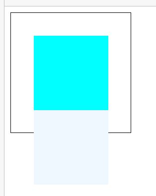
子元素100%会占满父元素的width、height
<style>.box {width: 100px;height: 100px;padding: 30px;border: 1px solid #000;}.box .box1{width: 100%;height: 100%;background-color: orange;}</style><div class="box"><div class="box1"></div></div>
方案3
<style>.box {width: 200px;height: 200px;padding: 30px;border: 10px solid #000;box-sizing: border-box;-moz-box-sizing: border-box;/* firefox */-webkit-box-sizing: border-box;/* chrome safari*/-ms-box-sizing: border-box;/* IE8以下 */}.box .box1{width: 100%;height: 100%;background-color: orange;}</style><div class="box"><div class="box1"></div></div>
box-sizing: border-box;把pading、border算到width,width=元素大小+padding +border
元素内容大小随着width-减去-padding-border,自动计算计算大小
cntent-box 元素内容大小就是width大小,padding、border再叠加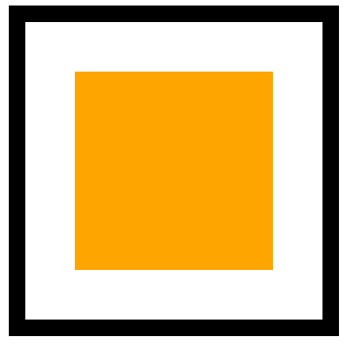
-moz-box-sizing: border-box;/* firefox */-webkit-box-sizing: border-box;/* chrome safari*/-ms-box-sizing: border-box;/* IE8以下 */
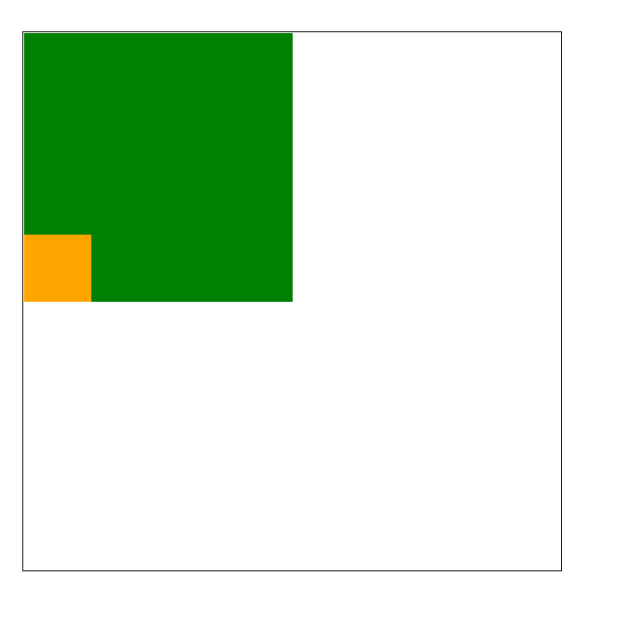
方案4
<style>div{/* div都写成这样,以后就不用动了,也好计算宽度 */box-sizing: border-box;-moz-box-sizing: border-box;/* firefox */-webkit-box-sizing: border-box;/* chrome safari*/-ms-box-sizing: border-box;/* IE8以下 */-moz-box-sizing: border-box;/* presto opera */}.box {width: 200px;height: 200px;padding: 30px;border: 10px solid #000;/* 内容,就解开上面设置的div的样式,回归正常盒子模型了content-box是以盒子的内容固定盒子尺寸,border、padding都是盒子内容,把这些都算到盒子的尺寸内部,所以盒子尺寸=width+padding+border所以盒子就扩大,border-box是以边界为基准固定盒子的尺寸,盒子尺寸=width=盒子内容+padding+border*//* box-sizing: content-box; */}.box .box1 {width: 100%;height: 100%;background-color: orange;}</style><div class="box"><div class="box1"></div></div>
<style>ul,li,div {/* div都写成这样,以后就不用动了,也好计算宽度 */box-sizing: border-box;-moz-box-sizing: border-box;/* firefox */-webkit-box-sizing: border-box;/* chrome safari*/-ms-box-sizing: border-box;/* IE8以下 */-moz-box-sizing: border-box;/* presto opera */}/* 想要修改,想能不能写个类出来,或能不能标签初始化,这样才能复用高 */.content-box {box-sizing: content-box;-moz-box-sizing: content-box;/* firefox */-webkit-box-sizing: content-box;/* chrome safari*/-ms-box-sizing: content-box;/* IE8以下 */-moz-box-sizing: content-box;/* presto opera */}/**padding: 30px 20px 10px 5px* 上 下 左 右*padding: 30px 20px 10px* 上 左右 下*padding 20px 10px* 上下 左右*padding 30px* 上下左右*/.box {width: 200px;height: 200px;padding: 30px;border: 10px solid #000;/* 内容,就解开上面设置的div的样式,回归正常盒子模型了content-box是以盒子的内容固定盒子尺寸,border、padding都是盒子内容,把这些都算到盒子的尺寸内部,所以盒子尺寸=width+padding+border所以盒子就扩大,border-box是以边界为基准固定盒子的尺寸,盒子尺寸=width=盒子内容+padding+border*//* box-sizing: content-box; */}.box .box1 {width: 100%;height: 100%;background-color: orange;}</style><div class="box content-box"><div class="box1"></div></div>
margin
<style>.text1{margin-right: 30px;}.text2{margin-left: 30px;}</style><span class="text1">123</span><span class="text2">234</span>
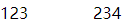
60px=30+30
居中
在html中margin居中
<style>.box{width: 100px;height: 100px;background-color: orange;margin:0 auto;/*左右为自动,居中*/}</style><div class="box"></div>
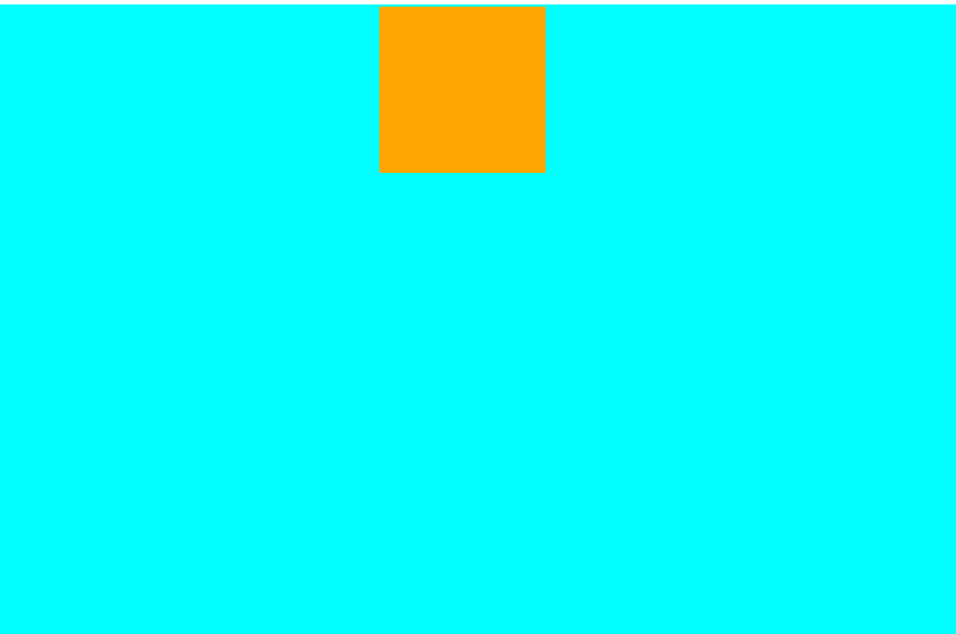
<style>.box{width: 200px;height: 200px;background-color: orange;}.box1{width: 50px;height: 50px;background-color: green;margin: 0 auto;margin-top: 100px;/* margin-top塌陷,margin塌陷 */}</style><div class="box"><div class="box1"></div></div>
<style>.bigbox{width: 100%;height: 100%;background-color: aqua;}.box{width: 100px;height: 100px;background-color: orange;margin:auto auto;/*左右为自动,居中第一个在html中为auto也不会在html中居中,height100%并不会执行,真的占满html的100%,但父子元素可以执行*/}</style><div class="bigbox"><div class="box"></div></div>
<style>.bigbox{width: 100%;height: 800px;background-color: aqua;border-top: 1px solid transparent;}.box{width: 100px;height: 100px;background-color: orange;margin:auto auto;/*左右为自动,居中*/}</style><div class="bigbox"><div class="box"></div></div>
body margin 默认边距
<style>.header{width: 100%;height: 60px;background-color: #000;}</style><div class="header"></div>
这空隙是什么?
<style>body{padding: 0;margin: 0;/*是body的margin属性的默认值,与padding无关*/}html{padding: 0;margin: 0;/* 都不是 */}.header{width: 100%;height: 60px;background-color: #000;}</style><div class="header"></div>
没有空隙了,当body margin为0时没有空隙,其它的依次试验,都有空隙,对照实验,控制变量法。
body的默认样式,与h1的默认样式同理,都有默认样式
不同浏览器不一样:
ie8 上下16 左右8
ie7 上下16 左右11
定位
<style>.box1{width: 100px;height: 100px;background-color: green;}.box2{width: 200px;height: 200px;background-color: orange;}</style><div class="box1"></div><div class="box2"></div>
<style>.box1 {position: absolute;width: 100px;height: 100px;background-color: green;}.box2 {width: 200px;height: 200px;background-color: orange;}</style><!-- 绝对定位 --><!-- position: absolute; --><!-- left/right top/bottom 只有定位元素才有,left right只能取其一--><div class="box1"></div><div class="box2"></div>
定位新开了一个层,定位元素在新开的层上面,相当于新开图层,像ps新建图层,ps新建图层拖动它
他本来像上上面的图一样,如果加定位,就不在以前的图层上了,就不在以前的位置上了,在别的图层上面。未被定位的元素就会把定位了的元素的位置占了
脱离文档流
相对定位
<style>.box1 {position: relative;width: 100px;height: 100px;background-color: green;}.box2{width: 200px;height: 200px;background-color: orange;}</style><div class="box1"></div><div class="box2"></div>
<style>.box1 {position: relative;top: 10px;left: 20px;width: 100px;height: 100px;background-color: green;}.box2 {width: 200px;height: 200px;background-color: orange;}</style><div class="box1"></div><div class="box2"></div>
也会开新的图层,但是之前的位置在老图层依然保留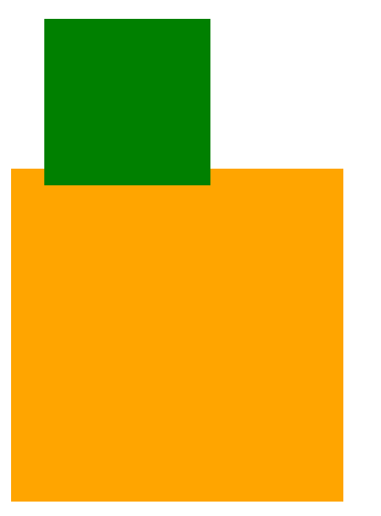
定位综合
<style>.box1 {width: 400px;height: 400px;margin: 100px 0 0 100px;border: 1px solid #000;}.box1 .box2{width: 200px;height: 200px;background-color: green;}.box1 .box2 .box3{position: absolute;top: 0;left: 0;width: 50px;height: 50px;background-color: orange;}</style><div class="box1"><div class="box2"><div class="box3"></div></div></div>
box3定位了,当没有其它元素也是定位元素时,会相对于整个html文档去定位
定位元素都会相对于什么什么去定位
<style>.box1 {position: relative;/* position: absolute; *//* absolute relative都可以达到效果 */width: 400px;height: 400px;margin: 100px 0 0 100px;border: 1px solid #000;}.box1 .box2{width: 200px;height: 200px;background-color: green;}.box1 .box2 .box3{position: absolute;bottom: 0;left: 0;width: 50px;height: 50px;background-color: orange;}</style><div class="box1"><div class="box2"><div class="box3"></div></div></div>
box1绝对定位,找box2,没有定位元素,box2不是定位元素,找box1,box1是定位元素,有position属性就是定位元素,是定位元素,是相对于定位元素的相对
相对元素是相对于定位元素,或者默认相对于html元素
找相对的的那个元素是向上找,找父级,找到的第一个,之后的就不找了,一直找到html
总结:相对于最近的、有定位的父元素绝对定位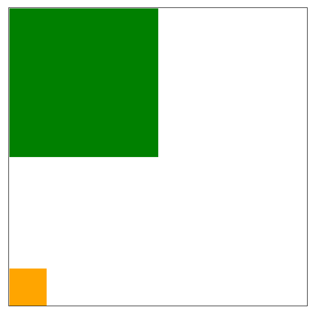
相对定位是相对于之前的自己的位置,发生的改变
相对它本身定位的
absolute相对于第一个父级定位元素去定位,不管是absolute,还是relative都可以
定位就是去top、left、right、button等
<style>.box1 {position: relative;/* position: absolute; *//* absolute relative都可以达到效果 */width: 400px;height: 400px;margin: 100px 0 0 100px;border: 1px solid #000;}.box1 .box2{position: absolute;width: 200px;height: 200px;background-color: green;}.box1 .box2 .box3{position: absolute;bottom: 0;left: 0;width: 50px;height: 50px;background-color: orange;}</style><div class="box1"><div class="box2"><div class="box3"></div></div></div>
<style>.box1 {position: relative;/* position: absolute; *//* absolute relative都可以达到效果 */top: 30px;right: 20px;/*right 不可以,left top可以*/width: 400px;height: 400px;margin: 100px 0 0 100px;border: 1px solid #000;}</style><div class="box1"><div class="box2"><div class="box3"></div></div></div>
<style>.box1 {/* position: relative; *//* position: absolute; *//* absolute relative都可以达到效果 */width: 400px;height: 400px;margin: 100px 0 0 100px;border: 1px solid #000;}.box1 .box2 {width: 200px;height: 200px;background-color: green;}.box1 .box2 .box3 {position: relative;top: -30px;bottom: 30px;left: 30px;right: 30px;/* bottom right没有用值可以设置为负值*/width: 50px;height: 50px;background-color: orange;}</style><div class="box1"><div class="box2"><div class="box3"></div></div></div>
总结
/* top: 30px;left: 30px; */bottom: 30px;right: 30px;
在relative定位中上面这两个效果一样,bottom:30变成了top:30的效果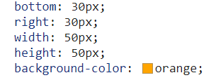
absolute有4个方位:top、bottom、right、left
不占有文档流
relative只有2个方位:top、left
根据元素之前的位置去定位,占据文档流空间,但只是之前的位置占有,定位之后的元素不占有

若有收获,就点个赞吧
0 人点赞
