01-CSS基础练习:JD首页的制作(顶部和底部)
前言
京东是典型的电商类网站,学习这个网站的制作比较有价值。我们准备用WebStorm进行开发。
京东首页的截图为:http://img.smyhvae.com/20180119_1653.jpg
页面规划:新建一个空的工程
我们首先新建一个空的工程:
CSS初始化(基本样式)
京东网站有一些基本样式,在各个页面中都要用到:(将这些基本样式copy到css.base里面去)
base.css中的公共的部分:
@charset "UTF-8";/*css 初始化 */html, body, ul, li, ol, dl, dd, dt, p, h1, h2, h3, h4, h5, h6, form, fieldset, legend, img { margin:0; padding:0; }fieldset, img,input,button { border:none; padding:0;margin:0;outline-style:none; } /*去掉边框、去掉轮廓(比如输入框外面的蓝边框)*//*去掉列表前面的圆点*/ul, ol {list-style: none;}input { padding-top:0; padding-bottom:0; font-family: "SimSun","宋体";} /*字体一般是指定这两个*/select, input { vertical-align:middle;}select, input, textarea { font-size:12px; margin:0; }textarea { resize:none; } /*禁止文本输入框在右下角拖拽(因为拖动后会调整输入框大小)*/img {border:0; vertical-align:middle; } /* 去掉图片底侧默认的3像素空白缝隙*/table { border-collapse:collapse; }body {font:12px/150% Arial,Verdana,"\5b8b\4f53"; /*\5b8b\4f53指的是宋体*/color:#666;background:#fff}/*start:清除浮动【推荐此方式进行清除浮动】。左浮动和右浮动都清除了,盒子刚好达到闭合的状态*/.clearfix:before, .clearfix:after {content: "";display: table;}.clearfix:after {clear: both;}.clearfix {*zoom: 1; /*IE/7/6*/}/*end:清除浮动*/a {color:#666; text-decoration:none; } /*去掉超链接的下划线*/a:hover{color:#C81623;} /*鼠标悬停时的颜色*/h1,h2,h3,h4,h5,h6 {text-decoration:none;font-weight:normal;font-size:100%;} /*font-size:100% 的意思是:让它们和父亲一样大,避免在不同的浏览器中显示大小不一致*/s,i,em{font-style:normal;text-decoration:none;} /*去掉i标签和em的斜体,取消s标签的删除线*/.col-red{color: #C81623!important;}/*公共类*/.w { /*版心(可视区)。需要专门提取出来 */width: 1210px;margin: 0 auto;}.fl {float: left}.fr {float: right}.al {text-align: left}.ac {text-align: center}.ar {text-align: right}.hide {display: none}
上方代码解释:
(1)清除浮动的方式:
.clearfix:before, .clearfix:after {content: "";display: table;}.clearfix:after {clear: both;}.clearfix {*zoom: 1; /*IE/7/6*/}
这是如今比较流行的清除浮动的方式。比如小米官网就是采用的这种。
(2)其他属性:
我们给fieldset, img,input,button等标签设置了outline-style:none,意思去掉轮廓(比如去掉输入框外面的蓝边框,去掉之后,蓝色没有了,但是黑色依然存在)。去掉的原因是:首先,轮廓不好看;其次,在google浏览器和在火狐浏览器上,渲染的效果不同。
img标签中,我们通过vertical-align:middle属性去掉图片底侧默认的3像素空白缝隙,还有一种方法可以达到效果,那就是display: block。
给h1,h2,h3,h4,h5,h6设置font-size:100%是因为:h标签在每个浏览器中显示的大小不一致,设置此属性则表示,让它们都和父亲一样大。
(3)一些小标记
s是删除线,i和em是斜体。我们经常用它们做一些小装饰、小图标。
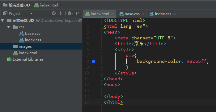
引入css文件
base.css初始化之后,我们需要在html文件中引入它。引入外部样式表的方式如下:(stylesheet指样式表)
<link rel="stylesheet" href="css/base.css">
效果如下:

注意,base.css和index.css的书写顺序不能颠倒,因为是按照书写顺序,从上往下进行加载的。
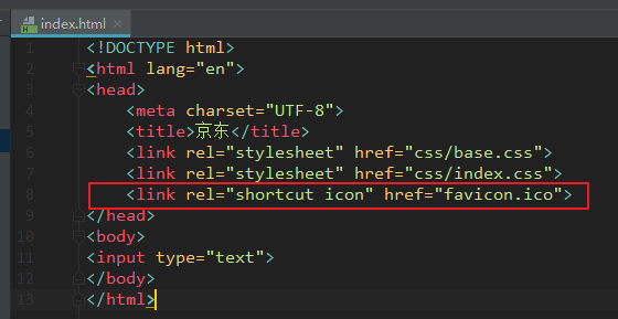
Favicon 小图标
Favicon 图标指的是箭头处这个小图标:

官网链接https://www.jx.com/favicon.ico可以下载这个小图标。
我们把favicon.ico图片放到工程文件的根目录,通过下面这种方式进行加载:
<link rel="shortcut icon" href="favicon.ico">
注意,shortcut icon是Favicon的专有名词,不能改成别的单词。
代码位置:
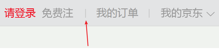
顶部导航的制作
我们先制作下面这个部分,它位于网站的最顶部:

顶部导航栏的html结构如下:(直接放在body标签下)
<!--顶部导航start--><div class="shortcut"><!--版心--><div class="w"><!--左浮动区域--><div class="fl"><div class="dt"> 送至:北京<i><s>◇</s></i></div></div><!--右浮动区域--><div class="fr"><ul><li><a href="#">你好,请登录</a> <a href="#" class="col-red">免费注册</a></li><li class="line"></li><li>我的订单</li><li class="line"></li><li class="fore">我的京东<i><s>◇</s></i></li><li class="line"></li><li>京东会员</li><li class="line"></li><li>企业采购</li><li class="line"></li><li class="fore tel-jd"><em class="tel"></em> <!--小手机图标-->手机京东<i><s>◇</s></i></li><li class="line"></li><li class="fore">关注京东<i><s>◇</s></i></li><li class="line"></li><li class="fore">客户服务<i><s>◇</s></i></li><li class="line"></li><li class="fore">网站导航<i><s>◇</s></i></li></ul></div></div></div><!--顶部导航end-->
顶部导航栏需要加入的css样式如下:(放到base.css中)
/*顶部导航start*/.shortcut {height: 30px;line-height: 30px;background-color: #f1f1f1;}.dt,.shortcut .fore {padding: 0 20px 0 10px;position: relative;}.dt i,.fore i {font: 400 15px/15px "宋体";position: absolute;top: 13px;right: 3px;height: 7px;overflow: hidden;width: 15px;}.dt s,.fore s {position: absolute;top: -8px;left: 0;}.fr li {float: left;padding: 0 10px;}.fr .line {width: 1px;height: 12px;background-color: #ddd;margin-top: 9px;padding: 0;}.shortcut .tel-jd {padding: 0 20px 0 25px;}.tel {position: absolute;width: 15px;height: 20px;background: url(../images/sprite.png) no-repeat;left: 5px;top: 5px;}/*顶部导航end*/
css代码解释:
(1)整个的顶部导航栏是一个shortcut:
.shortcut {height: 30px;line-height: 30px;background-color: #f1f1f1;}
然后将左侧的文字设置为左浮动,右侧的文字设置为右浮动。
(2)完成左侧部分的文字。
(3)右侧部分文字的结构:ul中放了九个li,用来存放文字。代码快捷键是ul>li*9(符号>是包含的关系)。
需要注意的是,“登录”和“注册”是同一个
- 里面的两个<a>。它们是一个整体,所以要放到同一个li里。
(4)文字中间的间隔线:
上图所示,我们发现,每个li之间都有1像素宽、12像素高的间隔线,这个也是用li做的。
(5)增加文字右侧的小三角。
(6)在手机京东这个li中增加手机小图标,这里用到了css精灵图。
京东顶部导航条的工程文件如下:
http://download.csdn.net/download/smyhvae/10214943
顶部banner图
接下来我们只做顶部的banner图,效果如下:

也就是上图中“1元抢宝”的那个位置。
涉及到的html代码如下:
<!--京东的topbanner部分--><div class="topbanner"><div class="w tb"><img src="images/topbanner.jpg" alt=""/><a href="javascript:;" class="close-banner"></a></div></div><!--京东的topbanner部分 end-->
在base.css中涉及到的css代码如下:
/*topbanner start*/.topbanner {background-color: #8A25C6;}.close-banner {position: absolute;right:0;top:5px;width: 19px;height: 19px;background: url(../images/close.png) no-repeat;}.close-banner:hover {background-position:bottom;}.tp{position: relative;}/*topbanner end*/
代码解释:
重点是close-banner这个class,也就是右上角的那个X。这里用到了子绝父相,注意,设置相对定位的父亲是tb这个class,因为要考虑到网页缩放的情况。
.close-banner:hover这个属性里,我们设置的背景图的定位是bottom,意思是,保证精灵图和父亲的底边贴齐,就不用使用像素的方式对精灵兔图进行定位了。
搜索框
搜索框的UI如下:

上图中,包含了四个部分:
左侧的logo
中间的搜索框
右侧的购物车
热搜文字(中间搜索框的下方)
我们在WebStorm中输入.search-logo+.search-input+.search-car+.search-moreA,然后按tab键,就可以补齐代码:
<div class="search-logo"></div><div class="search-input"></div><div class="search-car"></div><div class="search-moreA"></div>
相关的html代码如下:
<!--search部分start--><div class="serach"><div class="w clearfix"><div class="search-logo"><a href="http://www.jx.com" title="京西" target="_blank">京东官网</a></div><div class="search-input"><!--placeholder="运动相机"--><input type="text" value="运动相机"/><button>搜索</button></div><div class="search-car"><a href="#">我的购物车</a><i class="icon1"></i><i class="icon2">></i><i class="icon3">8</i></div><div class="search-moreAlink"><a href="#" class="col-red">出境999</a><a href="#">沸腾厨卫</a><a href="#">249减100</a><a href="#">手机节</a><a href="#">每150减50</a><a href="#">男靴</a><a href="#">巧克力</a><a href="#">cool1手机</a><a href="#">男士卫衣</a></div></div></div><!--search部分end-->
相关的css代码如下:
/*search部分start*/.search-logo {float: left;width: 362px;height: 60px;padding: 20px 0;}.search-logo a {width: 270px;height: 60px;display: block;text-indent: -9999px;background: url(../images/logo.png) no-repeat;}.search-input {float: left;height: 36px;padding-top: 25px;}.search-input input {float: left;width: 450px;height: 32px;padding-left: 4px;font: 400 14px/32px "microsoft yahei";color: rgb(153, 153, 153);border: 2px solid #B61D1D;border-right: 0;}.search-input button {width: 82px;height: 36px;color: #fff;float: left;font: 400 16px/36px "微软雅黑";background-color: #B61D1D;cursor: pointer;/*cursor: pointer; 变成小手*//*cursor: text; 变成光标*//*cursor: move; 变成四角箭头*//*cursor: default; 变成小白*/}.search-car {float: right;width: 96px;height: 34px;line-height: 34px;padding-left: 43px;position: relative;margin: 25px 65px 0 0;border: 1px solid #DFDFDF;background-color: #F9F9F9;}.icon1 {position: absolute;top: 9px;left: 18px;width: 18px;height: 16px;background: url(../images/tel.png) no-repeat 0 -58px;}.icon2 {position: absolute;right: 10px;color: #999;/*font-family: "SimSun";*/font: 13px/34px "SimSun";}.icon3 {position: absolute;top: -5px;/*left: 0;*/width: 16px;height: 14px;background-color: #C81623;line-height: 14px;text-align: center;color: #fff;border-radius: 7px 7px 7px 0; /*画圆角矩形*/}.search-moreAlink {float: left;width: 530px;height: 28px;line-height: 28px;}.search-moreAlink a {margin-right: 8px;}/*search部分end*/
对于这四个部分,我们依次来讲解。
1、左侧的logo
为了便于SEO,需要给图片这个超链接加上文字,然后设置文字的缩进为text-indent: -9999px;。
2、搜索栏
“搜索”按钮:当我们把鼠标放在“搜索”上的时候, 发现鼠标变成了小手,这里是用到了cursor属性。
cursor有如下属性值:
cursor: pointer; /*变成小手*/cursor: text; /*变成光标*/cursor: move; /*变成四角箭头*/cursor: default; /*变成默认的箭头*/
3、购物车
购物车里包含了四个元素:一个文字,三个图标。
为了让文字“我的购物车”这个<a>上下方向居中,我们给<a>标签的行高line-height为父亲的高度。
另外,“我的购物车”这四个字并不是水平居中的,于是,我们可以给它一个左侧的padding,而不用给右侧padding。
另外三个小图标可以用绝对定位来做。
右上角的小图标(圆角矩形):它的红色背景不是图片,而是用border-radius属性画的圆角矩形。
圆角矩形border-radius有下面几种画法:
border-radius: 宽/高一半;border-radius: 50%;border-radius: 0.3em;border-radius: 左上角 右上角 右下角 左下角;
搜索框下方的热搜文字
热搜文字的功能性并不强,仅仅使用几个超链接<a>标签即可(每个 a 之间用margin隔开)。不需要像别的导航栏那样,在ul里放li,在li里放a。
注意,每个 a 之间是用margin隔开,不是用padding隔开;否则的话,鼠标点击中间的空白处也会出现跳转。
顶部导航条+顶部banner+搜索框的工程文件如下:
http://download.csdn.net/download/smyhvae/10218022
slogen:口号
要求实现的效果如下:

上图可以看到,这里要实现的效果是:无论浏览器如何移动,要保证第二个slogen的左侧位于浏览器的正中间。这是可以用到绝对定位的知识。
html的代码如下:
<!--底部的口号 start--><div class="slogen"><span class="item slogen1"><img src="images/slogen1.png" alt=""/></span><span class="item slogen2"><img src="images/slogen2.png" alt=""/></span><span class="item slogen3"><img src="images/slogen3.png" alt=""/></span><span class="item slogen4"><img src="images/slogen4.png" alt=""/></span></div><!--底部的口号 end-->
class=slogen指的是整个slogen区域。item表示四个口号中相同的部分。
css的代码如下;
/*底部的口号 start*/.slogen {height: 54px;padding: 20px 0;background-color: #f5f5f5;position: relative;margin-bottom: 15px;}.item {width: 302px;position: absolute;top: 20px;left: 50%;}.slogen1 {margin-left: -608px;}.slogen2 {margin-left: -304px;}.slogen3 {margin-left: 2px;}.slogen4 {margin-left: 304px;}/*底部的口号 end*/
我们给item设置left: 50%;,确保每个item移到了父亲的正中间。然后每个item各自移动相应的距离即可实现。
最下方的购物指南&区域覆盖
需要实现的效果如下:
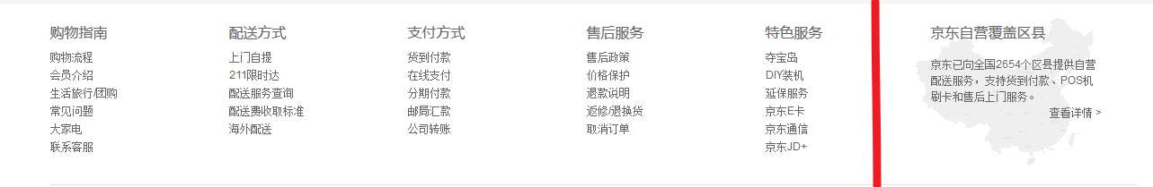
上图中,需要实现的内容包括两个部分:左侧的购物指南和右侧的区域覆盖(我把这两个部分用红线隔开了)。
购物指南
需要使用的布局如下:

这里的重点是要量出dt和dd的行高。
html代码如下:
<!--购物指南等 start--><div class="w footer-shopping clearfix"><dl><dt>购物指南</dt><dd><a href="#">购物流程</a></dd><dd><a href="#">会员介绍</a></dd><dd><a href="#">生活旅行/团购</a></dd><dd><a href="#">常见问题</a></dd><dd><a href="#">大家电</a></dd><dd><a href="#">联系客服</a></dd></dl><dl><dt>配送方式</dt><dd><a href="#">上门自提</a></dd><dd><a href="#">211限时达</a></dd><dd><a href="#">配送服务查询</a></dd><dd><a href="#">配送费收取标准</a></dd><dd><a href="#">海外配送</a></dd></dl><dl><dt>购物指南</dt><dd><a href="#">购物流程</a></dd><dd><a href="#">会员介绍</a></dd><dd><a href="#">生活旅行/团购</a></dd><dd><a href="#">常见问题</a></dd><dd><a href="#">大家电</a></dd><dd><a href="#">联系客服</a></dd></dl><dl><dt>购物指南</dt><dd><a href="#">购物流程</a></dd><dd><a href="#">会员介绍</a></dd><dd><a href="#">生活旅行/团购</a></dd><dd><a href="#">常见问题</a></dd><dd><a href="#">大家电</a></dd><dd><a href="#">联系客服</a></dd></dl><dl class="last-dl"><dt>购物指南</dt><dd><a href="#">购物流程</a></dd><dd><a href="#">会员介绍</a></dd><dd><a href="#">生活旅行/团购</a></dd><dd><a href="#">常见问题</a></dd><dd><a href="#">大家电</a></dd><dd><a href="#">联系客服</a></dd></dl></div><!--购物指南等 end-->
因为这片区域是浮动的,我们要通过clearfix这个class清除浮动,防止其被覆盖。
css代码如下:
/*购物指南等 start*/.footer-shopping {margin-top: 16px; /*和上方保持距离*/}.footer-shopping dl{float: left;width: 200px;}dl.last-dl {width: 100px;}.footer-shopping dt{height: 34px;font: 400 16px/34px "microsoft yahei";}.footer-shopping dd{line-height: 20px;}/*购物指南等 end*/
区域覆盖
html代码如下:
<div class="coverage"><h3>京东自营覆盖区县</h3><p>京东已向全国2654个区县提供自营配送服务,支持货到付款、POS机刷卡和售后上门服务。</p><a href="#">查看详情 ></a></div>
css代码如下:
/*覆盖区域 start*/.coverage {float: left;width: 186px;height: 169px;margin-right: 60px;padding-left: 17px;background: url(../images/china.png) no-repeat left bottom;}.coverage h3 {height: 34px;font: 400 16px/34px "microsoft yahei";}.coverage p {padding-top: 8px;}.coverage a {float: right;}/*覆盖区域 end*/
注意这里将精灵图设置为背景时,用到的定位属性是left bottom,意思是保证精灵图的左侧跟父亲左侧贴齐,下方和父亲下方贴齐。这样做的话,就不用通过像素来进行定位了。
最底部
最底部的效果如下:
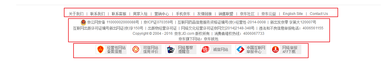
如上图所示,它包含了三个部分。
涉及到的html代码如下:
<!--最底部 start--><div class="w footer-bottom"><div class="footer-about"><a href="#">关于我们</a>|<a href="#">联系我们</a>|<a href="#">联系客服</a>|<a href="#">商家入驻</a>|<a href="#">营销中心</a>|<a href="#">手机京东</a>|<a href="#">友情链接</a>|<a href="#">销售联盟</a>|<a href="#">京东社区</a>|<a href="#">京东公益</a>|<a href="#">English Site</a>|<a href="#">Contact Us</a></div><div class="footer-copyright"><img src="images/guohui.png"/>京公网安备 11000002000088号 | 京ICP证070359号 | 互联网药品信息服务资格证编号(京)-经营性-2014-0008 | 新出发京零 字第大120007号<br>互联网出版许可证编号新出网证(京)字150号 | 出版物经营许可证 | 网络文化经营许可证京网文[2014]2148-348号 | 违法和不良信息举报电话:4006561155<br>Copyright © 2004 - 2016 JX.com 版权所有 | 消费者维权热线:4006067733<br>京东旗下网站:京东钱包</div><div class="footer-bottom-img"><a href="#"><img src="images/img1.jpg"/></a><a href="#"><img src="images/img1.jpg"/></a><a href="#"><img src="images/img1.jpg"/></a><a href="#"><img src="images/img1.jpg"/></a><a href="#"><img src="images/img1.jpg"/></a><a href="#"><img src="images/img1.jpg"/></a></div></div><!--最底部 end-->
涉及到的css代码如下:
/*最底部start*/.footer-bottom {margin-top: 20px;text-align: center; /*让文字在容器中水平方向居中*/padding: 20px 0 30px;border-top: 1px solid #E5E5E5;}.footer-bottom .footer-about a{margin: 0 10px;}.footer-copyright {padding: 10px 0;}.footer-bottom-img a {margin: 0 5px;}/*最底部end*/
你去京东官网看看,发现最最底部的文字竟然是图片:

总结
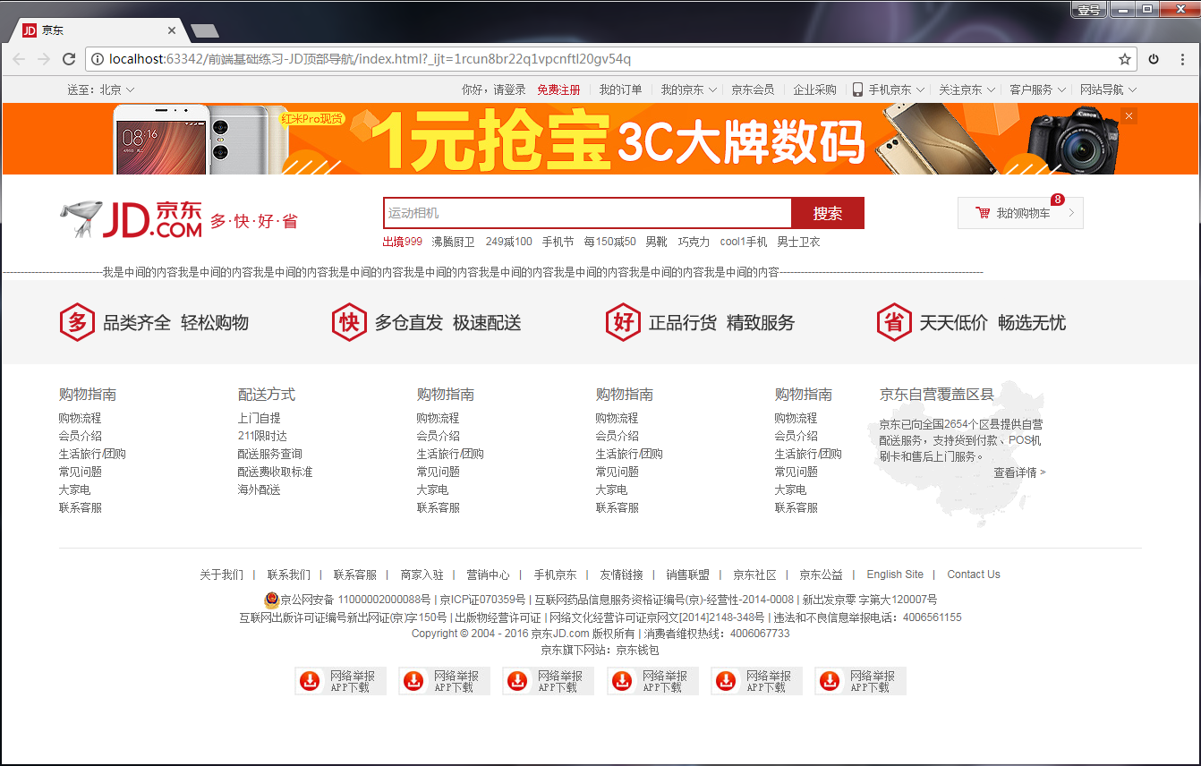
以上全部内容,最终实现的效果如下:
对应的工程文件如下:

若有收获,就点个赞吧
0 人点赞
