电子书地址:https://github.com/rougier/scientific-visualization-book
一本科学详解matplotlib的可视化书籍
目录

anatomy of figure

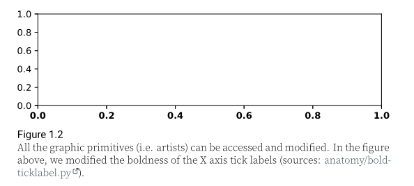
如上图所示,matplotlib图形由多个元素的层次结构组成,这些元素组合在一起形成实际图形,了解图形的不同元素很重要。
元素
Figure
figure最重要的元素是figure本身。它是在调用figure方法时创建的,我们已经看到您可以指定其大小,也可以指定背景色(facecolor)和标题(suptitle)。重要的是要知道,在保存figure时不会使用背景色,因为savefig函数还有一个facecolor参数(默认为白色),该参数将覆盖figure的背景色。如果不需要任何背景,可以在保存figure时指定transparent=True。
Axes
Axes是第二个最重要的元素,对应数据实际的呈现区域。它也被称为subplot。每个图形可以有一到多个轴,每个轴通常由称为spines的四条边(左、上、右和下)包围。这些spines中的每一根都可以用major ticks和minor ticks(分别指向内部或外部)、tick labels和label来装饰。
Axis
这些装饰过的spines被称为轴(axis)。水平方向是X轴,垂直方向是Y轴。每一个都由spine、major ticks和minor ticks、主刻度标签和次刻度标签以及轴标签组成。
Spines
spines是连接轴刻度线并标注数据区域边界的线。它们可以放置在任意位置,可以是可见的,也可以是不可见的。
Artist
图形上的一切,包括图形、轴和轴对象,都是artist。包括文字对象、Line2D对象、集合对象、面片对象。渲染人物时,所有artist都被绘制到画布上。给定的artist只能在一个轴上。
渲染
作者对matplotlib的渲染也给出了详细的设置方式
import matplotlibmatplotlib.use("xxx")


维度和分辨率
fig = plt.figure(figsize=(6,6))plt.savefig("output.png")
matplotlib的默认dpi为100,该尺寸对应于6英寸乘以6英寸的分辨率。对于一篇 scientific article,出版商通常会要求figures dpi在300到600之间。为了让dpi设置变得正确,我们需要知道在文档中插入图形的物理尺寸是多少。

作者提供了一个更具体的例子,让我们考虑一下这本书的格式是A5(148×210毫米)。左右边距各为20毫米,图像通常使用全文宽度显示。这意味着图像的物理宽度正好为108毫米,或大约为4.25英寸。如果我们使用推荐的600 dpi,我们最终会得到2550 pixels的宽度,这可能超出屏幕分辨率,因此不太方便。相反,当我们在屏幕上显示图形时,我们可以使用默认的 matplotlib dpi(100),只有在保存图形时,我们才使用不同且更高的dpi:
def figure(dpi):fig = plt.figure(figsize=(4.25,.2))ax = plt.subplot(1,1,1)text = "Text rendered at 10pt using %d dpi" % dpiax.text(0.5, 0.5, text, ha="center", va="center",fontname="Source Serif Pro",fontsize=10, fontweight="light")plt.savefig("figure-dpi-%03d.png" % dpi, dpi=dpi)figure(50), figure(100), figure(300), figure(600)

作者提供了许多有用的科研作图练习
import numpy as npimport matplotlib as mplimport matplotlib.pyplot as pltdef curve():n = np.random.randint(1,5)centers = np.random.normal(0.0,1.0,n)widths = np.random.uniform(5.0,50.0,n)widths = 10*widths/widths.sum()scales = np.random.uniform(0.1,1.0,n)scales /= scales.sum()X = np.zeros(500)x = np.linspace(-3,3,len(X))for center, width, scale in zip(centers, widths, scales):X = X + scale*np.exp(- (x-center)*(x-center)*width)return Xnp.random.seed(123)cmap = mpl.cm.get_cmap("Spectral")fig = plt.figure(figsize=(8, 8))ax = Nonefor n in range(3):ax = plt.subplot(1, 3, n + 1, frameon=False, sharex=ax)for i in range(50):Y = curve()X = np.linspace(-3, 3, len(Y))ax.plot(X, 3 * Y + i, color="k", linewidth=0.75, zorder=100 - i)color = cmap(i / 50)ax.fill_between(X, 3 * Y + i, i, color=color, zorder=100 - i)# Some random text on the right of the curvev = np.random.uniform(0, 1)if v < 0.4:text = "*"if v < 0.05:text = "***"elif v < 0.2:text = "**"ax.text(3.0,i,text,ha="right",va="baseline",size=8,transform=ax.transData,zorder=300,)ax.yaxis.set_tick_params(tick1On=False)ax.set_xlim(-3, 3)ax.set_ylim(-1, 53)ax.axvline(0.0, ls="--", lw=0.75, color="black", zorder=250)ax.text(0.0,1.0,"Value %d" % (n + 1),ha="left",va="top",weight="bold",transform=ax.transAxes,)if n == 0:ax.yaxis.set_tick_params(labelleft=True)ax.set_yticks(np.arange(50))ax.set_yticklabels(["Serie %d" % i for i in range(1, 51)])for tick in ax.yaxis.get_major_ticks():tick.label.set_fontsize(6)tick.label.set_verticalalignment("bottom")else:ax.yaxis.set_tick_params(labelleft=False)plt.tight_layout()plt.savefig("./zorder-plots.png", dpi=600)plt.savefig("./zorder-plots.pdf")plt.show()

参考资料:
[1] Nicolas Rougier. Scientific Visualization: Python + Matplotlib. Nicolas P. Rougier. 2021, 978-2-
9579901-0-8. hal-03427242

若有收获,就点个赞吧
0 人点赞
