Text Widget
Text Widgets是Flutter中一个十分常用的一个Widget,类似于Android平台下的TextView,几乎在每个App的UI中都会或多或少的出现它的身影,让我们去一睹Text的风采吧!
- 简单Text使用 ```dart import ‘package:flutter/material.dart’;
void main() { runApp(new MaterialApp(home: new TextDemo())); }
class TextDemo extends StatelessWidget { @override Widget build(BuildContext context) { return new Scaffold( appBar: new AppBar( title: new Text(“Hello Flutter”), ), body: new Center( child: new Text( “This is Flutter Widget —— Text ,is a StatelessWidget”, style: new TextStyle( fontStyle: FontStyle.italic, fontSize: 20.0, color: Colors.red, ), textAlign: TextAlign.center, )), ); } }
- 效果图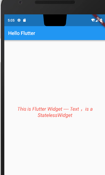Flutter中的Text Widget跟Android平台下的TextView十分类似,我们也可以跟在原生Android平台下一样的指定Text显示的样式,文字大小,颜色等,来一起看一下Flutter中关于Text的构造方法,以及Text里面有哪些属性可供开发者自己定制。```dartconst Text(this.data, {Key key,//Text显示的内容this.style, //Text显示的样式this.textAlign,//文本应该如何水平对齐,TextAlign.start,end 或者centerthis.textDirection, //文本方向,TextDirection.ltr\TextDirection.rtlthis.locale,this.softWrap, //是否自动换行,若为false,文字将不考虑容器大小,单行显示,超出屏幕部分将默认截断处理this.overflow, //当文字超出屏幕的时候,如何处理,TextOverflow.clip(裁剪)\TextOverflow.fade(渐隐)\TextOverflow.ellipsis(省略号)this.textScaleFactor, //字体显示倍率,上面的例子使用的字体大小是20.0,将字体设置成10.0,然后倍率为2this.maxLines, //最大行数设置this.semanticsLabel,})
上述的属性中,我们使用的最多的就是TextStyle属性了,比如我们想自己设定Text显示的颜色,大小,或者下划线、删除线等等各种各样的奇葩样式都可以通过TextStyle来指定,看下TextStyle的构造方法说明:
const TextStyle({this.inherit: true, // 为false的时候不显示this.color, // 颜色this.fontSize, // 字号this.fontWeight, // 字重,加粗也用这个字段 FontWeight.w700this.fontStyle, // FontStyle.normal FontStyle.italic斜体this.letterSpacing, // 字符间距 就是单个字母或者汉字之间的间隔,可以是负数this.wordSpacing, // 字间距 句字之间的间距this.textBaseline, // 基线,两个值,字面意思是一个用来排字母的,一人用来排表意字的(类似中文)this.height, // 当用来Text控件上时,行高(会乘以fontSize,所以不以设置过大)this.decoration, // 添加上划线,下划线,删除线this.decorationColor, // 划线的颜色this.decorationStyle, // 这个style可能控制画实线,虚线,两条线,点, 波浪线等this.debugLabel,String fontFamily, // 字体String package,})
TextStyle里面的样式我就不逐个为大家贴效果图了,读者可自行模拟测试下期基本用户,我贴上我的全部样例代码跟统一的效果图供大家参考。
- 效果图
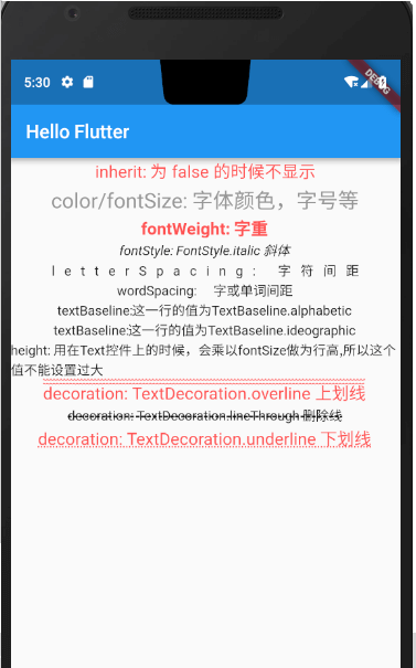
- 上图的完整示例代码
import 'package:flutter/material.dart';void main() {runApp(new MaterialApp(home: new TextDemo()));}class TextDemo extends StatelessWidget {@overrideWidget build(BuildContext context) {return new Scaffold(appBar: new AppBar(title: new Text("Hello Flutter"),),body: new Center(child: new Column(crossAxisAlignment: CrossAxisAlignment.center,children: <Widget>[new Text('inherit: 为 false 的时候不显示',style: new TextStyle(fontSize: 18.0,color: Colors.redAccent,inherit: true,),),new Text('color/fontSize: 字体颜色,字号等',style: new TextStyle(color: Color.fromARGB(255, 150, 150, 150),fontSize: 22.0,),),new Text('fontWeight: 字重',style: new TextStyle(fontSize: 18.0,color: Colors.redAccent,fontWeight: FontWeight.w700),),new Text('fontStyle: FontStyle.italic 斜体',style: new TextStyle(fontStyle: FontStyle.italic,),),new Text('letterSpacing: 字符间距',style: new TextStyle(letterSpacing: 10.0,// wordSpacing: 15.0),),new Text('wordSpacing: 字或单词间距',style: new TextStyle(// letterSpacing: 10.0,wordSpacing: 15.0),),new Text('textBaseline:这一行的值为TextBaseline.alphabetic',style: new TextStyle(textBaseline: TextBaseline.alphabetic),),new Text('textBaseline:这一行的值为TextBaseline.ideographic',style: new TextStyle(textBaseline: TextBaseline.ideographic),),new Text('height: 用在Text控件上的时候,会乘以fontSize做为行高,所以这个值不能设置过大',style: new TextStyle(height: 1.0,)),new Text('decoration: TextDecoration.overline 上划线',style: new TextStyle(fontSize: 18.0,color: Colors.redAccent,decoration: TextDecoration.overline,decorationStyle: TextDecorationStyle.wavy)),new Text('decoration: TextDecoration.lineThrough 删除线',style: new TextStyle(decoration: TextDecoration.lineThrough,decorationStyle: TextDecorationStyle.dashed)),new Text('decoration: TextDecoration.underline 下划线',style: new TextStyle(fontSize: 18.0,color: Colors.redAccent,decoration: TextDecoration.underline,decorationStyle: TextDecorationStyle.dotted)),],),));}}
TextField
通过对Text的学习我们了解到Text是用于显示文本的,如果对显示的文本有一些特殊的要求,比如字体样式,文字颜色我们可以通过TextStyle去给Text指定style来做个性化定制,这一点跟原生Android的TextView非常类似,有了文字显示就肯定会有文字输入,今天我们就一起来学习一下Flutter中的文字输入Widget TextField。
先来看下TextField的构造方法
const TextField({Key key,this.controller, 控制器,控制TextField文字this.focusNode,this.decoration = const InputDecoration(), //输入器装饰TextInputType keyboardType, 输入的类型this.textInputAction,this.textCapitalization = TextCapitalization.none,this.style,this.textAlign = TextAlign.start, //文字显示位置this.autofocus = false,this.obscureText = false,this.autocorrect = true,this.maxLines = 1,this.maxLength,this.maxLengthEnforced = true,this.onChanged, //文字改变触发this.onEditingComplete, //当用户提交可编辑内容时调用this.onSubmitted, 文字提交触发(键盘按键)this.inputFormatters,this.enabled,this.cursorWidth = 2.0,this.cursorRadius,this.cursorColor,this.keyboardAppearance,this.scrollPadding = const EdgeInsets.all(20.0),})
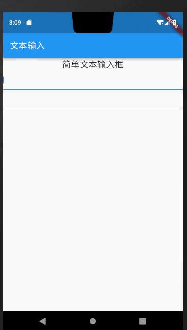
通过上面的构造方法跟预览效果图,熟悉android开发的小伙伴们是不是有种似曾相识的感觉,Flutter的TextField跟原生Android中的EditText用法包括部分属性名几乎都是一样的,比如我们可以通过keyboardType来指定唤起软件盘时的输入方式,例如上图的两个输入框属性设置:
import 'package:flutter/material.dart';import 'package:flutter/services.dart';void main() {runApp(new MaterialApp(home: new PullToRefreshDemo()));}class PullToRefreshDemo extends StatelessWidget {@overrideWidget build(BuildContext context) {return Scaffold(appBar: new AppBar(title: new Text("文本输入"),),body: new Center(child: new Column(children: <Widget>[new Text("简单文本输入框",style: new TextStyle(fontSize: 20.0)),new TextField(keyboardType: TextInputType.text,), //指定输入方式为文本输入new TextField(keyboardType: TextInputType.number,),//指定唤起软键盘时默认显示数字键盘],)),);}}
通过上面的构造方法我们留意到TextField给我提供了onChanged、onSubmitted、OnEditingComplete回调方法帮助我们监听输入框的内容变化、编辑提交、编辑完成等事件,我们给输入框绑定上述监听方法做下测试:
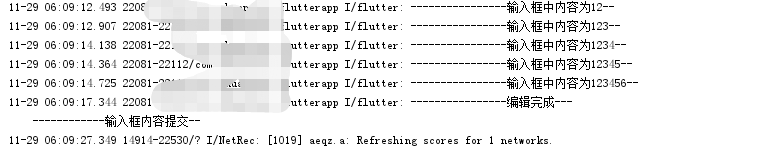
new TextField(onSubmitted: (value){print("------------文字提交触发(键盘按键)--");},onEditingComplete: (){print("----------------编辑完成---");},onChanged: (value){print("----------------输入框中内容为:$value--");},keyboardType: TextInputType.text,),
唤起软键盘后在输入框中输入123456,log控制台打印出:
到此对输入框的基本使用你已经完全get到了,但是现实开发过程中,可能我们会需要给输入框指定一些辅助性的说明内容,比如输入框未输入内容时添加hint提示,或者在输入框的旁边添加Icon指示,或者输入框内部文字的显示样式、背景色等等,这些辅助性的设置在Flutter中统一有一个叫做InputDecoration的装饰器来完成操作,我们先来看下InputDecoration的构造方法,然后来简单尝试下几个日常开发中常用的操作。
const InputDecoration({this.icon, //输入框左侧添加个图标this.labelText,//输入框获取焦点/有内容 会移动到左上角,否则在输入框内labelTex的位置this.labelStyle,this.helperText,this.helperStyle,this.hintText, //未输入文字时,输入框中的提示文字this.hintStyle,this.errorText,this.errorStyle,this.errorMaxLines,this.isDense,this.contentPadding,this.prefixIcon, //输入框内侧左面的控件this.prefix,this.prefixText,this.prefixStyle,this.suffixIcon,//输入框内侧右面的图标this.suffix,this.suffixText,this.suffixStyle,this.counterText,this.counterStyle,this.filled,this.fillColor,this.errorBorder,this.focusedBorder,this.focusedErrorBorder,this.disabledBorder,this.enabledBorder,this.border, //增加一个边框this.enabled = true,this.semanticCounterText,})
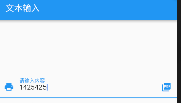
给输入框添加输入辅助性输入说明:
body: new Center(child: new TextField(decoration: new InputDecoration(labelText: "请输入内容",//输入框内无文字时提示内容,有内容时会自动浮在内容上方helperText: "随便输入文字或数字", //输入框底部辅助性说明文字prefixIcon: new Icon(Icons.print), //输入框左边图标suffixIcon: new Icon(Icons.picture_as_pdf), //输入框右边图片contentPadding: const EdgeInsets.only(bottom:15.0)),keyboardType: TextInputType.number,),));
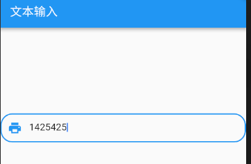
通过给InputDecoration设置border给输入框添加边框:
body: new Center(child: new TextField(decoration: new InputDecoration(border: new OutlineInputBorder( //添加边框gapPadding: 10.0,borderRadius: BorderRadius.circular(20.0),),prefixIcon: new Icon(Icons.print),contentPadding: const EdgeInsets.all(15.0)),keyboardType: TextInputType.number,),));
其他样式跟属性读者可自行运行体验,我就不逐一列举说明了,总之参考文档再结合原生开发的经验去使用TextField还是比较简单的。下面我分享一个完整的登录UI的例子供大家参考:
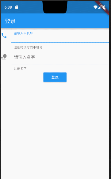
完整代码:
import 'package:flutter/material.dart';void main() {runApp(new MaterialApp(home: new MyApp()));}class MyApp extends StatefulWidget {@overrideState<StatefulWidget> createState() {return new MyAppState();}}class MyAppState extends State<MyApp> {@overrideWidget build(BuildContext context) {TextEditingController _userPhoneController = new TextEditingController();TextEditingController _userPasswordController = new TextEditingController();/*** 清空输入框内容*/void onTextClear() {setState(() {_userPhoneController.text = "";_userPasswordController.text = "";});}return new Scaffold(appBar: new AppBar(title: new Text("登录"),),body: new Column(children: <Widget>[new TextField(controller: _userPhoneController,keyboardType: TextInputType.number,decoration: new InputDecoration(contentPadding: const EdgeInsets.all(10.0),icon: new Icon(Icons.phone),labelText: "请输入手机号",helperText: "注册时填写的手机号"),onChanged: (String str) {//onChanged是每次输入框内每次文字变更触发的回调print('手机号为:$str----------');},onSubmitted: (String str) {//onSubmitted是用户提交而触发的回调{当用户点击提交按钮(输入法回车键)}print('最终手机号为:$str---------------');},),new TextField(controller: _userPasswordController,keyboardType: TextInputType.text,decoration: new InputDecoration(contentPadding: const EdgeInsets.all(10.0),icon: new Icon(Icons.nature_people),labelText: "请输入名字",// hintText: "fdsfdss",helperText: "注册名字"),),new Builder(builder: (BuildContext context) {return new RaisedButton(onPressed: () {if (_userPasswordController.text.toString() == "10086" &&_userPhoneController.text.toString() == "10086") {Scaffold.of(context).showSnackBar(new SnackBar(content: new Text("校验通过")));} else {Scaffold.of(context).showSnackBar(new SnackBar(content: new Text("校验有问题,请重新输入")));onTextClear(); //情况输入内容,让用户重新输入}},color: Colors.blue,highlightColor: Colors.deepPurple,disabledColor: Colors.cyan,child: new Text("登录",style: new TextStyle(color: Colors.white),),);})],));}}

若有收获,就点个赞吧
0 人点赞
