线性渐变达到目标(一个角)
.box{width: 200px;height: 300px;background-color: #58a;background: linear-gradient(45deg, transparent 15px, #58a 0);}

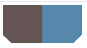
线性渐变达到目标(两个角)
.box{width: 200px;height: 100px;background: #58a;background:linear-gradient(-45deg, transparent 15px, #58a 0)right,linear-gradient(45deg, transparent 15px, #655 0)left;background-size: 50% 100%;background-repeat: no-repeat;}
线性渐变达到目标(四个角)
.box{width: 200px;height: 100px;background: #58a;background:linear-gradient(135deg, transparent 15px, #58a 0)top left,linear-gradient(-135deg, transparent 15px, #58a 0)top right,linear-gradient(-45deg, transparent 15px, #58a 0)bottom right,linear-gradient(45deg, transparent 15px, #58a 0)bottom left;background-size: 50% 50%;background-repeat: no-repeat;}

弧形切角
background: #58a;background:radial-gradient(circle at top left,transparent 15px, #58a 0) top left,radial-gradient(circle at top right,transparent 15px, #58a 0) top right,radial-gradient(circle at bottom right,transparent 15px, #58a 0) bottom right,radial-gradient(circle at bottom left,transparent 15px, #58a 0) bottom left;background-size: 50% 50%;background-repeat: no-repeat


若有收获,就点个赞吧
0 人点赞
