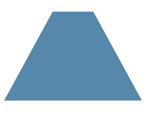
利用伪元素进行3d变形为梯形
.box{width: 100px;height: 100px;margin: 100px auto;position: relative;color: wheat;}.box::before{content: '';position: absolute;top: 0; right: 0; bottom: 0; left: 0;z-index: -1;background: #58a;transform: perspective(.5em) rotateX(5deg);}</style></head><body><div class="box"> </div>
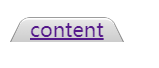
如你所见,我们给它添加了背景、边框、圆角、投影等一系列样式。 它们都可以完美生效!不仅如此,我们只需要把 transform-origin 改成 bottom left 或 bottom right,就可以立即得到左侧倾斜或右侧倾斜的标 签页
只要改变 transform-origin 就 可以得到单侧倾斜的标签页
.nav > a {position: relative;display: inline-block;padding: .3em 1em 0;}.nav > a::before {content: '';position: absolute;top: 0; right: 0; bottom: 0; left: 0;z-index: -1;background: #ccc;background-image: linear-gradient(hsla(0,0%,100%,.6),hsla(0,0%,100%,0));border: 1px solid rgba(0,0,0,.4);border-bottom: none;border-radius: .5em .5em 0 0;box-shadow: 0 .15em white inset;transform: perspective(.5em) rotateX(5deg);transform-origin: bottom;}</style></head><body><div class="nav"> <a href="">content</a></div>

若有收获,就点个赞吧
0 人点赞
