脚手架(Scaffold)
脚手架Scaffold是Flutter UI中重要的组成部分,实现了大部分的APP页面需求,相当于房屋框体结构,页面一般都需要基于Scaffold来开发,主要成员包含:appBar(顶部Bar)、body(主体)、floatingActionButton(悬浮按钮)、drawer/endDrawer(抽屉)、bottomSheet(底部Sheet)、bottomNavigationBar(底部导航栏)。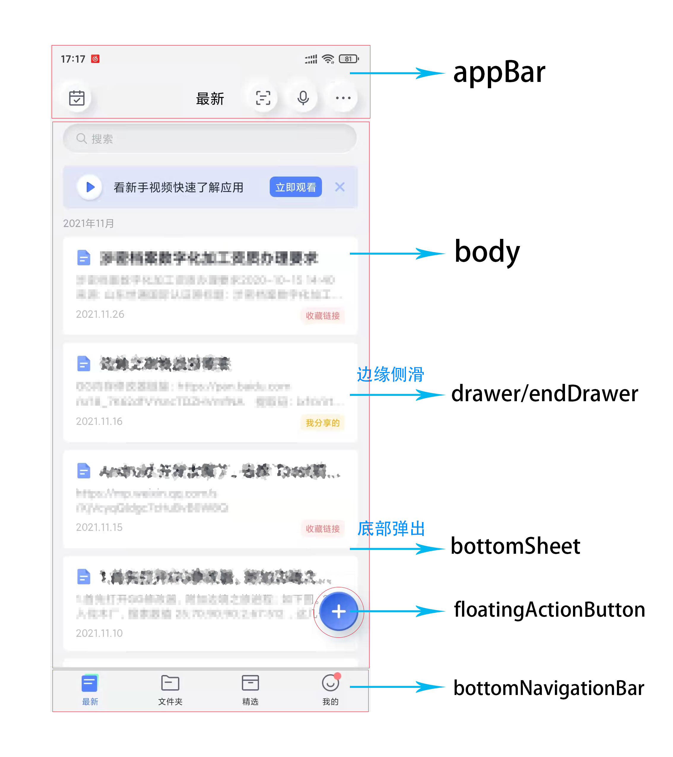
appBar
appBar是Scaffold中的顶部工具栏,显示标题和添加一些便捷常用的工具/菜单。appBar接受PreferredSizeWidget,可自定bar,也可使用Flutter提供的AppBar(),AppBar的构成如下图,主要包含leading(导航)、title(标题)、actions(工具/菜单)、flexibleSpace(灵活空间)、bottom(底部扩展) 几个部分。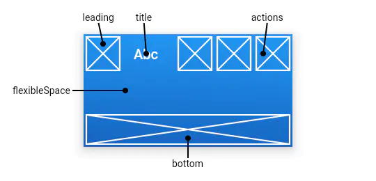
- leading 导航:非根节点没有重写的话,会自动生成一个返回按钮,并实现关闭当前页面的路由操作。
- title 标题:页面的标题。
- actions 工具/菜单:一个 Widget 列表,作为便捷菜单或工具栏。
- flexibleSpace 灵活空间:一个显示在 AppBar 下方的控件,高度和 AppBar 高度一样。
- bottom 底部拓展:通常用来实现TabBar。
body
body是Scaffold的主体,可以在其中添加各式各样的Widget来丰富应用。
floatingActionButton
floatingActionButton是一个悬浮按钮,位置默认在屏幕右下角。
drawer
drawer是一个左侧划出的抽屉,设置drawer是会默认在appBar的leading处添加按钮,并对这个按钮添加呼出drawer事件。
endDrawer
同drawer,endDrawer是一个右侧划出的抽屉,设置endDrawer是会默认在appBar的actions 处添加按钮,并对这个按钮添加呼出drawer事件。
bottomSheet
bottomSheet是一个底部弹出框,一般用于弹出分享列表。
bottomNavigationBar
bottomNavigationBar是底部导航栏,用于快速切换应用模块。
文本
Text
Text是普通文本组件,继承自StatelessWidget,源码如下:
/// Creates a text widget.////// If the [style] argument is null, the text will use the style from the/// closest enclosing [DefaultTextStyle].////// The [data] parameter must not be null.////// The [overflow] property's behavior is affected by the [softWrap] argument./// If the [softWrap] is true or null, the glyph causing overflow, and those that follow,/// will not be rendered. Otherwise, it will be shown with the given overflow option.const Text(String this.data, {Key? key,this.style,this.strutStyle,this.textAlign,this.textDirection,this.locale,this.softWrap,this.overflow,this.textScaleFactor,this.maxLines,this.semanticsLabel,this.textWidthBasis,this.textHeightBehavior,})
其中常用参数:
- data:显示的内容
- style:样式
- textAlign:文本应如何水平对齐
- softWrap:某一行中文本过长,是否需要换行。默认为true,如果为false,需要设置overflow
- overflow:如何处理视觉溢出
- maxLines:最大行数
示例:
Text('标题',style: TextStyle(fontSize: 18,fontWeight: FontWeight.bold),),
RichText
RichText是富文本,继承自MultiChildRenderObjectWidget,是个RenderObjectWidget,源码如下:
/// Creates a paragraph of rich text./// The [text], [textAlign], [softWrap], [overflow], and [textScaleFactor]/// arguments must not be null./// The [maxLines] property may be null (and indeed defaults to null), but if/// it is not null, it must be greater than zero./// The [textDirection], if null, defaults to the ambient [Directionality],/// which in that case must not be null.RichText({Key? key,required this.text,this.textAlign = TextAlign.start,this.textDirection,this.softWrap = true,this.overflow = TextOverflow.clip,this.textScaleFactor = 1.0,this.maxLines,this.locale,this.strutStyle,this.textWidthBasis = TextWidthBasis.parent,this.textHeightBehavior,})
其中常用参数:
- text:返回一个TextSpan,在其中自定义内容和样式
- textAlign:文本应如何水平对齐
- softWrap:某一行中文本过长,是否需要换行。默认为true,如果为false,需要设置overflow
- overflow:如何处理视觉溢出
- maxLines:最大行数
示例:
RichText(text: TextSpan(children: <InlineSpan>[TextSpan(text: '第一部分',style: TextStyle(color: Colors.red)),TextSpan(text: ',第二部分,'),TextSpan(text: '第三部分',style: TextStyle(color: Colors.red)),]),)
TextField
TextField 是个文本输入框,简单使用:
TextField(decoration: InputDecoration(hintText: '请输入用户名',hintStyle: TextStyle(color: Colors.grey),hintMaxLines: 1),)
图片
Image
Image用于显示图片,简单使用:
// 网络Image.network('https://flutter.github.io/assets-for-api-docs/assets/widgets/puffin.jpg',),// 本地Image.asset('assets/images/aa.jpg',width: 150,height: 150,fit: BoxFit.none,alignment: Alignment.centerRight,),
列表
ListView
ListView是一个单数的列表组件,简单使用:
ListView(children: <Widget>[Text('标题1'),Text('标题2'),Text('标题3'),Text('标题4'),],)
GridView
GridView是一个复数的列表组件,简单使用:
GridView(gridDelegate: SliverGridDelegateWithFixedCrossAxisCount(crossAxisCount: 2,),children: [Text('标题1'),Text('标题2'),Text('标题3'),Text('标题4'),],)
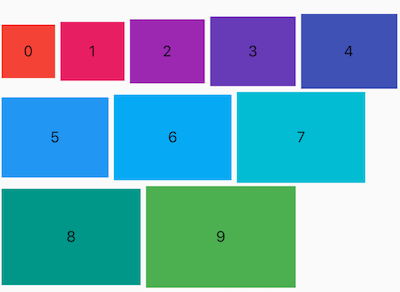
Wrap
Warp是一个自适应的列表,简单使用:
Wrap(spacing: 5,runSpacing: 3,crossAxisAlignment: WrapCrossAlignment.center,children: List.generate(10, (i) {double w = 50.0 + 10 * i;double h = 50.0 + 5 * i;return Container(color: Colors.primaries[i],height: h,alignment: Alignment.center,width: w,child: Text('$i'),);}),)
容器
Container 是最常用的组件之一,它是单容器类组件,仅能包含一个子组件,用于装饰和定位子组件,例如设置背景颜色、形状等。简单使用:
// 基础Container(child: Text('标题1'),)// 限定Container(height: 200,width: 200,decoration: BoxDecoration(image: DecorationImage(image: NetworkImage('https://flutter.github.io/assets-for-api-docs/assets/widgets/owl-2.jpg'),fit: BoxFit.cover,),border: Border.all(color: Colors.blue,width: 2,),borderRadius: BorderRadius.circular(12),),)
布局
线性(Row/Column )
Row 是将子组件以水平方式布局的组件, Column 是将子组件以垂直方式布局的组件。简单使用:
// 横向排列Row(children: <Widget>[Container(height: 50,width: 100,color: Colors.red,),Container(height: 50,width: 100,color: Colors.green,),Container(height: 50,width: 100,color: Colors.blue,),],)// 竖向排列Column(mainAxisSize: MainAxisSize.min,children: <Widget>[Container(height: 50,width: 100,color: Colors.red,),Container(height: 50,width: 100,color: Colors.green,),Container(height: 50,width: 100,color: Colors.blue,),],)
叠加定位
叠加布局组件Stack, 组件将子组件叠加显示,根据子组件的顺序依次向上叠加,简单使用:
Stack(children: <Widget>[Container(height: 200,width: 200,color: Colors.red,),Container(height: 170,width: 170,color: Colors.blue,),Container(height: 140,width: 140,color: Colors.yellow,)],)
可使用Positioned进行定位:
Stack(overflow: Overflow.visible,children: <Widget>[Container(height: 200,width: 200,color: Colors.red,),Positioned(left: 100,top: 100,height: 150,width: 150,child: Container(color: Colors.green,),)],)
手势
GestureDetector
GestureDetector 是手势识别的组件,可以识别点击、双击、长按事件、拖动、缩放等手势。简单使用:
// 点击GestureDetector(onTapDown: (TapDownDetails tapDownDetails) {print('onTapDown');},onTapUp: (TapUpDetails tapUpDetails) {print('onTapUp');},onTap: () {print('onTap');},onTapCancel: () {print('onTapCancel');},child: Center(child: Container(width: 200,height: 200,color: Colors.red,),),)// 双击GestureDetector(onDoubleTap: ()=>print('onDoubleTap'),child: Center(child: Container(width: 200,height: 200,color: Colors.red,),),)//长按事件GestureDetector(onLongPressStart: (v) => print('onLongPressStart'),onLongPressMoveUpdate: (v) => print('onLongPressMoveUpdate'),onLongPressUp: () => print('onLongPressUp'),onLongPressEnd: (v) => print('onLongPressEnd'),onLongPress: () => print('onLongPress'),child: Center(child: Container(width: 200,height: 200,color: Colors.red,),),)// 拖动事件GestureDetector(onVerticalDragStart: (v) => print('onVerticalDragStart'),onVerticalDragDown: (v) => print('onVerticalDragDown'),onVerticalDragUpdate: (v) => print('onVerticalDragUpdate'),onVerticalDragCancel: () => print('onVerticalDragCancel'),onVerticalDragEnd: (v) => print('onVerticalDragEnd'),child: Center(child: Container(width: 200,height: 200,color: Colors.red,),),)// 缩放事件GestureDetector(onScaleStart: (v) => print('onScaleStart'),onScaleUpdate: (ScaleUpdateDetails v) => print('onScaleUpdate'),onScaleEnd: (v) => print('onScaleEnd'),child: Center(child: Container(width: 200,height: 200,color: Colors.red,),),)
InkWell
InkWell 组件在用户点击时出现“水波纹”效果,简单使用:
InkWell(onTap: (){},child: Text('这是InkWell点击效果'),)

若有收获,就点个赞吧
0 人点赞
