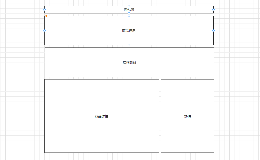
- 商品详情
- 商品详情-基础布局
- 商品详情-渲染面包屑
- 商品详情-图片预览组件
- 商品详情-图片放大镜
- 回顾
- 商品详情-基本信息展示
- 商品详情-城市组件-基础布局
- 商品详情-城市组件-获取数据
- 商品详情-城市组件-交互逻辑
- ★规格组件-SKU&SPU概念
- ★规格组件-基础结构和样式
- ★规格组件-渲染与选中效果
- ★规格组件-禁用效果-思路分析
- ★规格组件-禁用效果-路径字典
- ★规格组件-禁用效果-设置状态
- 回顾
- ★规格组件-数据通讯
- 商品详情-数量选择组件
- 商品详情-按钮组件
- 商品详情-同类推荐组件
- 商品详情-标签页组件
- 商品详情-热榜组件
- 商品详情-详情组件
- 商品详情-注意事项组件
- 回顾
- 商品详情-评价组件-头部渲染
- 商品详情-评价组件-实现列表
- 商品详情-评价组件-图片预览
- 商品详情-评价组件-★分页组件
商品详情
商品详情-基础布局
目的:完成商品详情基础布局,路由配置,搭好页面架子。
大致步骤:
- 准备组件结构容器
- 提取商品推荐组件且使用
- 配置路由和组件
落地代码:
- 页面组件:
src/views/goods/index.vue
<template><div class='xtx-goods-page'><div class="container"><!-- 面包屑 --><XtxBread><XtxBreadItem to="/">首页</XtxBreadItem><XtxBreadItem to="/">手机</XtxBreadItem><XtxBreadItem to="/">华为</XtxBreadItem><XtxBreadItem to="/">p30</XtxBreadItem></XtxBread><!-- 商品信息 --><div class="goods-info"></div><!-- 商品推荐 --><GoodsRelevant /><!-- 商品详情 --><div class="goods-footer"><div class="goods-article"><!-- 商品+评价 --><div class="goods-tabs"></div><!-- 注意事项 --><div class="goods-warn"></div></div><!-- 24热榜+专题推荐 --><div class="goods-aside"></div></div></div></div></template><script>import GoodsRelevant from './components/goods-relevant'export default {name: 'XtxGoodsPage',components: { , GoodsRelevant }}</script><style scoped lang='less'>.goods-info {min-height: 600px;background: #fff;}.goods-footer {display: flex;margin-top: 20px;.goods-article {width: 940px;margin-right: 20px;}.goods-aside {width: 280px;min-height: 1000px;}}.goods-tabs {min-height: 600px;background: #fff;}.goods-warn {min-height: 600px;background: #fff;margin-top: 20px;}</style>
- 商品推荐组件:
src/views/goods/components/goods-relevant.vue
<template><div class='goods-relevant'></div></template><script>export default {name: 'GoodsRelevant'}</script><style scoped lang='less'>.goods-relevant {background: #fff;min-height: 460px;margin-top: 20px;}</style>
- 路由配置:
src/router/index.js
const Goods = () => import('@/views/goods/index')
children: [{ path: '/', component: Home },{ path: '/category/:id', component: TopCategory },{ path: '/category/sub/:id', component: SubCategory },+ { path: '/product/:id', component: Goods }]
总结:
- 实现页面的基本结构
- 拆分推荐的商品的组件
- 配置路由
商品详情-渲染面包屑
目的:获取数据,渲染面包屑。
大致步骤:
- 定义获取商品详情API函数
- 在组件setup中获取商品详情数据
- 定义一个useXxx函数处理数据
注意:如果携带一个错误的token,那么是获取不到数据的(后端的验证策略有问题)
落地代码:
- API函数
src/api/product.js
import request from '@/utils/request'// 获取商品的详细数据export const findGoods = (id) => {return request({method: 'get',url: '/goods',data: { id }})}
- useGoods函数
src/views/goods/index.vue在setup中使用
import GoodsRelevant from './components/goods-relevant'import { nextTick, ref, watch } from 'vue'import { findGoods } from '@/api/product'import { useRoute } from 'vue-router'export default {name: 'XtxGoodsPage',components: { GoodsRelevant },setup () {const goods = useGoods()return { goods }}}// 获取商品详情const useGoods = () => {// 出现路由地址商品ID发生变化,但是不会重新初始化组件const goods = ref(null)const route = useRoute()watch(() => route.params.id, (newVal) => {if (newVal && `/product/${newVal}` === route.path) {findGoods(route.params.id).then(data => {// 让商品数据为null让后使用v-if的组件可以重新销毁和创建goods.value = nullnextTick(() => {goods.value = data.result})})}}, { immediate: true })return goods}
- 防止报错,加载完成goods再显示所有内容
<div class='xtx-goods-page' v-if="goods">
- 渲染面包屑
<!-- 面包屑 --><XtxBread><XtxBreadItem to="/">首页</XtxBreadItem><XtxBreadItem :to="'/category/'+goodsDetail.categories[1].id">{{goodsDetail.categories[1].name}}</XtxBreadItem><XtxBreadItem :to="'/category/sub/'+goodsDetail.categories[0].id">{{goodsDetail.categories[0].name}}</XtxBreadItem><XtxBreadItem>{{goodsDetail.name}}</XtxBreadItem></XtxBread>
总结:
- 处理详情数据,需要先置空,再通过nextTick更新数据
- 把逻辑处理代码拆分为Hook函数
- 面包屑进行动态填充
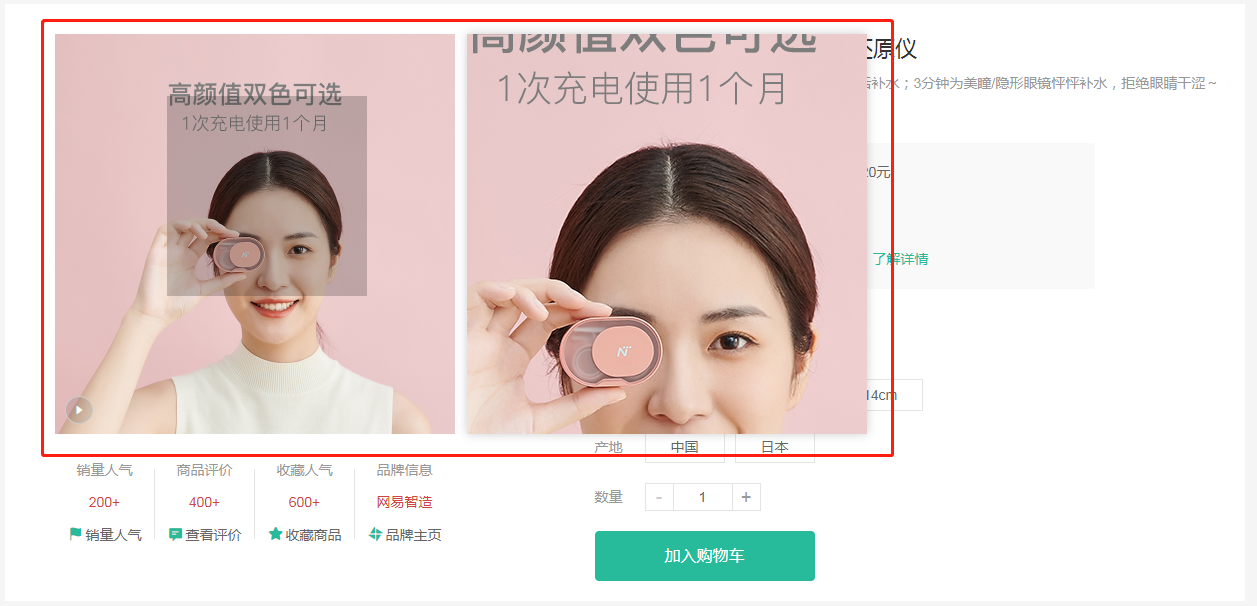
商品详情-图片预览组件
目的:完成商品图片预览功能和切换
大致步骤:
- 首先准备商品信息区块左右两侧的布局盒子
在定义一个商品图片组件,用来实现图片预览
- 首先组件布局,渲染
- 实现切换图片
落地代码:商品信息区块,布局盒子
src/views/goods/index.vue
<!-- 商品信息 --><div class="goods-info"><div class="media"></div><div class="spec"></div></div>
.goods-info {min-height: 600px;background: #fff;display: flex;.media {width: 580px;height: 600px;padding: 30px 50px;}.spec {flex: 1;padding: 30px 30px 30px 0;}}
- 商品图片组件,渲染和切换
src/views/goods/components/goods-image.vue
<template><div class="goods-image"><div class="middle"><img :src="images[currIndex]" alt=""></div><ul class="small"><li v-for="(img,i) in images" :key="img" :class="{active:i===currIndex}"><img @mouseenter="currIndex=i" :src="img" alt=""></li></ul></div></template><script>import { ref } from 'vue'export default {name: 'GoodsImage',props: {images: {type: Array,default: () => []}},setup (props) {const currIndex = ref(0)return { currIndex }}}</script><style scoped lang="less">.goods-image {width: 480px;height: 400px;position: relative;display: flex;.middle {width: 400px;height: 400px;background: #f5f5f5;}.small {width: 80px;li {width: 68px;height: 68px;margin-left: 12px;margin-bottom: 15px;cursor: pointer;&:hover,&.active {border: 2px solid @xtxColor;}}}}</style>
总结:
- 实现基本布局
- 封装图片预览组件,实现鼠标悬停切换效果(类似之前所作的Tab效果)
商品详情-图片放大镜
目的:实现图片放大镜功能
大致步骤:
- 首先准备大图容器和遮罩容器
- 然后使用
@vueuse/core的useMouseInElement方法获取基于元素的偏移量 - 计算出 遮罩容器定位与大容器背景定位 暴露出数据给模板使用
落地代码:src/views/goods/components/goods-image.vue
- 准备大图容器
<div class='goods-image'>+ <div class="large" :style="[{backgroundImage:`url(${images[currIndex]})`}]"></div><div class="middle">
.goods-image {width: 480px;height: 400px;position: relative;display: flex;+ z-index: 500;+ .large {+ position: absolute;+ top: 0;+ left: 412px;+ width: 400px;+ height: 400px;+ box-shadow: 0 0 10px rgba(0,0,0,0.1);+ background-repeat: no-repeat;+ background-size: 800px 800px;+ background-color: #f8f8f8;+ }
总结:实现右侧大图布局效果(背景图放大4倍)
- 准备待移动的遮罩容器
<div class="middle" ref="target"><img :src="images[currIndex]" alt="">+ <div class="layer"></div></div>
.middle {width: 400px;height: 400px;+ position: relative;+ cursor: move;+ .layer {+ width: 200px;+ height: 200px;+ background: rgba(0,0,0,.2);+ left: 0;+ top: 0;+ position: absolute;+ }}
- 使用vueuse提供的API获取鼠标偏移量
import { reactive, ref, watch } from 'vue'import { useMouseInElement } from '@vueuse/core'
const usePreviewImg = () => {const target = ref(null)const show = ref(false)// elementX 鼠标基于容器左上角X轴偏移// elementY 鼠标基于容器左上角Y轴偏移// isOutside 鼠标是否在模板容器外const { elementX, elementY, isOutside } = useMouseInElement(target)const position = reactive({ left: 0, top: 0 })const bgPosition = reactive({ backgroundPositionX: 0, backgroundPositionY: 0 })watch([elementX, elementY, isOutside], () => {// 控制X轴方向的定位 0-200 之间if (elementX.value < 100) position.left = 0else if (elementX.value > 300) position.left = 200else position.left = elementX.value - 100// 控制Y轴方向的定位 0-200 之间if (elementY.value < 100) position.top = 0else if (elementY.value > 300) position.top = 200else position.top = elementY.value - 100// 设置大背景的定位bgPosition.backgroundPositionX = -position.left * 2 + 'px'bgPosition.backgroundPositionY = -position.top * 2 + 'px'// 设置遮罩容器的定位position.left = position.left + 'px'position.top = position.top + 'px'// 设置是否显示预览大图show.value = !isOutside.value})return { position, bgPosition, show, target }}
- 在setup中返回模板需要数据,并使用它
setup () {const { currIndex, toggleImg } = useToggleImg()+ const { position, bgPosition, show, target } = usePreviewImg()+ return { currIndex, toggleImg, position, bgPosition, show, target }}
<div class="large" v-show="show" :style="[{backgroundImage:`url(${images[currIndex]})`},bgPosition]"></div><div class="middle" ref="target"><img :src="images[currIndex]" alt=""><div class="layer" v-show="show" :style="position"></div></div>
总结:
- 基于Vueuse提供方法监控进入DOM内的坐标
- 基于坐标的变化控制遮罩层的移动
- 基于坐标的变化控制右侧预览图背景的变化
- 控制进入和离开时显示和隐藏效果
回顾
- 二级分类
- 排序和复选框参数的选择,并且传递给接口方法
- 筛选条件参数的获取,并且传递给接口方法
- 修复可视区没有数据的问题
- 商品详情
- 熟悉基本业务:查询商品数据进行展示
- 基本组件结构布局
- 调用接口获取商品详情数据
- 顶部的面包屑动态填充
- 商品图片预览的效果
- 图片的切换
- 放大镜效果
- 基于vueuse提供的方法判断鼠标是否进入指定区域
- 动态计算遮罩层和放大图片的背景的位置
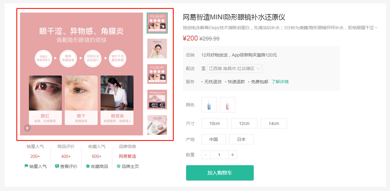
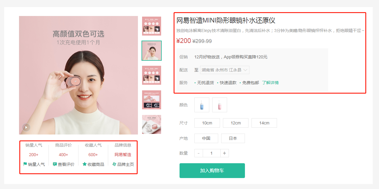
商品详情-基本信息展示
目的:展示商品基本信息
大致步骤:
- 商品销售属性组件
- 商品名称信息组件
落地代码:
- ⑴基础布局:
红色区域1 src/views/goods/components/goods-sales.vue
<template><ul class="goods-sales"><li><p>销量人气</p><p>200+</p><p><i class="iconfont icon-task-filling"></i>销量人气</p></li><li><p>商品评价</p><p>400+</p><p><i class="iconfont icon-comment-filling"></i>查看评价</p></li><li><p>收藏人气</p><p>600+</p><p><i class="iconfont icon-favorite-filling"></i>收藏商品</p></li><li><p>品牌信息</p><p>苏宁电器</p><p><i class="iconfont icon-dynamic-filling"></i>品牌主页</p></li></ul></template><script>export default {name: 'GoodsSales'}</script><style scoped lang='less'>.goods-sales {display: flex;width: 400px;align-items: center;text-align: center;height: 140px;li {flex: 1;position: relative;~ li::after {position: absolute;top: 10px;left: 0;height: 60px;border-left: 1px solid #e4e4e4;content: "";}p {&:first-child {color: #999;}&:nth-child(2) {color: @priceColor;margin-top: 10px;}&:last-child {color: #666;margin-top: 10px;i {color: @xtxColor;font-size: 14px;margin-right: 2px;}&:hover {color: @xtxColor;cursor: pointer;}}}}}</style>
红色区域2 src/views/goods/components/goods-name.vue
<template><p class="g-name">2件装 粉釉花瓣心意点缀 点心盘*2 碟子盘子</p><p class="g-desc">花瓣造型干净简约 多功能使用堆叠方便</p><p class="g-price"><span>108.00</span><span>199.00</span></p><div class="g-service"><dl><dt>促销</dt><dd>12月好物放送,App领券购买直降120元</dd></dl><dl><dt>配送</dt><dd>至 </dd></dl><dl><dt>服务</dt><dd><span>无忧退货</span><span>快速退款</span><span>免费包邮</span><a href="javascript:;">了解详情</a></dd></dl></div></template><script>export default {name: 'GoodName'}</script><style lang="less" scoped>.g-name {font-size: 22px}.g-desc {color: #999;margin-top: 10px;}.g-price {margin-top: 10px;span {&::before {content: "¥";font-size: 14px;}&:first-child {color: @priceColor;margin-right: 10px;font-size: 22px;}&:last-child {color: #999;text-decoration: line-through;font-size: 16px;}}}.g-service {background: #f5f5f5;width: 500px;padding: 20px 10px 0 10px;margin-top: 10px;dl {padding-bottom: 20px;display: flex;align-items: center;dt {width: 50px;color: #999;}dd {color: #666;&:last-child {span {margin-right: 10px;&::before {content: "•";color: @xtxColor;margin-right: 2px;}}a {color: @xtxColor;}}}}}</style>
- ⑵使用组件
src/views/goods/index.vue
import GoodsSales from './components/goods-sales'import GoodsName from './components/goods-name'
components: { GoodsRelevant, GoodsImage, GoodsSales, GoodsName },
<!-- 商品信息 --><div class="goods-info"><div class="media"><GoodsImage :images="goods.mainPictures" />+ <GoodsSales /></div><div class="spec">+ <GoodsName :goods="goods"/></div></div>
- ⑶渲染数据
src/views/goods/components/goods-name.vue
<p class="g-name">{{goods.name}}</p><p class="g-desc">{{goods.desc}}</p><p class="g-price"><span>{{goods.price}}</span><span>{{goods.oldPrice}}</span></p>
总结:
- 准备商品销售信息组件
- 商品名称信息组件
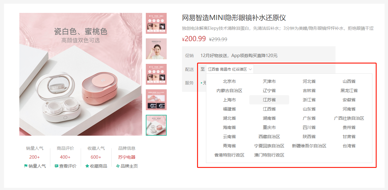
商品详情-城市组件-基础布局
目的:完成城市组件的基础布局和基本显示隐藏切换效果。
大致步骤:
- 准备基本组件结构
- 完成切换显示隐藏
- 完成点击外部隐藏
落地代码:
src/components/library/xtx-city.vue
- 结构
<template><div class="xtx-city" ref="target"><div class="select" @click="toggle" :class="{active}"><span class="placeholder">请选择配送地址</span><span class="value"></span><i class="iconfont icon-angle-down"></i></div><div class="option" v-show='isShow'><span class="ellipsis" v-for="i in 24" :key="i">北京市</span></div></div></template>
- 逻辑
<script>import { ref } from 'vue'import { onClickOutside } from '@vueuse/core'export default {name: 'XtxCity',setup () {const isShow = ref(false)// 控制选择城市弹窗的显示和隐藏const toggle = () => {isShow.value = !isShow.value}return { isShow, toggle }}}</script>
- 样式
<style scoped lang="less">.xtx-city {display: inline-block;position: relative;z-index: 400;.select {border: 1px solid #e4e4e4;height: 30px;padding: 0 5px;line-height: 28px;cursor: pointer;&.active {background: #fff;}.placeholder {color: #999;}.value {color: #666;font-size: 12px;}i {font-size: 12px;margin-left: 5px;}}.option {width: 542px;border: 1px solid #e4e4e4;position: absolute;left: 0;top: 29px;background: #fff;min-height: 30px;line-height: 30px;display: flex;flex-wrap: wrap;padding: 10px;> span {width: 130px;text-align: center;cursor: pointer;border-radius: 4px;padding: 0 3px;&:hover {background: #f5f5f5;}}}}</style>
总结:
- 实现城市选择组件的基本布局
- 控制弹窗的显示和隐藏
商品详情-城市组件-获取数据
2目的:组件初始化的时候获取城市数据,进行默认展示。
大致步骤:
- 获取数据函数封装且支持缓存。
- 获取数据渲染且加上加载中效果。
- 加上一个
vue-cli配置,处理图片为base64
落地代码:src/components/library/xtx-city.vue
- 获取数据的函数
// 获取城市数据// 1. 数据在哪里?https://yjy-oss-files.oss-cn-zhangjiakou.aliyuncs.com/tuxian/area.json// 2. 何时获取?打开城市列表的时候,做个内存中缓存// 3. 怎么使用数据?定义计算属性,根据点击的省份城市展示export const getCityList = async () => {// 添加缓存,防止频繁加载列表数据if (window.cityList) {// 缓存中已经存在数据了return window.cityList}const ret = await axios.get(cityUrl)// 给window对象添加了一个属性cityListwindow.cityList = ret.data// 把数据返回return ret.data}
- toggle使用函数
<script>import { ref } from 'vue'import { getCityList } from '@/api/product.js'export default {name: 'XtxCity',setup () {// 城市列表数据const list = ref([])// 显示隐藏状态位const isShow = ref(false)// 控制选择城市弹窗的显示和隐藏const toggle = () => {isShow.value = !isShow.value// 打开弹窗是调用接口获取城市列表数据if (isShow.value) {getCityList().then(data => {list.value = data})}}return { isShow, toggle, list }}}</script>
总结:
- 点击选择城市按钮,调用接口获取城市列表数据
- 添加城市列表数据的缓存(基于window的全局属性进行缓存)
- 加载中样式
.option {// 省略....loading {height: 290px;width: 100%;background: url(../../assets/images/loading.gif) no-repeat center;}}
- 模板中使用
<div class="option" v-if="visible">+ <div v-if="loading" class="loading"></div>+ <template v-else>+ <span class="ellipsis" v-for="item in currList" :key="item.code">{{item.name}}</span>+ </template></div>
注意事项: 需要配置10kb下的图片打包成base64的格式 vue.config.js
chainWebpack: config => {config.module.rule('images').use('url-loader').loader('url-loader').tap(options => Object.assign(options, { limit: 10000 }))}
总结:
- 添加一个加载的状态效果
- 需要把小图片转换为base64数据,提高加载效率(基于webpack的配置进行处理)
商品详情-城市组件-交互逻辑
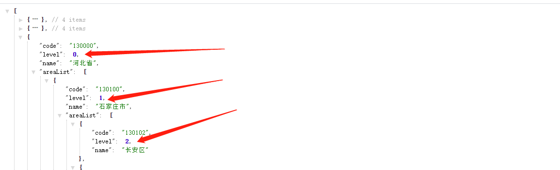
3目的:显示省市区文字,让组件能够选择省市区并且反馈给父组件。
大致步骤:
- 明确和后台交互的时候需要产生哪些数据,省code,市code,地区code,它们组合再一起的文字。
- 商品详情的默认地址,如果登录了有地址列表,需要获取默认的地址,设置商品详情的地址。
- 然后默认的地址需要传递给
xtx-city组件做默认值显示 - 然后
xtx-city组件产生数据的时候,需要给出:省code,市code,地区code,它们组合在一起的文字。
落的代码:
- 第一步:父组件设置 省市区的code数据,对应的文字数据。
src/views/goods/components/goods-name.vue
setup (props) {// 默认情况const provinceCode = ref('110000')const cityCode = ref('119900')const countyCode = ref('110101')const fullLocation = ref('北京市 市辖区 东城区')// 有默认地址if (props.goods.userAddresses) {const defaultAddr = props.goods.userAddresses.find(addr => addr.isDefault === 1)if (defaultAddr) {provinceCode.value = defaultAddr.provinceCodecityCode.value = defaultAddr.cityCodecountyCode.value = defaultAddr.countyCodefullLocation.value = defaultAddr.fullLocation}}return { fullLocation }}
<XtxCity :fullLocation="fullLocation" />
总结:获取后端的详情数据中默认的配送地址,进行显示
- 第二步:监听用户点击 省,市 展示 市列表和地区列表。
src/components/xtx-city.vue
<div class="option" v-show="visible">+ <span @click="changeCity(city)" class="ellipsis"
// 选中的省市区const changeResult = reactive({provinceCode: '',provinceName: '',cityCode: '',cityName: '',countyCode: '',countyName: '',fullLocation: ''})// 控制城市的切换const changeCity = (city) => {if (city.level === 0) {// 省级changeResult.provinceCode = city.codechangeResult.provinceName = city.name} else if (city.level === 1) {// 市级changeResult.cityCode = city.codechangeResult.cityName = city.name} else if (city.level === 2) {// 县级changeResult.countyCode = city.codechangeResult.countyName = city.name// 关闭弹窗toggle()// 把选中的数据交给父组件changeResult.fullLocation = `${changeResult.provinceName} ${changeResult.cityName} ${changeResult.countyName}`emit('change-result', changeResult)}}
- 计算出需要展示列表
// 动态计算当前显示的是省级还是市级还是县级const cityList = computed(() => {// 省级列表let result = list.value// 计算市级列表if (changeResult.provinceCode && changeResult.provinceName) {// 点击了省,计算它的市级数据result = result.find(item => item.code === changeResult.provinceCode).areaList}// 计算县级列表if (changeResult.cityCode && changeResult.cityName) {// 点击了省,计算它的市级数据return result.find(item => item.code === changeResult.cityCode).areaList}return result})
- 打开弹层清空之前的选择
// 控制选择城市弹窗的显示和隐藏const toggle = () => {isShow.value = !isShow.value// 打开弹窗是调用接口获取城市列表数据if (isShow.value) {loading.value = truegetCityList().then(data => {list.value = dataloading.value = false})// 打开弹窗时,请求数据+ for (const key in changeResult) {+ changeResult[key] = ''+ }}}
- 第三步:点击地区的时候,将数据通知给父组件使用,关闭对话框
src/components/xtx-city.vue
// 控制城市的切换const changeCity = (city) => {if (city.level === 0) {// 省级changeResult.provinceCode = city.codechangeResult.provinceName = city.name} else if (city.level === 1) {// 市级changeResult.cityCode = city.codechangeResult.cityName = city.name} else if (city.level === 2) {// 县级changeResult.countyCode = city.codechangeResult.countyName = city.name// 关闭弹窗toggle()// 把选中的数据交给父组件changeResult.fullLocation = `${changeResult.provinceName} ${changeResult.cityName} ${changeResult.countyName}`emit('change-result', changeResult)}}
src/views/goods/components/goods-name.vue
// 更新选中的省市区信息const changeResult = (result) => {provinceCode.value = result.provinceCodecityCode.value = result.cityCodecountyCode.value = result.countyCodefullLocation.value = result.fullLocation}
<XtxCity @change-result='changeResult' :fullLocation='fullLocation' />
总结:
- 控制选中省市区的切换操作
- 通过计算属性获取当前的省市区数据
- 控制结果的选中
- 第四步,点击弹窗之外关闭弹窗
// 弹窗引用对象const target = ref(null)onClickOutside(target, () => {// 点击弹窗之外的区域自动触发toggle()})
总结:基于vueuse提供onClickOutside方法控制弹窗的关闭
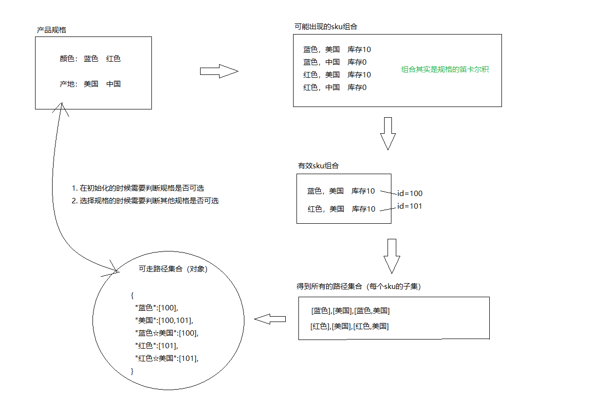
★规格组件-SKU&SPU概念
官方话术:
- SPU(Standard Product Unit):标准化产品单元。是商品信息聚合的最小单位,是一组可复用、易检索的标准化信息的集合,该集合描述了一个产品的特性。通俗点讲,属性值、特性相同的商品就可以称为一个SPU。
- SKU(Stock Keeping Unit)库存量单位,即库存进出计量的单位, 可以是以件、盒、托盘等为单位。SKU是物理上不可分割的最小存货单元。在使用时要根据不同业态,不同管理模式来处理。
画图理解:
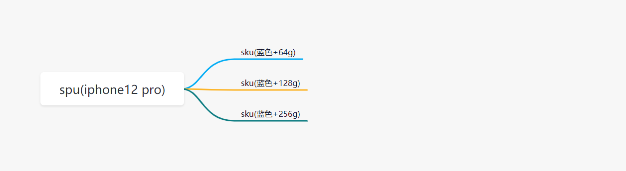
总结一下:
- spu代表一种商品,拥有很多相同的属性。
- sku代表该商品可选规格的任意组合,他是库存单位的唯一标识。
- 如何判断组合选择的规格参数是否可以选中?
- 从后端可以得到所有的SKU数据
- 我们需要过滤出有库存的SKU数据
- 为了方便进行组合判断,需要计算每个SKU规格的集合数据的【笛卡尔集】
- 此时当点击规格标签时,把选中的规格进行组合,然后去笛卡尔集中判断,只要有一个存在,就证明这种组合是有效的(点击组合点击)
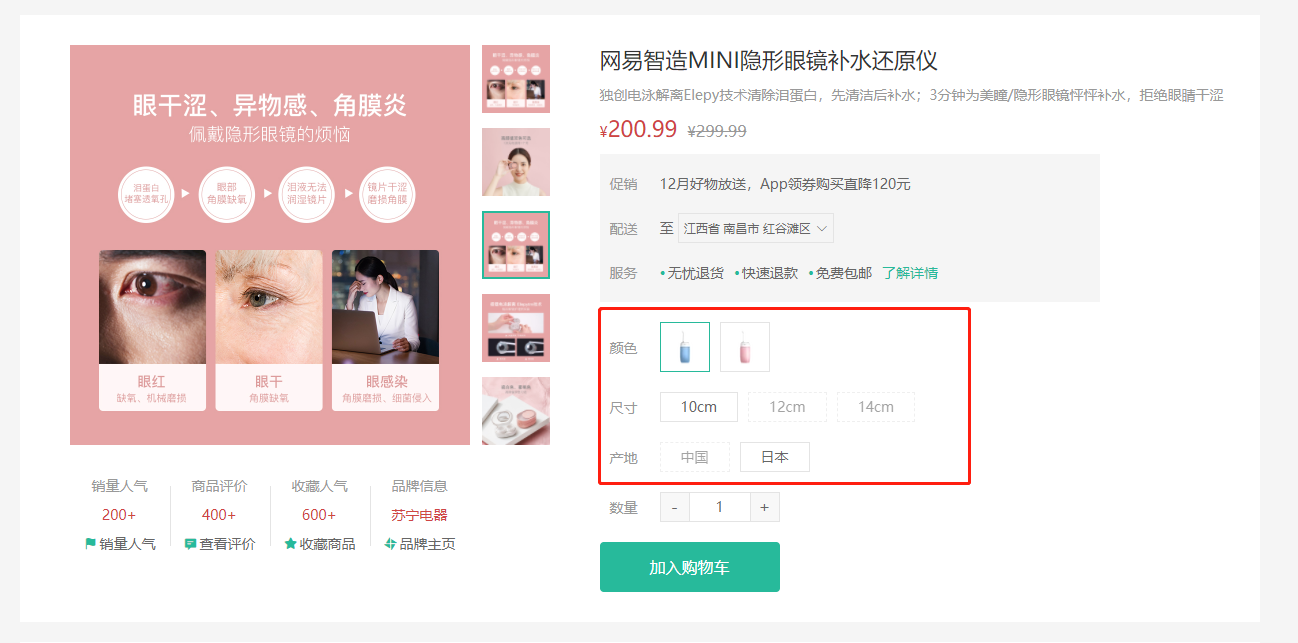
★规格组件-基础结构和样式
目标,完成规格组件的基础布局。
大致步骤:
- 准备组件
- 使用组件
落地代码:
- 组件结构
src/views/goods/components/goods-sku.vue
<template><div class="goods-sku"><dl><dt>颜色</dt><dd><img class="selected" src="https://yanxuan-item.nosdn.127.net/d77c1f9347d06565a05e606bd4f949e0.png" alt=""><img class="disabled" src="https://yanxuan-item.nosdn.127.net/d77c1f9347d06565a05e606bd4f949e0.png" alt=""></dd></dl><dl><dt>尺寸</dt><dd><span class="disabled">10英寸</span><span class="selected">20英寸</span><span>30英寸</span></dd></dl><dl><dt>版本</dt><dd><span>美版</span><span>港版</span></dd></dl></div></template><script>export default {name: 'GoodsSku'}</script><style scoped lang="less">.sku-state-mixin () {border: 1px solid #e4e4e4;margin-right: 10px;cursor: pointer;&.selected {border-color: @xtxColor;}&.disabled {opacity: 0.6;border-style: dashed;cursor: not-allowed;}}.goods-sku {padding-left: 10px;padding-top: 20px;dl {display: flex;padding-bottom: 20px;align-items: center;dt {width: 50px;color: #999;}dd {flex: 1;color: #666;> img {width: 50px;height: 50px;.sku-state-mixin ();}> span {display: inline-block;height: 30px;line-height: 28px;padding: 0 20px;.sku-state-mixin ();}}}}</style>
- 使用组件
src/views/goods/index.vue
+import GoodsSku from './components/goods-sku'name: 'XtxGoodsPage',+ components: { GoodsRelevant, GoodsImage, GoodsSales, GoodsName, GoodsSku },setup () {
<div class="spec"><!-- 名字区组件 --><GoodsName :goods="goods" /><!-- 规格组件 -->+ <GoodsSku /></div>
总结: 每一个按钮拥有
selecteddisabled类名,做 选中 和 禁用 要用。
★规格组件-渲染与选中效果
目的:根据商品信息渲染规格,完成选中,取消选中效果。
大致步骤:
- 依赖
goods.specs渲染规格 绑定按钮点击事件,完成选中和取消选中
- 当前点的是选中,取消即可
- 当前点的未选中,先当前规格按钮全部取消,当前按钮选中。
落的代码:src/views/goods/components/goods-sku.vue
<template><div class="goods-sku"><dl v-for='(item, i) in specs' :key='i'><dt>{{item.name}}</dt><dd><template v-for='(tag, n) in item.values' :key='n'><img :class='{selected: tag.selected}' v-if='tag.picture' :src="tag.picture" alt="" @click='toggle(tag, item.values)'><span :class='{selected: tag.selected}' v-else @click='toggle(tag, item.values)'>{{tag.name}}</span></template></dd></dl></div></template><script>export default {name: 'GoodsSku',props: {// 商品的规格参数specs: {type: Array,default: () => []}},setup () {// 控制当前标签的选中和反选const toggle = (tag, list) => {if (tag.selected) {// 如果有selected属性并且值为true,证明已经选中tag.selected = false} else {// 没有selected属性或者值为false,没有选中// 先把同类标签所有的selected状态设置Wiefalse(取消选中),当前的标签状态设置为选中list.forEach(item => {item.selected = false})tag.selected = true}}return { toggle }}}</script>
总结:
- 动态渲染所有的规格参数:两层遍历
- 控制标签的选中和反选
★规格组件-禁用效果-思路分析
目标:大致了解禁用效果的整体思路,注意只是了解。
大致步骤:
- 根据后台返回的skus数据得到有效sku组合
- 根据有效的sku组合得到所有的子集集合
- 根据子集集合组合成一个路径字典,也就是对象。
- 在组件初始化的时候去判断每个规格是否可以点击
- 在点击规格的时候去判断其他规格是否可点击
- 判断的依据是,拿着所有规格和现在已经选中的规则取搭配,得到可走路径。
- 如果可走路径在字典中,可点击
- 如果可走路径不在字典中,禁用
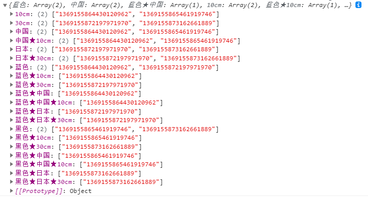
★规格组件-禁用效果-路径字典
目的:根据后台skus数据得到可走路径字典对象
- js算法库 https://github.com/trekhleb/javascript-algorithms
- 幂集算法 https://raw.githubusercontent.com/trekhleb/javascript-algorithms/master/src/algorithms/sets/power-set/bwPowerSet.js
src/vender/power-set.js
/*** Find power-set of a set using BITWISE approach.** @param {*[]} originalSet* @return {*[][]}*/export default function bwPowerSet(originalSet) {const subSets = [];// We will have 2^n possible combinations (where n is a length of original set).// It is because for every element of original set we will decide whether to include// it or not (2 options for each set element).const numberOfCombinations = 2 ** originalSet.length;// Each number in binary representation in a range from 0 to 2^n does exactly what we need:// it shows by its bits (0 or 1) whether to include related element from the set or not.// For example, for the set {1, 2, 3} the binary number of 0b010 would mean that we need to// include only "2" to the current set.for (let combinationIndex = 0; combinationIndex < numberOfCombinations; combinationIndex += 1) {const subSet = [];for (let setElementIndex = 0; setElementIndex < originalSet.length; setElementIndex += 1) {// Decide whether we need to include current element into the subset or not.if (combinationIndex & (1 << setElementIndex)) {subSet.push(originalSet[setElementIndex]);}}// Add current subset to the list of all subsets.subSets.push(subSet);}return subSets;}
src/views/goods/components/goods-sku.vue
import getPowerSet from '@/vender/power-set.js'const spliter = '★'const getPathMap = (originSet) => {// 最终形成的路径字典const result = {}// 遍历所有的sku信息originSet.forEach(sku => {if (sku.inventory === 0) return// 后续处理表示有效SKU// 获取有效的SKU值:[蓝色, 中国, 20cm]const validSku = sku.specs.map(item => item.valueName)// 计算SKU的子集(笛卡尔集)const subset = getPowerSet(validSku)// 遍历subset,生成路径字典subset.forEach(path => {// 排除空集if (path.length === 0) return// 基于子集项目拼接字符串const pathKey = path.join(spliter)if (result[pathKey]) {// 字典已经存在该属性result[pathKey].push(sku.id)} else {// 字典中尚不存在该属性result[pathKey] = [sku.id]}})})return result}
+ setup (props) {+ const pathMap = getPathMap(props.goods.skus)+ console.log(pathMap)
- 参照示例
★规格组件-禁用效果-设置状态
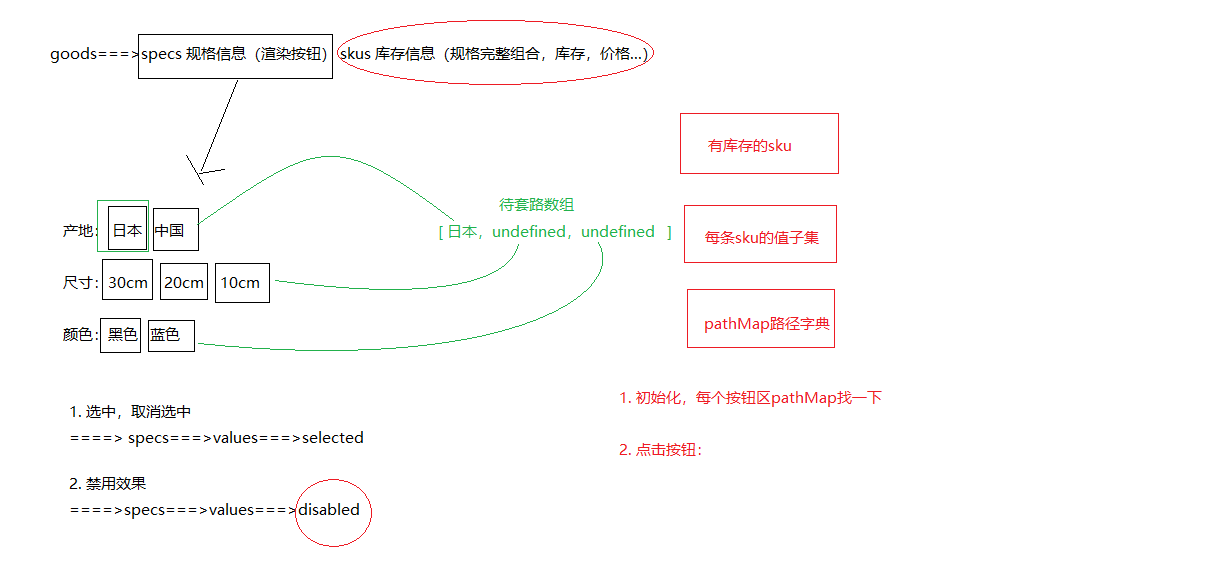
目的:在组件初始化的时候,点击规格的时候,去更新其他按钮的禁用状态。
大致的步骤:
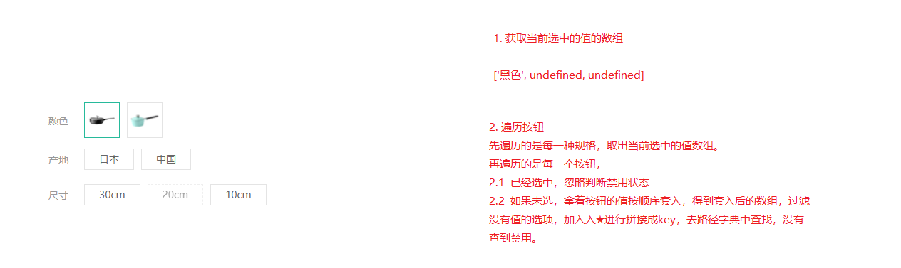
- 再需要更新状态的时候获取当前选中的规格数组
- 遍历所有的规格按钮,拿出按钮的值设置给规格数组,然后得到key
- 拿着key去路径字典中查找,有就可点击,没有禁用即可。
src/views/goods/components/goods-sku.vue
// 获取当前选中的规格数据const getSelectedValue = (specs) => {const result = []specs.forEach((item, i) => {const tagObj = item.values.find(tag => tag.selected)if (tagObj) {// 其中一个选项选中了,存取选中的标签的名称result[i] = tagObj.name} else {// 一个标签也没有选中result[i] = undefined}})return result}
// 控制规格标签是否被禁用const updateDisabledStatus = (specs, pathMap) => {// seletedValues = [undefined, undefined, undefined]specs.forEach((spec, i) => {// 每次规格的遍历,选中的值需要重新初始化const seletedValues = getSelectedValue(specs)spec.values.forEach(tag => {if (tag.selected) {// 标签本身就是选中状态,不需要处理return} else {// 没有选中(初始化时,需要判断当个规格的禁用状态)seletedValues[i] = tag.name}// 此时,需要判断当前的按钮是否应该被禁用// 基于当前选中的值,组合一个路径// 过滤掉undefined值,基于剩余的值组合一个路径let currentPath = seletedValues.filter(item => item)if (currentPath.length > 0) {// 拼接路径字符串 currentPath = 黑色★10cmcurrentPath = currentPath.join(spliter)// 判断当前的路径是否在路径字典中(如果在字典中没有找到该路径,证明当前的标签应该禁用)tag.disabled = !pathMap[currentPath]}// 单独判断单个按钮是否应该禁用// tag.disabled = !pathMap[tag.name]})})}
setup (props) {const pathMap = getPathMap(props.goods.skus)// 组件初始化的时候更新禁用状态+ updateDisabledStatus(props.goods.specs, pathMap)const clickSpecs = (item, val) => {// 如果是禁用状态不作为+ if (val.disabled) return// 1. 选中与取消选中逻辑if (val.selected) {val.selected = false} else {item.values.find(bv => { bv.selected = false })val.selected = true}// 点击的时候更新禁用状态+ updateDisabledStatus(props.goods.specs, pathMap)}return { clickSpecs }}
总结
- 判断初始状态按钮的禁用效果
- 判断点击按钮后,每一个按钮的禁用状态
回顾
- 城市选择组件
- 配置组件的基本结构
- 控制选择城市弹窗的展示和隐藏
- 获取城市列表数据:抽取通用地址,方便维护;添加数据缓存,提高性能。
- 添加加载数据的状态:提升用户体验;配置webpack转换图片base64格式(提高性能)
- 控制城市默认数据的显示:父组件向子组件传递数据
- 控制省市区列表数据的变化:计算属性的使用
- 获取省市区的数据:子组件向父组件传递数据
- 点击弹窗之外关闭弹窗:基于vueuse提供的方法实现
- 商品规格的操作组件
- SPU和SKU的概念的理解
- 商品规格参数选择和禁用状态的验证流程分析
- 准备组件的基本结构
- 控制规格的选中和反选
- 熟悉子集的转换算法:基于第三方封装好的方法计算数组的子集
- 计算规格路径字典
- 封装获取规格值的方法:获取选择的所有规格数据
- 基于选中的规格值,去路径字典中判断是否存在,如果不存在就禁用对应的规格
★规格组件-数据通讯
目的:根据传入的skuId进行默认选中,选择规格后触发change事件传出选择的sku数据。
大致步骤:
- 根据传入的SKUID选中对应规格按钮
选择规格后传递sku信息给父组件
- 完整规格,传 skuId 价格 原价 库存 规格文字
- 不完整的,传 空对象
落的代码:根据传人的sku设置默认选中的规格
src/views/goods/components/goods-sku.vue
skuId: {type: String,default: ''}
// 初始化规格的选中状态(根据skuId)const initSkuSeletedStatus = (skuId, specs, skus) => {// 1、根据SKUId获取对应的sku详细信息const currentSku = skus.find(item => item.id === skuId)// 2、控制currentSku.specs中的规格进行选中specs.forEach(item => {// 3、得到需要选中的规格的值const selectedValue = currentSku.specs.find(skuItem => skuItem.name === item.name).valueName// 4、根据selectedValue控制规格的选中item.values.find(tag => tag.name === selectedValue).selected = true})}
setup (props, { emit }) {const pathMap = getPathMap(props.goods.skus)// 根据传入的skuId默认选中规格按钮+ // 根据SKUId初始化规格的选中状态+ if (props.skuId) {+ initSkuSeletedStatus(props.skuId, props.specs, props.skus)+ }// 组件初始化的时候更新禁用状态updateDisabledStatus(props.goods.specs, pathMap)
总结:根据SKUId中的规格数据控制规格的选中
根据选择的完整sku规格传出sku信息
- 其中传出的specsText是提供给购物车存储使用的。
src/views/goods/components/goods-sku.vue
+ setup (props, { emit }) {
const clickSpecs = (item, val) => {// 如果是禁用状态不作为if (val.disabled) return false// 1. 选中与取消选中逻辑if (val.selected) {val.selected = false} else {item.values.find(bv => { bv.selected = false })val.selected = true}// 点击的时候更新禁用状态updateDisabledStatus(props.goods.specs, pathMap)+ // 获取此时选中的规格的所有的值,传递给父组件+ // 1、如果所有的规格都选择了才是合理的+ // 2、如果有未选的的规格,就不应该得到数据+ const result = getSelectedValue(props.specs)+ if (result.filter(item => item).length === props.specs.length) {+ // 所有的规格都进行了选择+ // 有效数据:skuId,price,oldPrice,inventory,specsText (来源于SKU记录)+ // 根据当前的选中的规格结果,拼接路径字典key+ const pathKey = result.join(spliter)+ // 根据路径获取路径字典中存储的skuId+ const skuId = pathMap[pathKey][0]+ // 根据SKUId获取详细数据+ const sku = props.skus.find(item => item.id === skuId)+ // 拼接specsText数据+ let specsText = ''+ sku.specs.forEach(item => {+ specsText += item.name + ':' + item.valueName + ','+ })+ if (specsText.length > 0) {+ specsText = specsText.substring(0, specsText.length - 1)+ }+ // 组合有效数据+ const specInfo = {+ skuId: skuId,+ price: sku.price,+ oldPrice: sku.oldPrice,+ inventory: sku.inventory,+ specsText: specsText+ }+ emit('sku-info', specInfo)+ } else {+ // 还有规格没有选+ emit('sku-info', {})+ }
src/views/goods/index.vue
<GoodsSku @sku-info='skuInfo' :specs='goodsDetail.specs' :skus='goodsDetail.skus' />
setup () {const goods = useGoods()// sku改变时候触发+ const skuInfo = (sku) => {+ if (sku.skuId) {+ goods.value.price = sku.price+ goods.value.oldPrice = sku.oldPrice+ goods.value.inventory = sku.inventory+ }+ }+ return { goods, changeSku }}
- 基于数组的reduce方法重构拼接字符串的逻辑
let specsText = ['', ...sku.specs].reduce((result, item) => result + item.name + ':' + item.valueName + ',')specsText = specsText.length > 0 && specsText.substring(0, specsText.length - 1)// 组合有效数据const specInfo = {skuId: skuId,price: sku.price,oldPrice: sku.oldPrice,inventory: sku.inventory,specsText: specsText}
总结:数组的reduce方法的基本使用
- 参数一表示什么意思?上一次计算的结果,t的初始值值是数组的第一项数据,后续的值是上一次计算的结果
- 参数二表示arr数组的其中一项数据,从第二项开始
商品详情-数量选择组件
目的:封装一个通用的数量选中组件。
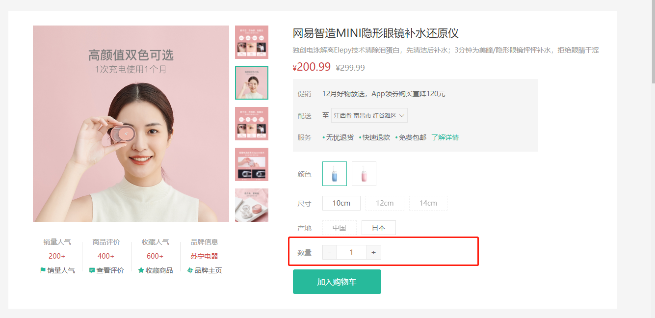
大致功能分析:
- 默认值为1
- 可限制最大最小值
- 点击-就是减1 点击+就是加1
- 需要完成v-model得实现
- 存在无label情况
基础布局代码:src/components/library/xtx-numbox.vue
<template><div class="xtx-numbox"><div class="label">数量</div><div class="numbox"><a href="javascript:;">-</a><input type="text" readonly value="1"><a href="javascript:;">+</a></div></div></template><script>export default {name: 'XtxNumbox'}</script><style scoped lang="less">.xtx-numbox {display: flex;align-items: center;.label {width: 60px;color: #999;padding-left: 10px;}.numbox {width: 120px;height: 30px;border: 1px solid #e4e4e4;display: flex;> a {width: 29px;line-height: 28px;text-align: center;background: #f8f8f8;font-size: 16px;color: #666;&:first-of-type {border-right:1px solid #e4e4e4;}&:last-of-type {border-left:1px solid #e4e4e4;}}> input {width: 60px;padding: 0 5px;text-align: center;color: #666;}}}</style>
逻辑功能实现:
src/components/library/xtx-numbox.vue
<script>import { useVModel } from '@vueuse/core'export default {name: 'XtxNumbox',props: {label: {type: String,default: ''},modelValue: {type: Number,default: 1},min: {type: Number,default: 1},max: {type: Number,required: true}},setup (props, { emit }) {const n = useVModel(props, 'modelValue', emit)// 控制商品数量变更const toggle = (step) => {let num = props.modelValue + stepif (num <= 1) {// 控制最小值num = 1} else if (num >= props.max) {// 控制最大值num = props.max}// emit('update:modelValue', num)n.value = num}return { toggle, n }}}</script>
src/views/goods/index.vue
<XtxNumbox v-model='num' label='数量' :max='goodsDetail.inventory' />
// 选择的数量+ const num = ref(1)+ return { toggle, n, num }
总结:
- 父向子传递数据
- 子向父传递数据
- 基于第三方vueuse提供的方法useVModel优化父子之间的数据传递
商品详情-按钮组件
目的:封装一个通用按钮组件,有大、中、小、超小四种尺寸,有默认、主要、次要、灰色四种类型。
大致步骤:
- 完成组件基本结构
- 介绍各个参数的使用
- 测试按钮组件
落地代码:
- 封装组件:
src/components/library/xtx-button.vue
<template><button class="xtx-button ellipsis" :class="[size,type]"><slot /></button></template><script>export default {name: 'XtxButton',props: {size: {type: String,default: 'middle'},type: {type: String,default: 'default'}}}</script><style scoped lang="less">.xtx-button {appearance: none;border: none;outline: none;background: #fff;text-align: center;border: 1px solid transparent;border-radius: 4px;cursor: pointer;}.large {width: 240px;height: 50px;font-size: 16px;}.middle {width: 180px;height: 50px;font-size: 16px;}.small {width: 100px;height: 32px;font-size: 14px;}.mini {width: 60px;height: 32px;font-size: 14px;}.default {border-color: #e4e4e4;color: #666;}.primary {border-color: @xtxColor;background: @xtxColor;color: #fff;}.plain {border-color: @xtxColor;color: @xtxColor;background: lighten(@xtxColor,50%);}.gray {border-color: #ccc;background: #ccc;;color: #fff;}</style>
- 使用组件:
src/views/goods/index.vue
<div class="spec"><GoodsName :goods="goods"/><GoodsSku :goods="goods" @change="changeSku"/><XtxNumbox label="数量" v-model="num" :max="goods.inventory"/>+ <XtxButton type="primary" style="margin-top:20px;">加入购物车</XtxButton></div>
总结:封装通用的按钮组件,抽取尺寸和样式属性;基于默认插槽定制按钮文字。
商品详情-同类推荐组件
目的:实现商品的同类推荐与猜你喜欢展示功能。
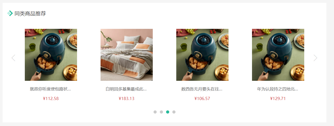
大致功能需求:
- 完成基础布局(头部),后期改造xtx-carousel.vue组件来展示商品效果。
- 然后可以通过是否传入商品ID来区别同类推荐和猜你喜欢。
落的代码开始:
- 基础布局
src/views/goods/components/goods-relevant.vue
<template><div class="goods-relevant"><div class="header"><i class="icon" /><span class="title">同类商品推荐</span></div><!-- 此处使用改造后的xtx-carousel.vue --></div></template><script>export default {// 同类推荐,猜你喜欢name: 'GoodsRelevant'}</script><style scoped lang='less'>.goods-relevant {background: #fff;min-height: 460px;margin-top: 20px;.header {height: 80px;line-height: 80px;padding: 0 20px;.title {font-size: 20px;padding-left: 10px;}.icon {width: 16px;height: 16px;display: inline-block;border-top: 4px solid @xtxColor;border-right: 4px solid @xtxColor;box-sizing: border-box;position: relative;transform: rotate(45deg);&::before {content: "";width: 10px;height: 10px;position: absolute;left: 0;top: 2px;background: lighten(@xtxColor, 40%);}}}}</style>
- 获取数据传入xtx-carousel.vue组件
src/views/goods/index.vue传ID
<!-- 商品推荐 --><GoodsRelevant :goodsId="goodsDetail.id"/>
- 定义获取数据的API
src/api/goods.js
/*** 获取商品同类推荐-未传入ID为猜喜欢* @param {String} id - 商品ID* @param {Number} limit - 获取条数*/export const findRelGoods = (id, limit = 16) => {return request({method: 'get',url: '/goods/relevant',data: { id, limit }})}
- 获取数据
src/views/goods/components/goods-relevant.vue
<div class="header"><i class="icon" />+ <span class="title">{{goodsId?'同类商品推荐':'猜你喜欢'}}</span></div>
<script>import { findRelGoods } from '@/api/product.js'import { ref } from 'vue'const useGoodsList = (goodsId) => {const list = ref([])findRelGoods(goodsId).then(data => {// list.value = data.result// 原始的数据data.result一共16条数据// 现在需要每页显示4条const pageSize = 4// 计算出总页数const perPageNum = Math.ceil(data.result.length / pageSize)// 对原始数据数据进行分页处理for (let i = 0; i < perPageNum; i++) {// 每一页的数据const pageArr = data.result.slice(i * pageSize, (i + 1) * pageSize)list.value.push(pageArr)}})return list}export default {// 同类推荐,猜你喜欢name: 'GoodsRelevant',props: {goodsId: {type: String,required: true}},setup (props) {// list = [[], [], [], []]const list = useGoodsList(props.goodsId)return { list }}}</script>
<!-- 此处使用改造后的xtx-carousel.vue --><XtxCarousel :slides="list" style="height:380px" auto-play />
- 改造xtx-carousel.vue组件
src/components/library/xtx-carousel.vue
+ <RouterLink v-if="item.hrefUrl" :to="item.hrefUrl"><img :src="item.imgUrl" alt=""></RouterLink>+ <div v-else class="slider">+ <RouterLink v-for="goods in item" :key="goods.id" :to="`/product/${goods.id}`">+ <img :src="goods.picture" alt="">+ <p class="name ellipsis">{{goods.name}}</p>+ <p class="price">¥{{goods.price}}</p>+ </RouterLink>
// 轮播商品.slider {display: flex;justify-content: space-around;padding: 0 40px;> a {width: 240px;text-align: center;img {padding: 20px;width: 230px!important;height: 230px!important;}.name {font-size: 16px;color: #666;padding: 0 40px;}.price {font-size: 16px;color: @priceColor;margin-top: 15px;}}}
- 覆盖xtx-carousel.vue的样式在
src/views/goods/components/goods-relevant.vue
:deep(.xtx-carousel) {height: 380px;.carousel {&-indicator {bottom: 30px;span {&.active {background: @xtxColor;}}}&-btn {top: 110px;opacity: 1;background: rgba(0,0,0,0);color: #ddd;i {font-size: 30px;}}}}
注意:vue3.0使用深度作用选择器写法
:deep(选择器)
商品详情-标签页组件
目的:实现商品详情组件和商品评价组件的切换
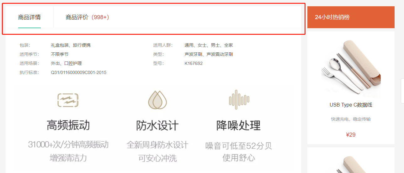
大致步骤:
- 完成基础的tab的导航布局
- 完成tab标签页的切换样式效果
- 使用动态组件完成可切换 详情 和 评论 组件
落的代码:
- 标签页基础布局
src/vies/goods/components/goods-tabs.vue
<div class="goods-tabs"><nav><a class="active" href="javascript:;">商品详情</a><a href="javascript:;">商品评价<span>(500+)</span></a></nav><!-- 切换内容的地方 --></div>
.goods-tabs {min-height: 600px;background: #fff;nav {height: 70px;line-height: 70px;display: flex;border-bottom: 1px solid #f5f5f5;a {padding: 0 40px;font-size: 18px;position: relative;> span {color: @priceColor;font-size: 16px;margin-left: 10px;}&:first-child {border-right: 1px solid #f5f5f5;}&.active {&::before {content: "";position: absolute;left: 40px;bottom: -1px;width: 72px;height: 2px;background: @xtxColor;}}}}}
- tabs组件切换
src/vies/goods/components/goods-tabs.vue
<template><div class="goods-tabs"><nav><a @click='toggle("GoodsDetail")' :class="{active: componentName === 'GoodsDetail'}" href="javascript:;">商品详情</a><a @click='toggle("GoodsComment")' :class="{active: componentName === 'GoodsComment'}" href="javascript:;">商品评价<span>(500+)</span></a></nav><!-- 切换内容的地方 --><!-- <GoodsDetail v-if='currentIndex === 0'/> --><!-- <GoodsComment v-if='currentIndex === 1'/> --><!-- 基于动态组件控制组件的切换 --><component :is='componentName'></component></div></template><script>import GoodsDetail from './goods-detail.vue'import GoodsComment from './goods-comment.vue'import { ref } from 'vue'export default {name: 'GoodsTabs',components: { GoodsDetail, GoodsComment },setup () {// 当前组件的名称const componentName = ref('GoodsDetail')const toggle = (name) => {componentName.value = name}return { toggle, componentName }}}</script>
- 使用tabs组件
src/views/goods/index.vue
+import GoodsTabs from './components/goods-tabs'// ... 省略export default {name: 'XtxGoodsPage',+ components: { GoodsRelevant, GoodsImage, GoodsSales, GoodsName, GoodsSku, GoodsTabs },setup () {
<div class="goods-article"><!-- 商品+评价 -->+ <GoodsTabs :goods="goods" /><!-- 注意事项 --><div class="goods-warn"></div></div>
-.goods-tabs {- min-height: 600px;- background: #fff;-}
- 定义详情组件,
src/vies/goods/components/goods-detail.vue
<template><div class="goods-detail">详情</div></template><script>export default {name: 'GoodsDetail'}</script><style scoped lang="less"></style>
- 定义评价组件。
src/vies/goods/components/goods-comment.vue
<template><div class="goods-comment">评价</div></template><script>export default {name: 'GoodsComment'}</script><style scoped lang="less"></style>
总结:
- 封装Tab选项卡组件并实现切换功能
- 基于动态组件实现组件的切换
商品详情-热榜组件
目的:展示24小时热榜商品,和周热榜商品。
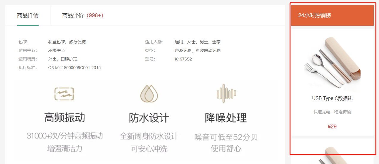
大致步骤:
- 定义一个组件,完成多个组件展现型态,根据传入组件的类型决定。
- 1代表24小时热销榜 2代表周热销榜 3代表总热销榜
- 获取数据,完成商品展示和标题样式的设置。
落的代码:
- 定义组件
src/views/goods/components/goods-hot.vue
<template><div class="goods-hot"><h3>{{title}}</h3></div></template><script>import { computed } from 'vue'export default {name: 'GoodsHot',props: {type: {type: Number,default: 1}},setup (props) {const titleObj = { 1: '24小时热销榜', 2: '周热销榜', 3: '总热销榜' }const title = computed(() => {return titleObj[props.type]})return { title }}}</script><style scoped lang="less"></style>
- 使用组件
src/views/goods/index.vue
+import GoodsHot from './components/goods-hot'// ... 省略name: 'XtxGoodsPage',+ components: { GoodsRelevant, GoodsImage, GoodsSales, GoodsName, GoodsSku, GoodsTabs, GoodsHot },setup () {
<!-- 24热榜+专题推荐 --><div class="goods-aside"><GoodsHot :goodsId="goods.id" :type="1" /><GoodsHot :goodsId="goods.id" :type="2" /></div>
- 获取数据,设置组件样式
src/api/goods.js
/*** 获取热榜商品* @param {Number} type - 1代表24小时热销榜 2代表周热销榜 3代表总热销榜* @param {Number} limit - 获取个数*/export const findHotGoods = ({id,type, limit = 3}) => {return request({method: 'get',url: '/goods/hot',data: {id, type, limit }})}
src/views/goods/components/goot-hot.vue
import { computed, ref } from 'vue'import GoodsItem from '../../category/components/goods-item'import { findHotGoods } from '@/api/goods'export default {name: 'GoodsHot',props: {type: {type: Number,default: 1},goodsId: {type: String}},components: { GoodsItem },setup (props) {// 处理标题const titleObj = { 1: '24小时热销榜', 2: '周热销榜', 3: '总热销榜' }const title = computed(() => {return titleObj[props.type]})// 商品列表const goodsList = ref([])findHotGoods({ id: props.goodsId, type: props.type }).then(data => {goodsList.value = data.result.map(item => {item.tag = item.descreturn item})})return { title, goodsList }}}
<template><div class="goods-hot"><h3>{{title}}</h3><div v-if="list"><GoodsItem v-for="item in list" :key="item.id" :info="item"/></div></div></template>
.goods-hot {h3 {height: 70px;background: @helpColor;color: #fff;font-size: 18px;line-height: 70px;padding-left: 25px;margin-bottom: 10px;font-weight: normal;}::v-deep .goods-item {background: #fff;width: 100%;margin-bottom: 10px;img {width: 200px;height: 200px;}p {margin: 0 10px;}&:hover {transform: none;box-shadow: none;}}}
总结:抽取组件时,需要定制变化的数据作为属性,计算属性的使用。
商品详情-详情组件
目的:展示商品属性和商品详情。
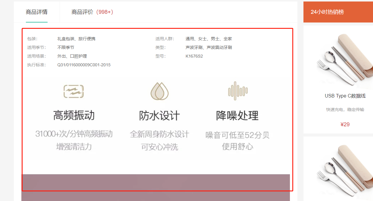
大致步骤:
- 完成基础布局,主要是属性,详情是图片。
goods/index.vue提供goods数据,子孙组件注入goods数据,渲染展示即可。
落的代码:
- 传递goods数据
src/views/goods/index.vuesetup中提供数据
provide('goods', goodsDetail)
- 使用goods数据,展示评价数量
src/views/goods/components/goods-tabs.vue
setup () {const goods = inject('goods')return { goods }},
+ >商品评价<span>({{goods.commentCount}})</span></a
- 使用goods数据,展示商品详情
src/views/goods/components/goods-detail.vue
<template><div class="goods-detail"><!-- 属性 --><ul class="attrs"><li v-for="item in goods.details.properties" :key="item.value"><span class="dt">{{item.name}}</span><span class="dd">{{item.value}}</span></li></ul><!-- 图片 --><img v-for="item in goods.details.pictures" :key="item" :src="item" alt=""></div></template><script>import { inject } from 'vue'export default {name: 'GoodsDetail',setup () {const goods = inject('goods')return { goods }}}</script><style scoped lang="less">.goods-detail {padding: 40px;.attrs {display: flex;flex-wrap: wrap;margin-bottom: 30px;li {display: flex;margin-bottom: 10px;width: 50%;.dt {width: 100px;color: #999;}.dd {flex: 1;color: #666;}}}> img {width: 100%;}}</style>
总结:
- 父组件向孙子组件传递数据:provide提供数据,inject接收数据
商品详情-注意事项组件
目的:展示购买商品的注意事项。
- 商品详情首页
src/views/goods/index.vue
+import GoodsWarn from './components/goods-warn'
name: 'XtxGoodsPage',+ components: { GoodsRelevant, GoodsImage, GoodsSales, GoodsName, GoodsSku, GoodsTabs, GoodsHot, GoodsWarn },setup () {
<!-- 注意事项 -->+ <GoodsWarn />
- 注意事项组件
src/views/goods/components/goods-warn.vue
<template><!-- 注意事项 --><div class="goods-warn"><h3>注意事项</h3><p class="tit">• 购买运费如何收取?</p><p>单笔订单金额(不含运费)满88元免邮费;不满88元,每单收取10元运费。(港澳台地区需满500元免邮费;不满500元,每单收取30元运费)</p><br /><p class="tit">• 使用什么快递发货?</p><p>默认使用顺丰快递发货(个别商品使用其他快递)</p><p>配送范围覆盖全国大部分地区(港澳台地区除外)</p><br /><p class="tit">• 如何申请退货?</p><p>1.自收到商品之日起30日内,顾客可申请无忧退货,退款将原路返还,不同的银行处理时间不同,预计1-5个工作日到账;</p><p>2.内裤和食品等特殊商品无质量问题不支持退货;</p><p>3.退货流程:确认收货-申请退货-客服审核通过-用户寄回商品-仓库签收验货-退款审核-退款完成;</p><p>4.因小兔鲜儿产生的退货,如质量问题,退货邮费由小兔鲜儿承担,退款完成后会以现金券的形式报销。因客户个人原因产生的退货,购买和寄回运费由客户个人承担。</p></div></template><style lang="less" scoped>.goods-warn {margin-top: 20px;background: #fff;padding-bottom: 40px;h3 {height: 70px;line-height: 70px;border-bottom: 1px solid #f5f5f5;padding-left: 50px;font-size: 18px;font-weight: normal;margin-bottom: 10px;}p {line-height: 40px;padding: 0 25px;color: #666;&.tit {color: #333;}}}</style>
回顾
- 规格组件
- 根据SKUID控制标签规格的选中状态
- 获取选中的规格数据
- 熟悉数组的reduce方法
- 控制商品数量组件
- 控制数量的加和减:父子组件之间的数据交互
- 基于Vueuse提供的方法简化父子组件的交互
- 按钮组件
- 实现通用的按钮组件:父组件向子组件传值
- 相关推荐组件
- 基于之前封装的轮播图效果进行定制
- 不要修改通用的组件样式,而是根据需求定制组件样式
- 标签页组件
- 控制Tab的切换:基于动态组件方式实现
- 商品详情组件
- 动态渲染动态的熟悉和相关的图片
- 注意事项组件
- 添加一个布局组件
- 商品评论组件
- 准备基本布局,获取接口数据
- 基于mock的接口获取数据
- 基于axios调用接口,如果请求地址以http等标准的协议开头,不会拼接基准路径
商品详情-评价组件-头部渲染
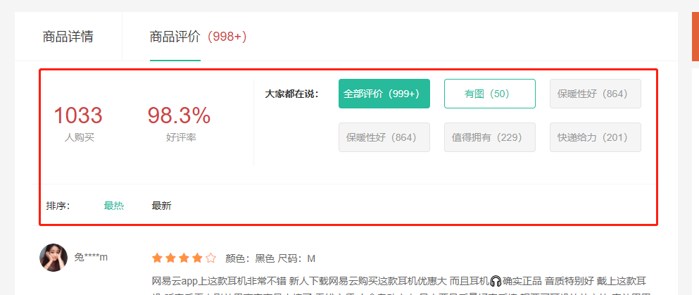
目的:根据后台返回的评价信息渲染评价头部内容。
大致步骤:
- 完成静态布局
- 定义API接口
- 获取数据,处理完毕,提供给模版
- 渲染模版
落的代码:
- 布局
src/views/goods/components/goods-comment.vue
<template><div class="goods-comment"><div class="head"><div class="data"><p><span>100</span><span>人购买</span></p><p><span>99.99%</span><span>好评率</span></p></div><div class="tags"><div class="dt">大家都在说:</div><div class="dd"><a href="javascript:;" class="active">全部评价(1000)</a><a href="javascript:;">好吃(1000)</a><a href="javascript:;">便宜(1000)</a><a href="javascript:;">很好(1000)</a><a href="javascript:;">再来一次(1000)</a><a href="javascript:;">快递棒(1000)</a></div></div></div><div class="sort"><span>排序:</span><a href="javascript:;" class="active">默认</a><a href="javascript:;">最新</a><a href="javascript:;">最热</a></div><div class="list"></div></div></template><script>export default {name: 'GoodsComment'}</script><style scoped lang="less">.goods-comment {.head {display: flex;padding: 30px 0;.data {width: 340px;display: flex;padding: 20px;p {flex: 1;text-align: center;span {display: block;&:first-child {font-size: 32px;color: @priceColor;}&:last-child {color: #999;}}}}.tags {flex: 1;display: flex;border-left: 1px solid #f5f5f5;.dt {font-weight: bold;width: 100px;text-align: right;line-height: 42px;}.dd {flex: 1;display: flex;flex-wrap: wrap;> a {width: 132px;height: 42px;margin-left: 20px;margin-bottom: 20px;border-radius: 4px;border: 1px solid #e4e4e4;background: #f5f5f5;color: #999;text-align: center;line-height: 40px;&:hover {border-color: @xtxColor;background: lighten(@xtxColor,50%);color: @xtxColor;}&.active {border-color: @xtxColor;background: @xtxColor;color: #fff;}}}}}.sort {height: 60px;line-height: 60px;border-top: 1px solid #f5f5f5;border-bottom: 1px solid #f5f5f5;margin: 0 20px;color: #666;> span {margin-left: 20px;}> a {margin-left: 30px;&.active,&:hover {color: @xtxColor;}}}}</style>
- 接口
src/api/goods.js
/*** 获取商品的评价统计信息* @param {String} id - 商品ID*/// 获取商品的评论的统计数据export const findCommentInfoByGoods = (id) => {// return request({method: 'get',url: '`/goods/${id}/evaluate`'})return request({method: 'get',// 当请求地址是http或者是https等标准协议时,那么axios基准路径不会再次拼接// 评论数据没有正式的接口,如下的地址是模拟的假数据url: `https://mock.boxuegu.com/mock/1175/goods/${id}/evaluate`})}// https://mock.boxuegu.com/mock/1175/goods/${id}/evaluate
- 获取数据,处理数据
src/views/goods/components/goods-comment.vue
import { findCommentInfoByGoods } from '@/api/goods'import { ref } from 'vue'const getCommentInfo = (props) => {const commentInfo = ref(null)findCommentInfoByGoods(props.goods.id).then(data => {// type 的目的是将来点击可以区分点的是不是标签data.result.tags.unshift({ type: 'img', title: '有图', tagCount: data.result.hasPictureCount })data.result.tags.unshift({ type: 'all', title: '全部评价', tagCount: data.result.evaluateCount })commentInfo.value = data.result})return commentInfo}export default {name: 'GoodsComment',props: {goods: {type: Object,default: () => {}}},setup (props) {const commentInfo = getCommentInfo(props)return { commentInfo }}}
- 渲染模版 + tag选中效果
src/views/goods/components/goods-comment.vue
<template><div class="goods-comment"><div class="head" v-if='commentInfo'><div class="data"><p><span>{{commentInfo.salesCount}}</span><span>人购买</span></p><p><span>{{commentInfo.praisePercent}}</span><span>好评率</span></p></div><div class="tags"><div class="dt">大家都在说:</div><div class="dd"><a href="javascript:;" :class='{active: currentIndex === i}' v-for='(item, i) in commentInfo.tags' :key='i' @click='currentIndex = i'>{{item.title}}({{item.tagCount}})</a></div></div></div><div class="sort"><span>排序:</span><a href="javascript:;" class="active">默认</a><a href="javascript:;">最新</a><a href="javascript:;">最热</a></div><div class="list"></div></div></template><script>
<script>import { ref, inject } from 'vue'import { findCommentInfoByGoods } from '@/api/product.js'export default {name: 'GoodsComment',setup () {// 当前选中的标签的索引const currentIndex = ref(0)// 商品详情数据const goods = inject('goods')// 评论配置信息const commentInfo = ref(null)findCommentInfoByGoods(goods.id).then(data => {// 手动添加两个选项data.result.tags.unshift({title: '有图',tagCount: data.result.hasPictureCount})data.result.tags.unshift({title: '全部评价',tagCount: data.result.evaluateCount})commentInfo.value = data.result})return { commentInfo, currentIndex }}}</script>
总结:
- 调用接口获取数据,渲染动态标签
- 控制标签选中的切换操作
商品详情-评价组件-实现列表
目的:完成列表渲染,筛选和排序。
大致步骤:
- 列表基础布局
- 筛选条件数据准备
- 何时去获取数据?
- 组件初始化
- 点标签
- 点排序
- 渲染列表
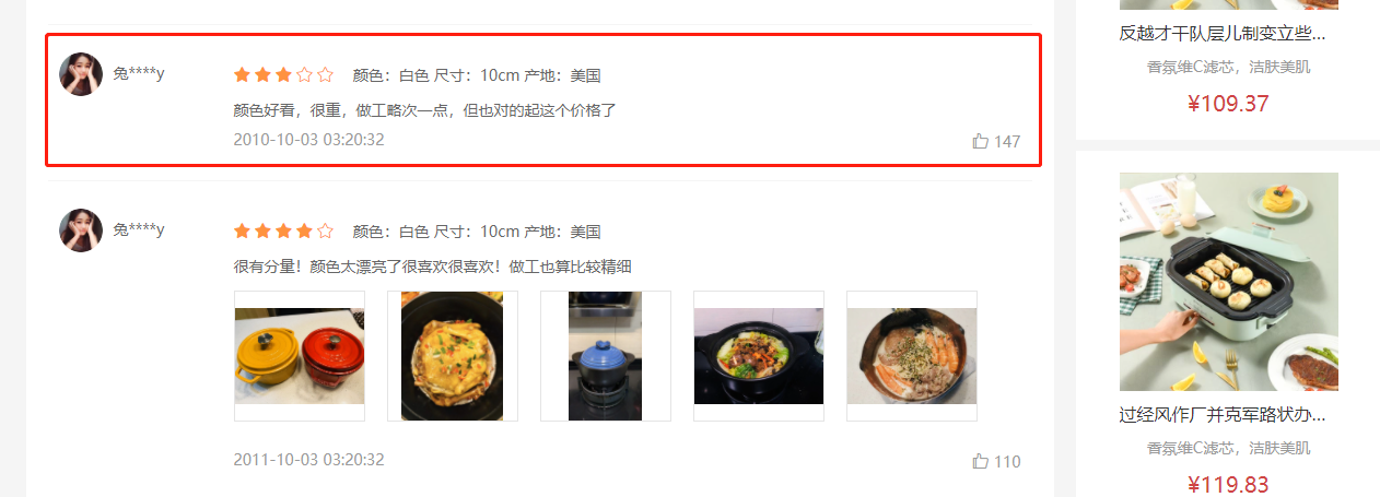
落地代码:
- 列表基础布局
<!-- 列表 --><div class="list"><div class="item"><div class="user"><img src="http://zhoushugang.gitee.io/erabbit-client-pc-static/uploads/avatar_1.png" alt=""><span>兔****m</span></div><div class="body"><div class="score"><i class="iconfont icon-wjx01"></i><i class="iconfont icon-wjx01"></i><i class="iconfont icon-wjx01"></i><i class="iconfont icon-wjx01"></i><i class="iconfont icon-wjx02"></i><span class="attr">颜色:黑色 尺码:M</span></div><div class="text">网易云app上这款耳机非常不错 新人下载网易云购买这款耳机优惠大 而且耳机🎧确实正品 音质特别好 戴上这款耳机 听音乐看电影效果声音真是太棒了 无线方便 小盒自动充电 最主要是质量好音质棒 想要买耳机的放心拍 音效巴巴滴 老棒了</div><div class="time"><span>2020-10-10 10:11:22</span><span class="zan"><i class="iconfont icon-dianzan"></i>100</span></div></div></div></div>
.list {padding: 0 20px;.item {display: flex;padding: 25px 10px;border-bottom: 1px solid #f5f5f5;.user {width: 160px;img {width: 40px;height: 40px;border-radius: 50%;overflow: hidden;}span {padding-left: 10px;color: #666;}}.body {flex: 1;.score {line-height: 40px;.iconfont {color: #ff9240;padding-right: 3px;}.attr {padding-left: 10px;color: #666;}}}.text {color: #666;line-height: 24px;}.time {color: #999;display: flex;justify-content: space-between;margin-top: 5px;}}}
- 筛选条件数据准备:定义筛选条件
// 筛选条件准备const reqParams = reactive({page: 1,pageSize: 10,hasPicture: null,tag: null,sortField: null})
- 封装获取评论列表数据的接口方法
// 获取评论列表数据export const findCommentListByGoods = (id, data) => {return request({method: 'get',url: `${mockBaseUrl}/1175/goods/${id}/evaluate/page`,data})}
- 获取评论列表数据
import { ref, inject, reactive } from 'vue'import { findCommentInfoByGoods, findCommentListByGoods } from '@/api/product.js'const useCommentList = (id, params) => {const list = ref([])findCommentListByGoods(id, params).then(data => {list.value = data.result})return list}
setup () {// 获取评论的列表数据const list = useCommentList(goods.value.id, reqParams)}
- 评论列表模板渲染
<!-- 列表 --><div class="list"><div class="item" v-for='item in list.items' :key='item.id'><div class="user"><img :src="item.member.avatar" alt=""><span>{{item.member.nickname}}</span></div><div class="body"><div class="score"><i class="iconfont icon-wjx01" v-for='star in item.score' :key='star'></i><i class="iconfont icon-wjx02" v-for='star in 5 - item.score' :key='star'></i><span class="attr">{{item.orderInfo.specs.reduce((ret, item) => `${ret} ${item.name}:${item.nameValue}`, '')}}</span></div><div class="text">{{item.content}}</div><div class="time"><span>{{item.createTime}}</span><span class="zan"><i class="iconfont icon-dianzan"></i>{{item.praiseCount}}</span></div></div></div></div>
- 收集排序条件
<!-- 排序 --><div class="sort"><span>排序:</span><a@click="changeSort(null)"href="javascript:;":class="{active:reqParams.sortField===null}">默认</a><a@click="changeSort('praiseCount')"href="javascript:;":class="{active:reqParams.sortField==='praiseCount'}">最热</a><a@click="changeSort('createTime')"href="javascript:;":class="{active:reqParams.sortField==='createTime'}">最新</a></div>
// 改变排序const changeSort = (type) => {reqParams.sortField = typereqParams.page = 1}
- 收集标签和是否有图条件
const changeTag = (i) => {// 选中索引currentIndex.value = i// 获取标签数据对象const tag = commentInfo.value.tags[i]if (tag.type === 'all') {// 全部评价reqParams.hasPicture = nullreqParams.tag = nullreqParams.sortField = null} else if (tag.type === 'img') {// 是否有图reqParams.hasPicture = truereqParams.tag = null} else {// 后续的四个标签reqParams.tag = tag.titlereqParams.hasPicture = false}// 重置页码reqParams.page = 1}
- 监听条件的变化(当组件初始化的时候,筛选条件改变的时候)
// 侦听排序和标签的参数变化const list = ref([])watch(reqParams, () => {// useCommentList(goods.value.id, reqParams, list)findCommentListByGoods(goods.id, reqParams).then(data => {list.value = data.result})}, {immediate: true})
- 渲染模版:处理数据,昵称加*号,规格拼接字符串。
// 定义转换数据的函数(对应vue2.0的过滤器)const formatSpecs = (specs) => {return specs.reduce((p, c) => `${p} ${c.name}:${c.nameValue}`, '').trim()}const formatNickname = (nickname) => {return nickname.substr(0, 1) + '****' + nickname.substr(-1)}
总结:
- 调用接口获取评论基本配置信息和类别数据
- 支持条件筛选
商品详情-评价组件-图片预览
目的:封装一个组件展示 图片列表 和 预览图片 功能。
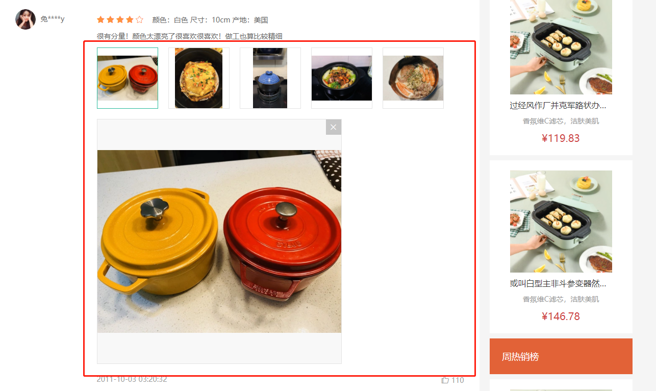
大致步骤:
- 准备一个组件导入goods-comment.vue使用起来,传入图片数据
- 展示图片列表,和选中图片功能。
- 提供图片预览功能和关闭图片预览。
落的代码:
- 展示图片列表和选中效果实现
src/views/goods/goods-comment-image.vue
<template><div class="goods-comment-image"><div class="list"><ahref="javascript:;":class="{active:currImage===url}"@click="currImage=url"v-for="url in pictures":key="url"><img :src="url" alt=""></a></div><div class="preview"></div></div></template><script>import { ref } from 'vue'export default {name: 'GoodsCommentImage',props: {pictures: {type: Array,default: () => []}},setup () {const currImage = ref(null)return { currImage }}}</script><style scoped lang="less">.goods-comment-image {.list {display: flex;flex-wrap: wrap;margin-top: 10px;a {width: 120px;height: 120px;border:1px solid #e4e4e4;margin-right: 20px;margin-bottom: 10px;img {width: 100%;height: 100%;object-fit: contain;}&.active {border-color: @xtxColor;}}}}</style>
src/views/goods/goods-comment.vue
+import GoodsCommentImage from './goods-comment-image'// ...export default {name: 'GoodsComment',+ components: { GoodsCommentImage },props: {
<div class="text">{{item.content}}</div><!-- 使用图片预览组件 -->+ <GoodsCommentImage v-if="item.pictures.length" :pictures="item.pictures" /><div class="time">
- 实现预览图片和关闭预览
<div class="preview" v-if="currImage"><img :src="currImage" alt=""><i @click="currImage=null" class="iconfont icon-close-new"></i></div>
.preview {width: 480px;height: 480px;border: 1px solid #e4e4e4;background: #f8f8f8;margin-bottom: 20px;position: relative;img {width: 100%;height: 100%;object-fit: contain;}i {position: absolute;right: 0;top: 0;width: 30px;height: 30px;background: rgba(0,0,0,0.2);color: #fff;text-align: center;line-height: 30px;}}
商品详情-评价组件-★分页组件
目的:封装一个统一的分页组件。

大致步骤:
- 分页基础布局,依赖数据分析。
- 分页内部逻辑,完成切换效果。
- 接收外部数据,提供分页事件。
落的代码:
- 分页基础布局,依赖数据分析
src/components/library/xtx-pagination.vue
<template><div class="xtx-pagination"><a href="javascript:;" class="disabled">上一页</a><span>...</span><a href="javascript:;" class="active">3</a><a href="javascript:;">4</a><a href="javascript:;">5</a><a href="javascript:;">6</a><a href="javascript:;">7</a><span>...</span><a href="javascript:;">下一页</a></div></template><script>export default {name: 'XtxPagination'}</script><style scoped lang="less">.xtx-pagination {display: flex;justify-content: center;padding: 30px;> a {display: inline-block;padding: 5px 10px;border: 1px solid #e4e4e4;border-radius: 4px;margin-right: 10px;&:hover {color: @xtxColor;}&.active {background: @xtxColor;color: #fff;border-color: @xtxColor;}&.disabled {cursor: not-allowed;opacity: 0.4;&:hover {color: #333}}}> span {margin-right: 10px;}}</style>
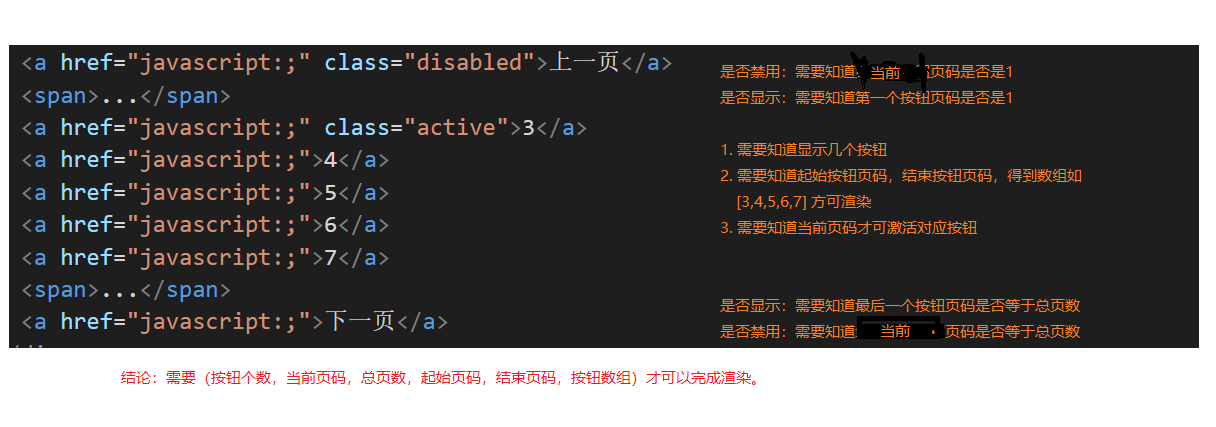
- 分页内部逻辑,完成切换效果
src/components/library/xtx-pagination.vue
1)准备渲染数据
setup () {// 总条数const myTotal = ref(100)// 每页条数const myPageSize = ref(10)// 当前第几页const myCurrentPage = ref(1)// 按钮个数const btnCount = 5// 重点:根据上述数据得到(总页数,起始页码,结束页码,按钮数组)const pager = computed(() => {// 计算总页数const pageCount = Math.ceil(myTotal.value / myPageSize.value)// 计算起始页码和结束页码// 1. 理想情况根据当前页码,和按钮个数可得到let start = myCurrentPage.value - Math.floor(btnCount / 2)let end = start + btnCount - 1// 2.1 如果起始页码小于1了,需要重新计算if (start < 1) {start = 1end = (start + btnCount - 1) > pageCount ? pageCount : (start + btnCount - 1)}// 2.2 如果结束页码大于总页数,需要重新计算if (end > pageCount) {end = pageCountstart = (end - btnCount + 1) < 1 ? 1 : (end - btnCount + 1)}// 处理完毕start和end得到按钮数组const btnArr = []for (let i = start; i <= end; i++) {btnArr.push(i)}return { pageCount, start, end, btnArr }})return { pager, myCurrentPage}}
2)进行渲染
<a v-if="myCurrentPage<=1" href="javascript:;" class="disabled">上一页</a><a v-else href="javascript:;">上一页</a><span v-if="pager.start>1">...</span><a href="javascript:;" :class="{active:i===myCurrentPage}" v-for="i in pager.btnArr" :key="i">{{i}}</a><span v-if="pager.end<pager.pageCount">...</span><a v-if="myCurrentPage>=pager.pageCount" href="javascript:;" class="disabled">下一页</a><a v-else href="javascript:;">下一页</a>
3)切换效果
<div class="xtx-pagination"><a v-if="myCurrentPage<=1" href="javascript:;" class="disabled">上一页</a>+ <a @click="changePage(myCurrentPage-1)" v-else href="javascript:;">上一页</a><span v-if="pager.start>1">...</span>+ <a @click="changePage(i)" href="javascript:;" :class="{active:i===myCurrentPage}" v-for="i in pager.btnArr" :key="i">{{i}}</a><span v-if="pager.end<pager.pageCount">...</span><a v-if="myCurrentPage>=pager.pageCount" href="javascript:;" class="disabled">下一页</a>+ <a @click="changePage(myCurrentPage+1)" v-else href="javascript:;">下一页</a></div>
// 改变页码const changePage = (newPage) => {myCurrentPage.value = newPage}return { pager, myCurrentPage, changePage }
- 接收外部数据,提供分页事件。
props: {total: {type: Number,default: 100},currentPage: {type: Number,default: 1},pageSize: {type: Number,default: 10}},
// 监听传人的值改变watch(props, () => {myTotal.value = props.totalmyPageSize.value = props.pageSizemyCurrentPage.value = props.currentPage}, { immediate: true })
// 改变页码const changePage = (newPage) => {if (myCurrentPage.value !== newPage) {myCurrentPage.value = newPage// 通知父组件最新页码emit('current-change', newPage)}}
最后使用组件:
+ // 记录总条数const commentList = ref([])+ const total = ref(0)watch(reqParams, async () => {const data = await findCommentListByGoods(props.goods.id, reqParams)commentList.value = data.result+ total.value = data.result.counts}, { immediate: true })
// 改变分页函数const changePager = (np) => {reqParams.page = np}return { commentInfo, currTagIndex, changeTag, reqParams, changeSort, commentList, total, changePager }
<!-- 分页 --><XtxPagination @current-change="changePager" :total="total" :current-page="reqParams.page" />
筛选和排序改变后页码回到第一页:
// 改变排序const changeSort = (type) => {reqParams.sortField = type+ reqParams.page = 1}
const changeTag = (i) => {currTagIndex.value = i// 设置有图和标签条件const currTag = commentInfo.value.tags[i]if (currTag.type === 'all') {reqParams.hasPicture = falsereqParams.tag = null} else if (currTag.type === 'img') {reqParams.hasPicture = truereqParams.tag = null} else {reqParams.hasPicture = falsereqParams.tag = currTag.title}+ reqParams.page = 1}
优化:有条数才显示分页
<div class="xtx-pagination" v-if="total>0">

若有收获,就点个赞吧
0 人点赞
