一、Chip
Chip:标签,一个Material widget。 它可以将一个复杂内容实体展现在一个小块中,如联系人。
Chip 的定义
使用场景:事物的属性或标签,历史搜索记录等。
const Chip({Key key,this.avatar,//标签左侧的Widget@required this.label,this.labelStyle,this.labelPadding,this.deleteIcon,//删除图标,要与删除回调一起使用this.onDeleted,//删除回调this.deleteIconColor,this.deleteButtonTooltipMessage,this.shape,//形状this.clipBehavior = Clip.none,this.backgroundColor,this.padding,this.materialTapTargetSize,this.elevation,//阴影})
ActionChip
ActionChip 多了一个onPressed事件回调,还多了一个pressElevation 按下阴影。
const ActionChip({Key key,this.avatar,@required this.label,this.labelStyle,this.labelPadding,@required this.onPressed,this.pressElevation,this.tooltip,this.shape,this.clipBehavior = Clip.none,this.backgroundColor,this.padding,this.materialTapTargetSize,this.elevation,})
ChoiceChip
ChoiceChip 多了一个selected选中回调。
const ChoiceChip({Key key,this.avatar,@required this.label,this.labelStyle,this.labelPadding,this.onSelected,this.pressElevation,@required this.selected,this.selectedColor,this.disabledColor,this.tooltip,this.shape,this.clipBehavior = Clip.none,this.backgroundColor,this.padding,this.materialTapTargetSize,this.elevation,this.avatarBorder = const CircleBorder(),})
示例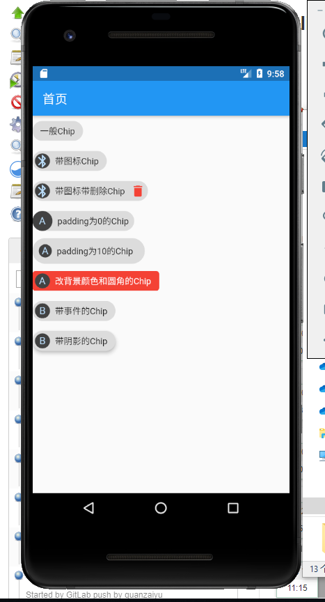
Column(crossAxisAlignment: CrossAxisAlignment.start,children: <Widget>[Chip(label: Text('一般Chip'),),Chip(avatar: CircleAvatar(backgroundColor: Colors.grey.shade800, child: new Icon(Icons.bluetooth)),label: Text('带图标Chip'),),Chip(avatar: CircleAvatar(backgroundColor: Colors.grey.shade800, child: new Icon(Icons.bluetooth)),label: Text('带图标带删除Chip'),deleteIcon: new Icon(Icons.delete,color: Colors.red,),onDeleted: () {print("点击了删除");},deleteButtonTooltipMessage: "点击删除",),Chip(avatar: CircleAvatar(backgroundColor: Colors.grey.shade800, child: Text('A')),label: Text('padding为0的Chip'),padding: EdgeInsets.all(0),),Chip(avatar: CircleAvatar(backgroundColor: Colors.grey.shade800, child: Text('A')),label: Text('padding为10的Chip'),padding: EdgeInsets.all(10),),Chip(avatar: CircleAvatar(backgroundColor: Colors.grey.shade800, child: Text('A')),label: Text('改背景颜色和圆角的Chip', style: TextStyle(color: Colors.white)),backgroundColor: Colors.red.shade500,shape: RoundedRectangleBorder(borderRadius: BorderRadius.circular(5.0))),ActionChip(avatar: CircleAvatar(backgroundColor: Colors.grey.shade800, child: Text('B')),label: Text('带事件的Chip'),onPressed: () {print("点击了ActionChip");},),ActionChip(avatar: CircleAvatar(backgroundColor: Colors.grey.shade800, child: Text('B')),label: Text('带阴影的Chip'),onPressed: () {},elevation: 5,pressElevation: 20,),],);
二、Card
Card: 卡片
示例: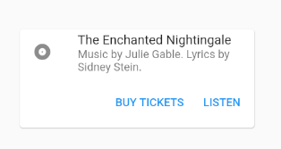
Container(constraints: BoxConstraints(maxWidth: 300),child: Card(child: Column(mainAxisSize: MainAxisSize.min,children: <Widget>[const ListTile(leading: Icon(Icons.album),title: Text('The Enchanted Nightingale'),subtitle: Text('Music by Julie Gable. Lyrics by Sidney Stein.'),),ButtonTheme.bar( // make buttons use the appropriate styles for cardschild: ButtonBar(children: <Widget>[FlatButton(child: const Text('BUY TICKETS'),onPressed: () { /* ... */ },),FlatButton(child: const Text('LISTEN'),onPressed: () { /* ... */ },),],),),],),),)
三、ListTile
ListTile: 显示带文本及图片, 通常用在 Card 组件中
示例: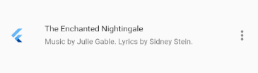
ListTile(leading: FlutterLogo(),title: Text('The Enchanted Nightingale'),subtitle: Text('Music by Julie Gable. Lyrics by Sidney Stein.'),trailing: Icon(Icons.more_vert),dense: true,isThreeLine: true,onTap: () { print(1); },enabled: true,)

若有收获,就点个赞吧
0 人点赞
