cubic-bezier() 函数
cubic-bezier() 函数定义了一个贝塞尔曲线(Cubic Bezier)。
贝塞尔曲线曲线由四个点 P0,P1,P2 和 P3 定义。P0 和 P3 是曲线的起点和终点。P0是(0,0)并且表示初始时间和初始状态,P3是(1,1)并且表示最终时间和最终状态。
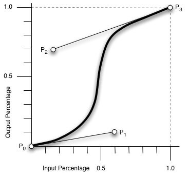
从上图我们需要知道的是 cubic-bezier 的取值范围:
P0:默认值 (0, 0)
P1:动态取值 (x1, y1)
P2:动态取值 (x2, y2)
P3:默认值 (1, 1)
我们需要关注的是 P1 和 P2 两点的取值,而其中 X 轴的取值范围是 0 到 1,当取值超出范围时 cubic-bezier 将失效;Y 轴的取值没有规定,当然也毋须过大。
最直接的理解是,将以一条直线放在范围只有 1 的坐标轴中,并从中间拿出两个点来拉扯(X 轴的取值区间是 [0, 1],Y 轴任意),最后形成的曲线就是动画的速度曲线。
cubic-bezier() 可用于 animation-timing-function 和 transition-timing-function 属性。
css3中常用的几个动画效果:
ease: cubic-bezier(0.25, 0.1, 0.25, 1.0) // 开始和结束慢,中间快linear: cubic-bezier(0.0, 0.0, 1.0, 1.0) // 匀速ease-in: cubic-bezier(0.42, 0, 1.0, 1.0) // 开始慢ease-out: cubic-bezier(0, 0, 0.58, 1.0) // 结速慢ease-in-out: cubic-bezier(0.42, 0, 0.58, 1.0) // 与ease类似,但比ease幅度大
实例演示
<div class="normal"></div><div class="custom"></div>
.normal {margin-bottom: 10px;width: 50px;height: 50px;background-color: #ff0000;border-radius: 50%;-webkit-transition: all 2s;-moz-transition: all 2s;-o-transition: all 2s;transition: all 2s;}.normal:hover {-webkit-transform: translateX(150px);-moz-transform: translateX(150px);-o-transform: translateX(150px);transform: translateX(150px);}.custom {width: 50px;height: 50px;border-radius: 50%;background-color: blue;-webkit-transition: all 2s cubic-bezier(.94,-0.25,.32,1.31);-moz-transition: all 2s cubic-bezier(.94,-0.25,.32,1.31);-o-transition: all 2s cubic-bezier(.94,-0.25,.32,1.31);transition: all 2s cubic-bezier(.94,-0.25,.32,1.31);}.custom:hover {-webkit-transform: translateX(300px);-moz-transform: translateX(300px);-o-transform: translateX(300px);transform: translateX(300px);}
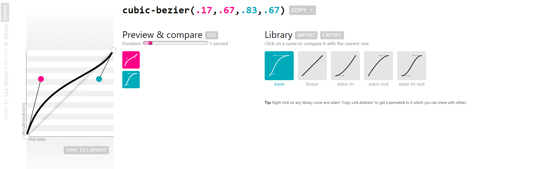
在线工具
https://cubic-bezier.com/

若有收获,就点个赞吧
0 人点赞
