富文本组件封装
富文本组件集成上传图片功能,包含大量代码,影响当前组件代码的可读性. 另外考虑富文本可能在任意其他组件使用,所以将富文本集成上传图片功能封装为一个通用组件,方便调用.
创建文件: src\components\CommBraftEditor\index.tsx
封装思路:
1. 当前组件为受控组件
2. 外部可以通过value初始化组件内容
3. 内部可以通过onChange反馈最新值给外部
4. 外部可以自定义插入图片的上传地址
5. 富文本功能组件支持默认和自定义
6. 扩展组件支持默认和自定义
import React,{useEffect, useState} from 'react';import {message, Upload} from 'antd';// 引入富文本依赖import BraftEditor from 'braft-editor';import 'braft-editor/dist/index.css';// 根据提示找到文件类型的位置 手动引入import type { UploadFile } from 'antd/lib/upload/interface';import type {EditorState,ControlType,ExtendControlType} from 'braft-editor/index';import {getToken} from '@/utils/myAuth';import {debounce} from 'lodash';// 因为无法直接import 使用require引入const {ContentUtils} = require('braft-utils');export type PropsT = {value?: string;onChange?: (v: string) => void;uploadAction?: string;controls?: ControlType[];extendControls?: ExtendControlType[];}const CommonBraftEditor: React.FC<PropsT> = props =>{const {value,uploadAction,onChange,controls:outControls,extendControls:outExtendControls} = props;// 给富文本添加关联值const [editorState,setEditorState] = useState<EditorState>(null);const controls = outControls|| ['bold', 'italic', 'underline', 'text-color', 'separator', 'link', 'separator','media'];const uploadCom: ExtendControlType = {key: 'antd-uploader',type: 'component',component: (<Uploadaction={uploadAction}accept="image/*"headers={{token: getToken() || '',}}showUploadList={false}onChange={({ file, fileList: files }: { file: UploadFile; fileList: UploadFile[] }) => {// clone数组,然后只需要一个let nowFiles = [...files];nowFiles = nowFiles.slice(-1);const { status, response } = file;if (status === 'done') {// 获取上传成功的回调结果const { success, data, message: err } = response;if (success) {message.success(`${file.name} 上传成功!`);// 避免因直接修改实参造成的报错if (nowFiles.length > 0) {nowFiles[0].url = data.fileUrl;setEditorState(ContentUtils.insertMedias(editorState, [{type: 'IMAGE',url: data.fileUrl}]))}} else {message.error(err);}} else if (status === 'error') {message.error(`${file.name} file upload failed.`);}}}>{/* 这里的按钮最好加上type="button",以避免在表单容器中触发表单提交,用Antd的Button组件则无需如此 */}<button type="button" className="control-item button upload-button" data-title="插入图片">上传图片</button></Upload>)}const extendControls: ExtendControlType[] = [];if(uploadAction){extendControls.push(uploadCom);}if(outExtendControls){extendControls.concat(outExtendControls);}/**** @param v*/const handleEditorChange = (v: EditorState) => {const contentValue = v.toHTML();onChange?.(contentValue);};useEffect(()=>{setEditorState(BraftEditor.createEditorState(value));},[value])return (<BraftEditorstyle={{ border: '1px solid #e5e5e5' }}value={editorState}onChange={debounce(handleEditorChange, 500)}onSave={debounce(handleEditorChange, 500)}controls={controls}extendControls={extendControls}/>)}export default CommonBraftEditor;
修改: src\pages\content\Article\components\ArticleEdit.tsx
这里就是简单的引入组件了. 需要注意的是,组件 CommBraftEditor 的onChange回调不能直接修改value属性,会造成死循环!
import React, { useEffect, useState } from 'react';import { Modal, Button, Form, Input, Switch, Upload, message } from 'antd';import { UploadOutlined } from '@ant-design/icons';import type { ArticleType, Dispatch, StateType,Loading } from 'umi';// 获取tokenimport { getToken } from '@/utils/myAuth';import { connect } from 'umi';// 根据提示找到文件类型的位置 手动引入import type { UploadFile } from 'antd/lib/upload/interface';import CommonBraftEditor from '@/components/CommBraftEditor';import PageLoading from '@/components/PageLoading';const { TextArea } = Input;const namespace = 'articleEdit';type PropsType = {isShow: boolean;setIsShow: any;editId?: string;dispatch?: Dispatch;refresh?: any;article: ArticleType;};type UploadPropsType = {value?: string;onChange?: (value: string) => void;};// 局部组件 自定义formItem组件// # https://ant.design/components/form-cn/#components-form-demo-customized-form-controlsconst FormUploadFC: React.FC<UploadPropsType> = ({ value, onChange }) => {const [fileList, setFileList] = useState<UploadFile[]>([]);// 随便定义一个符合UploadFile类型的对象,只需要url内容正常,即可显示useEffect(() => {// 避免出现空白文件列表if (value) {const theFile = [{uid: '2',name: 'yyy.png',status: 'done',url: value,},];setFileList(theFile);} else {setFileList([]);}}, [value]);return (<Uploadaction="/lejuAdmin/material/uploadFileOss"listType="picture"fileList={fileList}headers={{token: getToken() || '',}}// 用于移除文件后 对表单的校验同步onRemove={() => {onChange?.('');return true;}}// # https://ant.design/components/upload-cn/#APIonChange={({ file, fileList: files }: { file: UploadFile; fileList: UploadFile[] }) => {// clone数组,然后只需要一个let nowFiles = [...files];nowFiles = nowFiles.slice(-1);const { status, response } = file;if (status === 'done') {// 获取上传成功的回调结果const { success, data, message: err } = response;if (success) {message.success(`${file.name} 上传成功!`);// 避免因直接修改实参造成的报错if (nowFiles.length > 0) {nowFiles[0].url = data.fileUrl;onChange?.(data.fileUrl);}} else {message.error(err);}} else if (status === 'error') {message.error(`${file.name} file upload failed.`);}// # https://github.com/ant-design/ant-design/issues/2423setFileList(nowFiles);}}><Button icon={<UploadOutlined />}>Upload</Button></Upload>);};// 默认到处组件const ArticleEdit: React.FC<PropsType> = (props) => {const { isShow, setIsShow, editId, dispatch, refresh, article } = props;const [form] = Form.useForm();// 初始化富文本内容stateconst [initContent, setInitContent] = useState<string>('');// 使用的contentconst [content, setContent] = useState<string>('');// 根据编辑/新增需求 改变modal的titleconst [modelTitle, setModelTitle] = useState<string>('');useEffect(() => {// 弹窗打开,且存在id 则为编辑if (isShow) {if (editId) {setModelTitle('编辑文章');dispatch?.({type: `${namespace}/getArticleById`,payload: {id: editId,},});} else {setModelTitle('新增文章');}} else {// 还原表单form.resetFields();// 清空富文本setInitContent('');}}, [isShow]);// // 如果article变化 需要重置form表单useEffect(() => {// 为了避免莫名其妙的form 错误if (Object.keys(article).length > 0) {// 整理表单数据const articleData: ArticleType = {...article,isShow: article.isShow ? 1 : 0,};// 设置富文本内容setInitContent(article.content1 || '');// 设置form表单form.setFieldsValue({ ...articleData });}}, [article]);const cb = () => {// 1.关闭弹窗 清除校验setIsShow(false);form.resetFields();// 清空富文本setContent('');// 2.刷新父类列表refresh();};const handleOk = () => {form.validateFields().then(() => {// 获取表单数据const v = form.getFieldsValue();// 封装提交数据const articleData = {...v,isShow: v.isShow ? 1 : 0,content1: content,content2: content,editorType: 0, // 编辑器类型 默认富文本,写死};if (editId) {articleData.id = editId;}if (dispatch) {// // 提交dispatch({type: `${namespace}/saveArticle`,payload: {article: articleData,callback: cb,},});}}).catch(() => {message.error('请注意表单验证!');});};const handleCancel = () => {setIsShow(false);};return (<Modal width="60%" title={modelTitle} visible={isShow} onOk={handleOk} onCancel={handleCancel}><Formform={form}initialValues={{isShow: true,}}labelCol={{span: 4,}}wrapperCol={{span: 20,}}><Form.Itemlabel="标题"rules={[{ required: true, message: '标题不能为空!' }]}name="title"><Input placeholder="请输入文章标题"></Input></Form.Item><Form.Itemlabel="作者"rules={[{ required: true, message: '作者不能为空!' }]}name="author"><Input placeholder="请输入作者"></Input></Form.Item><Form.Item label="文章概要" name="summary"><TextArea></TextArea></Form.Item><Form.Item label="文章显示" name="isShow" valuePropName="checked"><Switch checkedChildren="显示" unCheckedChildren="隐藏" defaultChecked></Switch></Form.Item><Form.Itemlabel="上传封面"name="coverImg"rules={[{ required: true, message: '上传封面图片' }]}><FormUploadFC /></Form.Item><Form.Item label="编辑内容:"></Form.Item><CommonBraftEditorkey="1"uploadAction="/lejuAdmin/material/uploadFileOss"value={initContent}onChange={(v) => {// initContent仅作为初始化 如果使用initContent作为通知结果 会出现死循环!// setInitContent(v);setContent(v);}}/></Form></Modal>);};type UseStateType = {dispatch: Dispatch;article: StateType;};const mapStateToProps = (state: UseStateType) => {return {dispatch: state.dispatch,article: state[namespace].article};};export default connect(mapStateToProps)(ArticleEdit);
通过富文本组件封装我们学会了通用组件封装的方法,这里和vue基本是一致的.
dva-loading
- 内置 dva-loading,直接 connect
loading字段使用即可
经过umijs的合并简化,dva-loading不需要手动集成,直接在connect中即可获取loading字段,我们打印观察: 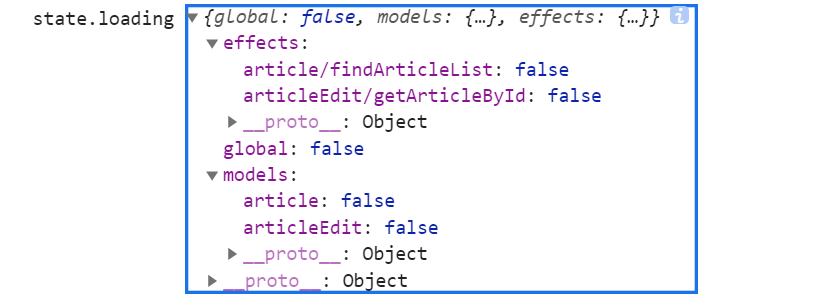
我们可以接用dva-loading优化弹窗打开后,由于网络延迟造成的表单填充卡顿问题,提高用户体验: 
在 element-ui种我们可以通过v-loading轻松的实现loading效果,在这里我们可以通过 <PageLoading/> 组件来实现:
import PageLoading from '@/components/PageLoading';...const { isShow, setIsShow, editId, dispatch, refresh, article,loading } = props;return (<Modal width="60%" title={modelTitle} visible={isShow} onOk={handleOk} onCancel={handleCancel}>{loading ? (<PageLoading />) : (<Formform={form}initialValues={{isShow: true,}}labelCol={{span: 4,}}wrapperCol={{span: 20,}}><Form.Itemlabel="标题"rules={[{ required: true, message: '标题不能为空!' }]}name="title"><Input placeholder="请输入文章标题"></Input></Form.Item><Form.Itemlabel="作者"rules={[{ required: true, message: '作者不能为空!' }]}name="author"><Input placeholder="请输入作者"></Input></Form.Item><Form.Item label="文章概要" name="summary"><TextArea></TextArea></Form.Item><Form.Item label="文章显示" name="isShow" valuePropName="checked"><Switch checkedChildren="显示" unCheckedChildren="隐藏" defaultChecked></Switch></Form.Item><Form.Itemlabel="上传封面"name="coverImg"rules={[{ required: true, message: '上传封面图片' }]}><FormUploadFC /></Form.Item><Form.Item label="编辑内容:"></Form.Item><CommonBraftEditorkey="1"uploadAction="/lejuAdmin/material/uploadFileOss"value={initContent}onChange={(v) => {// initContent仅作为初始化 如果使用initContent作为通知结果 会出现死循环!// setInitContent(v);setContent(v);}}/></Form>)}</Modal>);// 增加dva-loadingconst mapStateToProps = (state: UseStateType) => {return {dispatch: state.dispatch,article: state[namespace].article,loading: state.loading.effects[`${namespace}/getArticleById`]};};...
添加loading后,是不是舒服多了^_^
总结
学到这里,相信同学已经基本掌握了基于ts+react-antd-pro项目的常规功能开发.
通过本教程的学习,可以在已经掌握vue技术栈的基础上用尽量短的时间迅速展开react+antd项目开发.
本教程到此先告一段落,接下来暂时考虑加入:
- 动态权限 按钮权限
- 复杂组件
- 大屏报表

若有收获,就点个赞吧
0 人点赞
