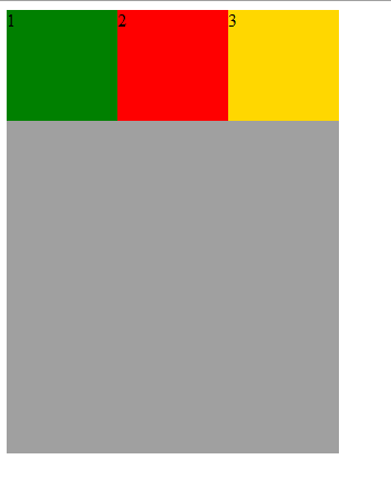
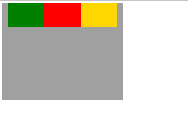
初始骨架和样式
<div class="container"><div style="background:green" class="chunk child1">1</div><div style="background:red" class="chunk child2">2</div><div style="background:gold" class="chunk child3">3</div></div>
.container{width: 300px;height: 400px;background: #A0A0A0;}.chunk{width: 100px;height: 100px;}
注:下面不再重复出现以上的css属性,除非需要更改现有的属性值
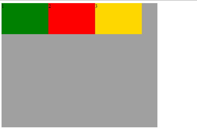
使用Flex布局
最新写法:
.container{display: flex;}
兼容写法:
.container{display: -webkit-box;}

容器的属性
flex-direction属性
flex-direction属性决定主轴的方向(即项目的排列方向)。
属性值有:flex-direction: row | row-reverse | column | column-reverse;
flex-direction: row
row(默认值):主轴为水平方向,起点在左端。
兼容写法
.container{-webkit-box-orient:horizontal;}
flex-direction: row-reverse
row-reverse:主轴为水平方向,起点在右端
兼容写法:
.container{-webkit-box-orient:horizontal;-webkit-box-direction:reverse;}
flex-direction: column
column:主轴为垂直方向,起点在上沿
兼容写法
.container{-webkit-box-orient:vertical;}

flex-direction: column-reverse
column-reverse:主轴为垂直方向,起点在下沿
兼容写法
.container{-webkit-box-orient:vertical;-webkit-box-direction:reverse;}
justify-content属性
justify-content属性定义了项目在主轴上的对齐方式。
属性值有:justify-content: flex-start | flex-end | center | space-between | space-around;
修改下容器的宽高,好观察对齐情况
.container{width: 500px;height: 400px;}
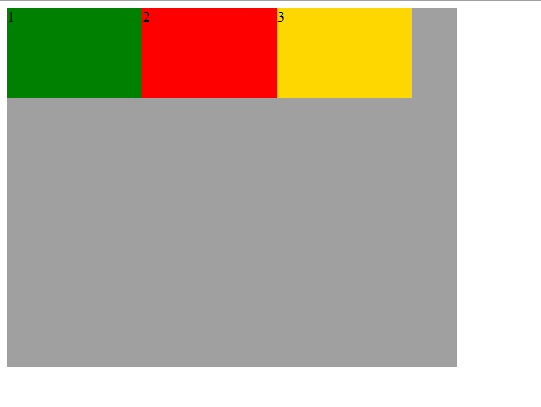
justify-content: flex-start
flex-start(默认值):左对齐
兼容写法
.container{-webkit-box-pack:start;}
justify-content: flex-end
flex-end:右对齐
兼容写法
.container{-webkit-box-pack:end;}

justify-content: center
center: 水平居中
兼容写法
.container{-webkit-box-pack:center;}
justify-content: space-between
pace-between:两端对齐,项目之间的间隔都相等。
兼容写法
.container{-webkit-box-pack:justify;}
align-items属性
align-items属性定义项目在交叉轴上如何对齐
属性值有:align-items: flex-start | flex-end | center | baseline | stretch
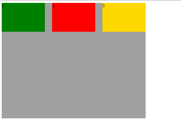
修改每个组块的高度,便于观察垂直对齐情况
.child1{height:100px;font-size: 16px;}.child2{height:200px;font-size: 28px;}.child3{height:300px;font-size: 36px;}
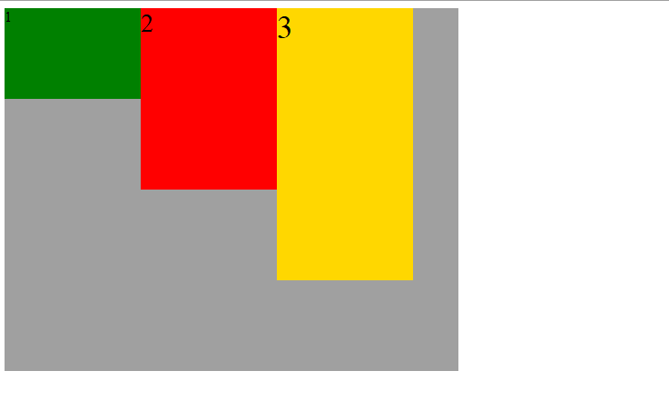
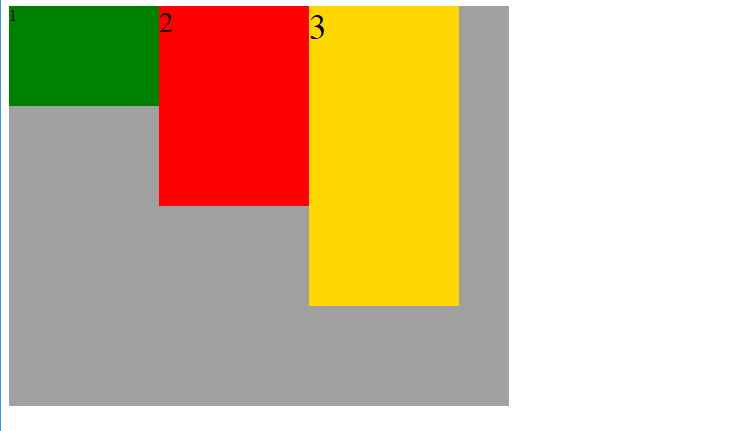
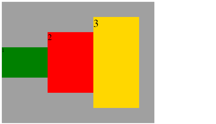
align-items: flex-start
flex-start:交叉轴的起点对齐
兼容写法
.container{-webkit-box-align:start;}
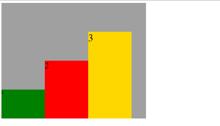
align-items: flex-end
flex-end:交叉轴的终点对齐
兼容写法
.container{-webkit-box-align:end;}
align-items: center
center:交叉轴的中点对齐
兼容写法
.container{-webkit-box-align:center;}
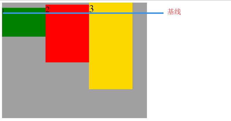
align-items: baseline
baseline: 项目的第一行文字的基线对齐
兼容写法
.container{-webkit-box-align:baseline;}
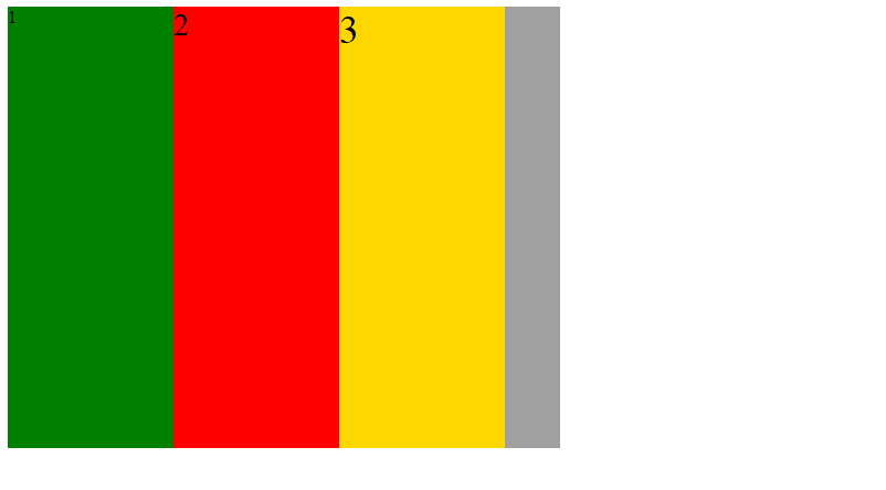
align-items: stretch
stretch(默认值):如果项目未设置高度或设为auto,将占满整个容器的高度
兼容写法
.container{-webkit-box-align:stretch;/*前提是项目未设置高度*/}
项目的属性
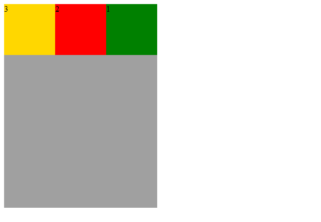
order属性
order属性定义项目的排列顺序。数值越小,排列越靠前,默认为0
现在想实现排序顺序为:2,3,1
兼容写法
.child1{-webkit-box-ordinal-group: 3;}.child2{-webkit-box-ordinal-group: 1;}.child3{-webkit-box-ordinal-group: 2;}

flex-grow属性
flex-grow属性定义项目的放大比例,默认为0,即如果存在剩余空间,也不放大。
如果所有项目的flex-grow属性都为1,则它们将等分剩余空间(如果有的话)。如果一个项目的flex-grow属性为2,其他项目都为1,则前者占据的剩余空间将比其他项多一倍。
兼容写法
/注:不能给项目设置宽度,否则项目的宽度与预期不同/
.child1{-webkit-box-flex: 1;}.child2{-webkit-box-flex: 1;}.child3{-webkit-box-flex:2;}

参考文章

若有收获,就点个赞吧
0 人点赞
