概述
Scalable Vector [ˈvektə(r)] Graphics [ˈgræfɪks] 可伸缩的矢量图形。99年由 W3C 发布,在 2013 年成为了 W3C 推荐标准。它是使用 HTML 来描述二维图形和绘图程序的语言。只需要定义好属性就可以获得一个用于网络的基于矢量的图形,特点在于改变尺寸也不损失图形质量。
1. 位图
位图都是像素点成的
- 它的优点在于:
- 色彩丰富;
- 图片效果逼真;
- 位图的缺点:
- 放大缩小会导致图片失真;
2. 矢量图
矢量图:由数学上一系列算法计算出的图形,通常使用于绘画几何图形。
- 矢量图的优点:
- 图片放大缩小不会失真。因为会动态计算图形,很适合制作地图;
- 可以被很多工具读取和修改,比如记事本;
- 与 gif、jpeg 相比尺寸更小,可压缩性更高;
- 矢量图的缺点:
- 色彩较少;
- 对于不会书写 SVG 的人员来说无法修改
SVG 常用 shapes
svg 标记都是单标记。
- 线
<line> - 矩形
<rect> - 圆形
<circle> - 椭圆
<ellipse> - 折线
<polyline> - 多边形
<polygon> - 路径
<path>
1. 绘制线条
<line> 标记绘制直线
- x1 y1 : 第一个点的坐标
x2 y2 : 第二个点的坐标
<svg width="100" height="100"><line x1="5" y1="5" x2="50" y2="20" stroke="#000" stroke-width="5"></svg>
1.1 描边 stroke
g 表示一组
- stroke-width 描边宽度,类似于 border-width
- stroke 描边
- none
- 颜色值
- currentColor 继承父级的 color 值
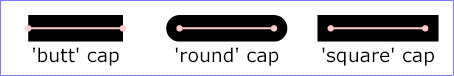
- stroke-linecap 描边端点表现方式
- butt
- round
- square
- stroke-linejoin 描边转角的表现方式
- miter
- round
- bevel

- stroke-miterlimit 描边相交(锐角)表现方式,默认4
- stroke-dasharray 虚线描边
- none 不是虚线
- 为一个逗号或空格分隔的数值列表,表示各个虚线端的长度,可以是长度值,可以是百分比值
- stroke-dashoffset 虚线的起始偏移
- stroke-opacity 描边透明度,默认为1
2. 创建矩形 rect
<rect> :绘制矩形的标记
- x y :原点坐标点
fill :填充色
<svg width="100" height="100"><rect x="10" y="10" width="80" height="80" fill="rgba(255,0,0,.5)"></rect></svg>
2.2 圆角矩形
x y:原点坐标
rx 和 ry :定义圆角的半径,类似于 border-radius
<svg width="100" height="100"><rect x="10" y="10" width="80" height="80" fill="rgba(255,0,0,.5)" rx="10" ry="10"></rect></svg>
2.3 半透明的矩形
fill-opacity:填充色的半透明度
- stroke-opacity:描边的半透明度
执行结果:<svg width="100" height="100"><rect x="10" y="10" width="80" height="80" fill="rgba(255,0,0,.5)" stroke="rgba(255,0,0,.9)" stroke-width="5" fill-opacity=".1" stroke-opacity=".1"></rect></svg>
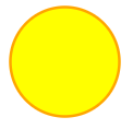
3. 创建圆形 circle


<circle> 用来创建一个圆
- cx 、 cy :定于圆中心的 x 和 y 坐标,如果没有这个属性,原点会被设置为 (0,0)
- r :圆半径
- stroke :描边颜色
- stroke-width :边框颜色
- fill :填充色
执行结果:<svg width="100" height="100"><circle cx="50" cy="50" r="40" stroke="orange" stroke-width="2" fill="yellow"></circle></svg>
4. 创建椭圆 ellipse
<ellipse> 绘制椭圆标记
- cx cy :定义椭圆中心点坐标
- rx ry 定义圆角半径
执行结果:<svg width="100" height="100"><ellipse cx="50%" cy="50%" rx="50" ry="40" fill="rgba(255,255,0,.5)"></ellipse></svg>

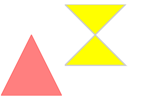
5. 多边形 polygon
<polygon> 标记弥补了 <line> 只能画一条线的不足,使用它可以创建一个多边形
- 使用
points属性,找到每一个点的坐标,点与点之间使用空格隔开 - 下面这段代码中,第一个点的坐标就在
(50,0)处,第二个坐标就在(0,100)处,最后个坐标(100,100)<svg width="100" height="100"><polygon points="50,0 0,100 100,100" stroke="rgba(255,0,0,.5)" fill="rgba(255,0,0,.5)"></polygon></svg>
执行结果:<svg><polygon points="0,0 100,0 0,100 100,100" stroke-width="2" stroke="#ccc" fill="yellow" fill-rule="nonzero"></polygon></svg>
6. 创建折线 polyline
<polyline> 标记绘制折线
- 使用 polyline 标记,找到每个点的坐标,点与点之间使用空格隔开
- polyline 用于创建任何只有直线的形状
- 注意这里的 fill 属性,值设置为了 none
<svg><polyline points="10,5 80,5 10,80 80,80" stroke="#000" fill="none"></polyline></svg>
7. 路径 path
<path> 是 svg 中比较强大和复杂的元素了,你可以通过 svg 在线编辑器:http://editor.method.ac/ 绘制图形
<svg><path stroke-width="5" stroke="orange" d="M 10 10 L 20 20"></path></svg>
<svg><g><text x="5" y="20">stroke 栗子~</text><path stroke-width="10" stroke="orange" d="M 10 30 L 90 30"></path><path stroke-width="10" stroke="orange" stroke-linecap="round" d="M 10 50 L 90 50" ></path><path stroke-width="10" stroke="orange" stroke-dasharray="3,4" d="M 10 70 L 90 70" ></path></g></svg>
下面的命令可用于定义路径,允许大小写,大写表示绝对定位,小写表示相对定位
- M = moveto 移动到坐标
- L = lineto 线条,绘制直线到坐标
- H = horizontal lineto 绘制水平线到坐标
- V = vertical lineto 绘制垂直线到坐标
- C = curveto 绘制曲线到坐标
- S = smooth curveto 绘制光滑的曲线到坐标
- Q = quadratic Bezier curve 绘制贝塞尔曲线到坐标
- T = smooth quadratic Bezier curveto 绘制光滑的二次贝塞尔曲线到坐标
- A = elliptical Arc 绘制椭圆弧到坐标
- Z = closepath 闭合路径
我们使用路径的方式再画一次三角形
<svg><path d="M 50 0 L 0 100 L 100 100 L 50 0" stroke="#000" fill="none"></path></svg>
8. 生成文字 text
<text> 绘制文字标记
- x:文字的 x 坐标
- y:文字的 y 坐标
- dx:x 轴偏移坐标
- dy:y 轴偏移坐标
- rotate:文字旋转角度
- textlength:渲染的文字所占据长度,可以用来设置字间距
- lengthAjust:使用哪种方式来渲染文字占据长度
<svg><text x="10" y="10" font-size="14" font-weight="bold" rotate="30" textlength="100">好棒棒耶~</text></svg>
9. 渐变
线性渐变
- x1 y1 、x2 y2 的点就是渐变的开始结束点坐标
水平的渐变
<svg><defs><linearGradient x1="0%" y1="0%" x2="100%" y2="100%" id="linear1"><stop offset="0%" stop-color="pink" stop-opacity="1"></stop><stop offset="100%" stop-color="skyblue" stop-opacity="1"></stop></linearGradient></defs><ellipse cx="150" cy="75" rx="85" ry="55" style="fill: url(#linear1)"></ellipse></svg>
垂直的渐变
<svg><defs><linearGradient x1="0%" y1="0%" x2="0%" y2="100%" id="linear1"><stop offset="0%" stop-color="pink" stop-opacity="1"></stop><stop offset="100%" stop-color="skyblue" stop-opacity="1"></stop></linearGradient></defs><ellipse cx="150" cy="75" rx="85" ry="55" style="fill: url(#linear1)"></ellipse></svg>
经向渐变
<svg><defs>//cx cy:颜色的起始点坐标 r:扩散范围 fx:渐变的终点<radialGradient id="radial1" cx="20%" cy="20%" r="60%" fx="50%"><stop offset="0%" stop-color="yellow" stop-opacity="1"></stop><stop offset="100%" stop-color="orange" stop-opacity="1"></stop></radialGradient></defs><ellipse cx="150" cy="75" rx="75" ry="75" style="fill: url(#radial1)"></ellipse></svg>
10. 其他
让图形可点击
<svg><a href="#"><circle cx="100" cy="50" r="40" stroke="black" stroke-width="2" fill="red"/></a></svg>
带有动画效果的 svg
<svg><rect width="100" height="100" x="20" y="20" fill="blue">//repeatCount 持续时间<animate attributeName="opacity" from="1" to="0" dur="5s" repeatCount="indefinite"></animate></rect></svg>
<svg><rect x="20" y="20" width="100" height="100"><animate attributeName="width" from="100" to="150" dur="5s" repeatCount="indefinite"></animate><animate attributeName="x" begin="0s" dur="5s" from="0" to="300" repeatCount="indefinite"></animate><animate attributeName="fill" from="pink" to="orange" begin="0s" dur="4s"></animate></rect></svg>文字的动画<svg><g transform="translate(0,20)"><text id="textRun" x="0" y="0">test text run<animateMotion path="M 0 0 L 100 100" dur="3s"/></text></g></svg>

若有收获,就点个赞吧
0 人点赞
