动态修改主题
这里主要通过动态选择主题色,根据element-plus/theme-chalk/index.css主题文件作为模板,用主题色替换变量 动态生成 全新的theme主题样式内容,内嵌到style标签中。
elemen主题涉及到的主题变量为以下几种:
element-plus ui每套主题 共用到以下种颜色 根据白色和主题色进行混合生成渐变色sasss中Mix 函数是将两种颜色根据一定的比例混合在一起,生成另一种颜色$--color-primary: #409EFF !default;// 下面几种都是根据主题色生成的渐变色 所以我们只关心主题色是什么 然后再生成这九种渐变色 把原始模板替换掉$--color-primary-light-1: mix($--color-white, $--color-primary, 10%) !default; /* 53a8ff */$--color-primary-light-2: mix($--color-white, $--color-primary, 20%) !default; /* 66b1ff */$--color-primary-light-3: mix($--color-white, $--color-primary, 30%) !default; /* 79bbff */$--color-primary-light-4: mix($--color-white, $--color-primary, 40%) !default; /* 8cc5ff */$--color-primary-light-5: mix($--color-white, $--color-primary, 50%) !default; /* a0cfff */$--color-primary-light-6: mix($--color-white, $--color-primary, 60%) !default; /* b3d8ff */$--color-primary-light-7: mix($--color-white, $--color-primary, 70%) !default; /* c6e2ff */$--color-primary-light-8: mix($--color-white, $--color-primary, 80%) !default; /* d9ecff */$--color-primary-light-9: mix($--color-white, $--color-primary, 90%) !default; /* ecf5ff */
关于element ui 颜色 设计可以阅读这两篇文章
https://element-plus.gitee.io/#/zh-CN/component/color
https://juejin.cn/post/6844903960218697741
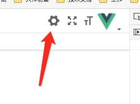
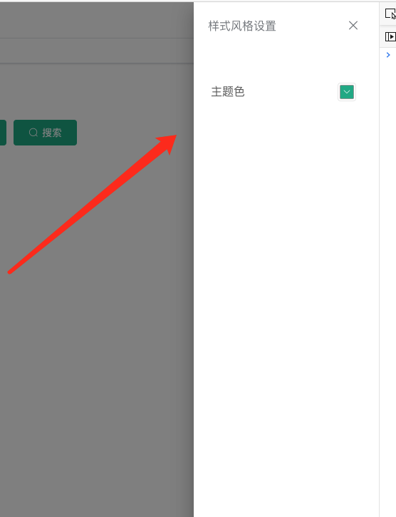
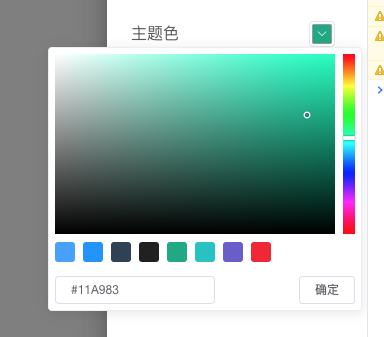
效果图
默认情况下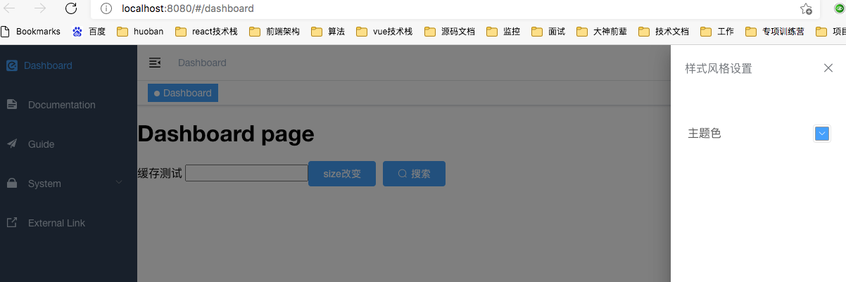
修改主题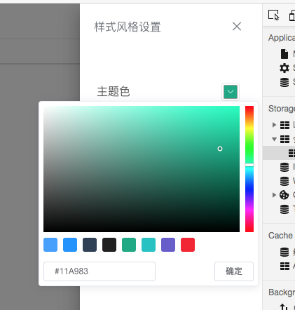
确定后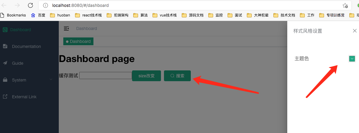
主题修改 看下html 动态生成的style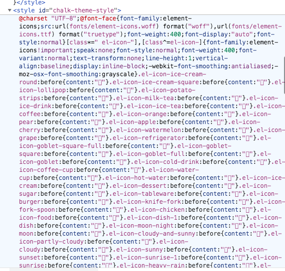
本章建议
> 建议大家先结合完整源码 先过一遍 别着急写 先看下主线 再细究
看源码时从App.vue里这个hook方法开始看 生成主题主要逻辑就在这个hook方法里
vue3-admin/src/App.vue
目前最新源码 https://gitee.com/brolly/vue3-element-admin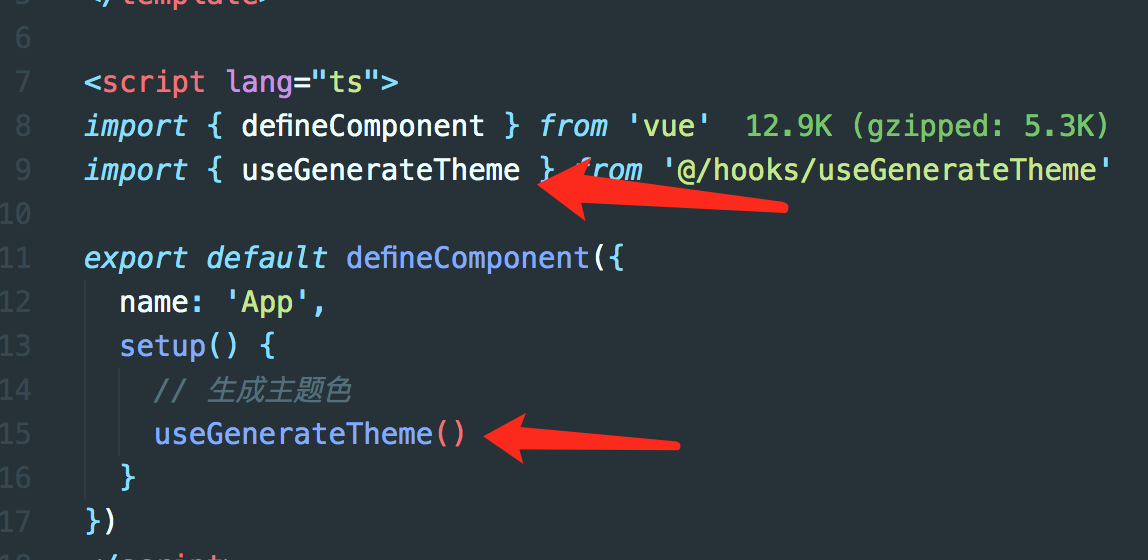
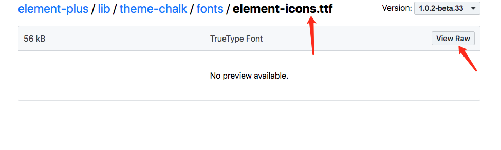
图标字体文件准备
选择对应版本图标字体
https://unpkg.com/browse/element-plus@1.0.2-beta.33/lib/theme-chalk/fonts/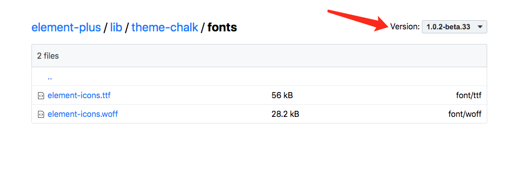
下载下来放到 vue3-admin/public下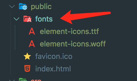
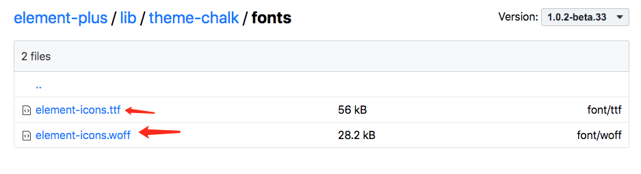
如何下载
点击ttf文件和woff文件 进去后点击 view raw下载
2-1 安装相关依赖
安装axios
首次我们需要远程获取element-plus/lib/theme-chalk/index.css 主题样式文件,作为原始模板
npm i axios
安装css-color-function
将通过该包提供的convert函数生成将css color-mod函数生成的渐变色 转换成rgb css-color-function使用说明文档
根据css-color-function 的color.convert函数 将颜色函数color CSS字符串转换为RGB颜色字符串。
// 下面color函数以及 shade tin是css的color-mod函数// 了解文档 http://cdn1.w3cplus.com/css4/color-mod.html'color(#11A983 shade(10%))' => 'rgb(15, 152, 118)''color(#11A983 tint(10%))' => 'rgb(41, 178, 143)''color(#11A983 tint(20%))' => 'rgb(65, 186, 156)''color(#11A983 tint(30%))' => 'rgb(88, 195, 168)''color(#11A983 tint(40%))' => 'rgb(112, 203, 181)''color(#11A983 tint(50%))' => 'rgb(136, 212, 193)''color(#11A983 tint(60%))' => 'rgb(160, 221, 205)''color(#11A983 tint(70%))' => 'rgb(184, 229, 218)''color(#11A983 tint(80%))' => 'rgb(207, 238, 230)''color(#11A983 tint(90%))' => 'rgb(231, 246, 243)'// 利用css-color-function转换为rgbimport color from 'css-color-function'color.convert('color(#11A983 shade(10%))') // 'rgb(15, 152, 118)'
npm i css-color-function
手动创建声明文件
可能需要重新启动npm run serve 如果还报缺少声明文件 重启下
src/css-color-function.d.ts
declare module 'css-color-function' {export function convert(color: string): string;}
2-2 Navbar添加设置图标

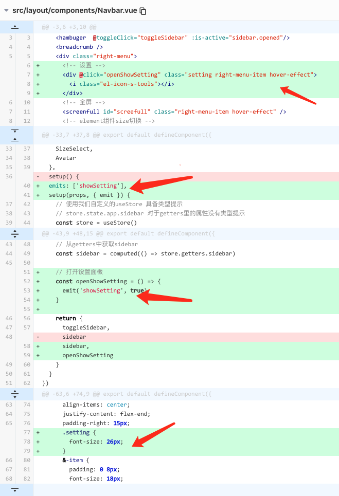
src/layout/components/Navbar.vue
<template><div class="navbar"><hambuger @toggleClick="toggleSidebar" :is-active="sidebar.opened"/><breadcrumb /><div class="right-menu"><!-- 设置 --><div @click="openShowSetting" class="setting right-menu-item hover-effect"><i class="el-icon-s-tools"></i></div><!-- 全屏 --><screenfull id="screefull" class="right-menu-item hover-effect" /><!-- element组件size切换 --><el-tooltip content="Global Size" effect="dark" placement="bottom"><size-select class="right-menu-item hover-effect" /></el-tooltip><!-- 用户头像 --><avatar /></div></div></template><script lang="ts">import { defineComponent, computed } from 'vue'import Breadcrumb from '@/components/Breadcrumb/index.vue'import Hambuger from '@/components/Hambuger/index.vue'import { useStore } from '@/store/index'import Screenfull from '@/components/Screenfull/index.vue'import SizeSelect from '@/components/SizeSelect/index.vue'import Avatar from './avatar/index.vue'export default defineComponent({name: 'Navbar',components: {Breadcrumb,Hambuger,Screenfull,SizeSelect,Avatar},emits: ['showSetting'],setup(props, { emit }) {// 使用我们自定义的useStore 具备类型提示// store.state.app.sidebar 对于getters里的属性没有类型提示const store = useStore()const toggleSidebar = () => {store.dispatch('app/toggleSidebar')}// 从getters中获取sidebarconst sidebar = computed(() => store.getters.sidebar)// 打开设置面板const openShowSetting = () => {emit('showSetting', true)}return {toggleSidebar,sidebar,openShowSetting}}})</script><style lang="scss">.navbar {display: flex;background: #fff;border-bottom: 1px solid rgba(0, 21, 41, .08);box-shadow: 0 1px 4px rgba(0, 21, 41, .08);.right-menu {flex: 1;display: flex;align-items: center;justify-content: flex-end;padding-right: 15px;.setting {font-size: 26px;}&-item {padding: 0 8px;font-size: 18px;color: #5a5e66;vertical-align: text-bottom;&.hover-effect {cursor: pointer;transition: background .3s;&:hover {background: rgba(0, 0, 0, .025);}}}}}</style>
2-2 封装RightPanel组件
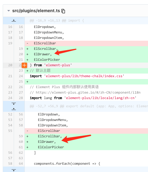
element.ts中导入el-drawer组件
src/components/RightPanel/index.vue
<template><div class="right-panel"><el-drawer:model-value="modelValue":direction="direction":show-close="showClose":custom-class="customClass":with-header="withHeader":title="title":size="size"@close="handleClose"><slot /></el-drawer></div></template><script lang="ts">import { defineComponent } from 'vue'export default defineComponent({name: 'RightPanel',props: {modelValue: {type: Boolean,default: true},direction: {type: String,validator(val: string) {return ['rtl', 'ltr', 'ttb', 'btt'].includes(val)},default: 'rtl'},title: {type: String,default: '自定义title'},size: {type: [String, Number]},customClass: {type: String,default: 'setting-panel'},showClose: {type: Boolean,default: true},withHeader: {type: Boolean,default: true}},// 在组件上使用modelValue文档说明// https://v3.cn.vuejs.org/guide/component-basics.html#%E5%9C%A8%E7%BB%84%E4%BB%B6%E4%B8%8A%E4%BD%BF%E7%94%A8-v-modelemits: ['update:modelValue', 'close'],setup(props, { emit }) {const handleClose = () => {emit('update:modelValue', false)emit('close')}return {handleClose}}})</script><style lang="scss" scoped></style>
layout组件中导入rightPanel
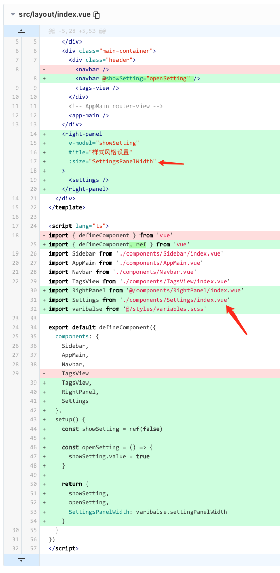
src/layout/index.vue
<template><div class="app-wrapper"><div class="sidebar-container"><Sidebar /></div><div class="main-container"><div class="header"><navbar @showSetting="openSetting" /><tags-view /></div><!-- AppMain router-view --><app-main /></div><right-panelv-model="showSetting"title="样式风格设置":size="SettingsPanelWidth"><!-- settings 面板设置组件 --><settings /></right-panel></div></template><script lang="ts">import { defineComponent, ref } from 'vue'import Sidebar from './components/Sidebar/index.vue'import AppMain from './components/AppMain.vue'import Navbar from './components/Navbar.vue'import TagsView from './components/TagsView/index.vue'import RightPanel from '@/components/RightPanel/index.vue'import Settings from './components/Settings/index.vue'import varibalse from '@/styles/variables.scss'export default defineComponent({components: {Sidebar,AppMain,Navbar,TagsView,RightPanel,Settings},setup() {// rightPanel显示隐藏状态const showSetting = ref(false)const openSetting = () => {showSetting.value = true}return {showSetting,openSetting,// 调整panel宽度SettingsPanelWidth: varibalse.settingPanelWidth}}})</script><style lang="scss" scoped>.app-wrapper {display: flex;width: 100%;height: 100%;.main-container {flex: 1;display: flex;flex-direction: column;overflow: hidden;.app-main {/* 50= navbar 50 如果有tagsview + 34 */min-height: calc(100vh - 84px);}}}</style>
调整样式修改scss变量
src/styles/variables.scss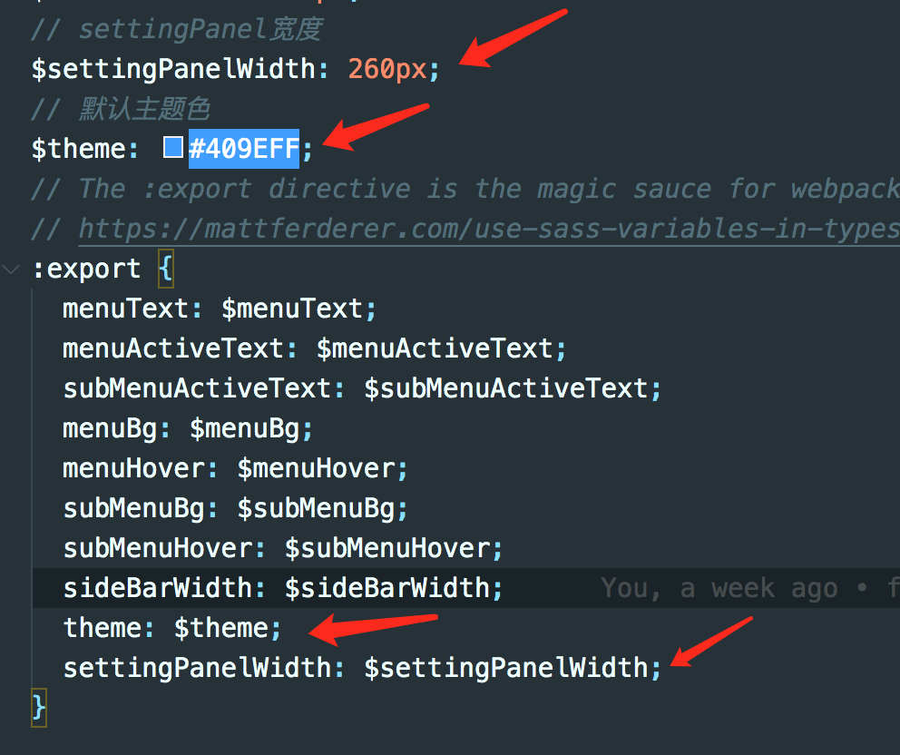
scss变量类型声明不要忘了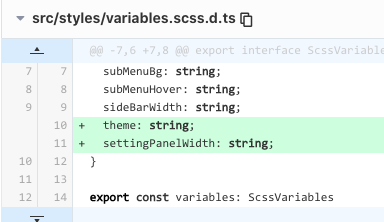
src/styles/variables.scss
// base color$blue:#324157;$light-blue:#3A71A8;$red:#C03639;$pink: #E65D6E;$green: #30B08F;$tiffany: #4AB7BD;$yellow:#FEC171;$panGreen: #30B08F;// sidebar$menuText:#bfcbd9;$menuActiveText:#409EFF;$subMenuActiveText:#f4f4f5; // https://github.com/ElemeFE/element/issues/12951$menuBg:#304156;$menuHover:#263445;$subMenuBg:#1f2d3d;$subMenuHover:#001528;$sideBarWidth: 210px;$settingPanelWidth: 260px;// 默认主题色$theme: #409EFF;// The :export directive is the magic sauce for webpack// https://mattferderer.com/use-sass-variables-in-typescript-and-javascript:export {menuText: $menuText;menuActiveText: $menuActiveText;subMenuActiveText: $subMenuActiveText;menuBg: $menuBg;menuHover: $menuHover;subMenuBg: $subMenuBg;subMenuHover: $subMenuHover;sideBarWidth: $sideBarWidth;theme: $theme;settingPanelWidth: $settingPanelWidth;}
src/styles/variables.scss.d.ts
export interface ScssVariables {menuText: string;menuActiveText: string;subMenuActiveText: string;menuBg: string;menuHover: string;subMenuBg: string;subMenuHover: string;sideBarWidth: string;theme: string;settingPanelWidth: string;}export const variables: ScssVariablesexport default variables
2-3 创建settings组件
src/store/modules/settings.ts
<template><div class="drawer-container"><div class="drawer-item"><span>主题色</span><!-- 主题组件 --><theme-picker /></div></div></template><script lang="ts">import { defineComponent } from 'vue'import ThemePicker from '@/components/ThemePicker/index.vue'export default defineComponent({name: 'Settings',components: {ThemePicker}})</script><style lang="scss" scoped>.drawer-container {padding: 24px;font-size: 14px;line-height: 1.5;word-wrap: break-word;.drawer-item {display: flex;justify-content: space-between;padding: 12px 0;font-size: 16px;color: rgba(0, 0, 0, .65);}}</style>
2-4 创建ThemePicker组件
颜色面板组件
element.ts导入color picker组件
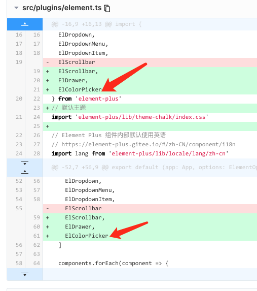
import { App } from 'vue'import {locale,ElButton,ElMessage,ElNotification,ElMessageBox,ElMenu,ElMenuItem,ElSubmenu,ElRow,ElCol,ElBreadcrumb,ElBreadcrumbItem,ElTooltip,ElDropdown,ElDropdownMenu,ElDropdownItem,ElScrollbar,ElDrawer,ElColorPicker} from 'element-plus'// 默认主题import 'element-plus/lib/theme-chalk/index.css'// Element Plus 组件内部默认使用英语// https://element-plus.gitee.io/#/zh-CN/component/i18nimport lang from 'element-plus/lib/locale/lang/zh-cn'// Element Plus 直接使用了 Day.js 项目的时间日期国际化设置, 并且会自动全局设置已经导入的 Day.js 国际化配置。import 'dayjs/locale/zh-cn'// $ELEMENT size属性类型export type Size = 'default' | 'medium' | 'small' | 'mini'interface ElementOptions {size: Size}export default (app: App, options: ElementOptions): void => {locale(lang)// 按需导入组件列表const components = [ElButton,ElMessage,ElNotification,ElMessageBox,ElMenu,ElMenuItem,ElSubmenu,ElRow,ElCol,ElBreadcrumb,ElBreadcrumbItem,ElTooltip,ElDropdown,ElDropdownMenu,ElDropdownItem,ElScrollbar,ElDrawer,ElColorPicker]components.forEach(component => {app.component(component.name, component)})// Vue.prototype 替换为 config.globalProperties// 文档说明 https://v3.cn.vuejs.org/guide/migration/global-api.html#vue-prototype-%E6%9B%BF%E6%8D%A2%E4%B8%BA-config-globalpropertiesapp.config.globalProperties.$message = ElMessageapp.config.globalProperties.$notify = ElNotificationapp.config.globalProperties.$confirm = ElMessageBox.confirmapp.config.globalProperties.$alert = ElMessageBox.alertapp.config.globalProperties.$prompt = ElMessageBox.prompt// 全局配置 https://element-plus.gitee.io/#/zh-CN/component/quickstart#quan-ju-pei-zhi// 该对象目前支持 size 与 zIndex 字段。size 用于改变组件的默认尺寸 small,zIndex 设置弹框的初始 z-index(默认值:2000)。app.config.globalProperties.$ELEMENT = {size: options.size}}
src/components/ThemePicker/index.vue
<template><el-color-pickerv-model="theme"class="theme-picker":predefine="themeColor"popper-class="theme-picker-dropdown"/></template><script lang='ts'>import { defineComponent, ref, computed, watch } from 'vue'import { useStore } from '@/store'import { useGenerateTheme } from '@/hooks/useGenerateTheme'export default defineComponent({name: 'ThemePicker',setup() {const store = useStore()// 预设可选颜色// eslint-disable-next-line comma-spacing, comma-dangleconst themeColor = ['#409EFF', '#1890ff', '#304156', '#212121', '#11a983', '#13c2c2', '#6959CD', '#f5222d',]// store中获取默认主题色const defaultTheme = computed(() => store.state.settings.theme)const theme = ref('')// 主题生成方法 稍后const { generateTheme } = useGenerateTheme()// 监听默认样式watch(defaultTheme, value => {theme.value = value}, {immediate: true})// 根据theme选择变化 重新生成主题watch(theme, (value) => {// 同步storestore.dispatch('settings/changeSetting', { key: 'theme', value })// 根据theme选择变化 重新生成主题generateTheme(value)})return {themeColor,theme}}})</script><style lang="scss">.theme-picker {height: 26px !important;margin-right: 8px;.el-color-picker__trigger {height: 26px !important;width: 26px !important;padding: 2px;}}.theme-message,.theme-picker-dropdown {z-index: 99999 !important;}.theme-picker-dropdown .el-color-dropdown__link-btn {display: none;}</style>
2-5 store中存储theme
创建settings module
src/store/modules/settings.ts
import { MutationTree, ActionTree } from 'vuex'import variables from '@/styles/variables.scss'import { IRootState } from '@/store'export interface ISettingsState {theme: string;originalStyle: string;}// 定义stateconst state: ISettingsState = {theme: variables.theme,originalStyle: '' // 保存element 主题样式文件内容 作为替换模板}// 动态key的情况下 根据不同的key 约束对应value// http://www.voidcn.com/article/p-wtmkdcie-byz.htmltype ValueOf<T> = T[keyof T];interface ISettings { // 约束payload类型key: keyof ISettingsState; // 约束为ISettingsState中keyvalue: ValueOf<ISettingsState>; // 约束为ISettingsState中value的类型}// 定义mutations 通用muationconst mutations: MutationTree<ISettingsState> = {CHANGE_SETTING(state, { key, value }: ISettings) {if (key in state) {(state[key] as ValueOf<ISettingsState>) = value}}}const actions: ActionTree<ISettingsState, IRootState> = {changeSetting({ commit }, data) {commit('CHANGE_SETTING', data)}}export default {namespaced: true,state,mutations,actions}
store中缓存settings.theme和settings.originalStyle
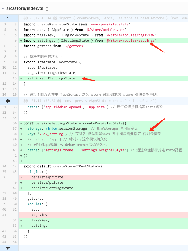
src/store/index.ts
import { InjectionKey } from 'vue'import { createStore, Store, useStore as baseUseStore } from 'vuex'import createPersistedState from 'vuex-persistedstate'import app, { IAppState } from '@/store/modules/app'import tagsView, { ITagsViewState } from '@/store/modules/tagsView'import settings, { ISettingsState } from '@/store/modules/settings'import getters from './getters'// 模块声明在根状态下export interface IRootState {app: IAppState;tagsView: ITagsViewState;settings: ISettingsState;}// 通过下面方式使用 TypeScript 定义 store 能正确地为 store 提供类型声明。// https://next.vuex.vuejs.org/guide/typescript-support.html#simplifying-usestore-usage// eslint-disable-next-line symbol-descriptionexport const key: InjectionKey<Store<IRootState>> = Symbol()// 对于getters在组件使用时没有类型提示// 有人提交了pr #1896 为getters创建泛型 应该还未发布// https://github.com/vuejs/vuex/pull/1896// 代码pr内容详情// https://github.com/vuejs/vuex/pull/1896/files#diff-093ad82a25aee498b11febf1cdcb6546e4d223ffcb49ed69cc275ac27ce0ccce// vuex store持久化 默认使用localstorage持久化const persisteAppState = createPersistedState({storage: window.sessionStorage, // 指定storage 也可自定义key: 'vuex_app', // 存储名 默认都是vuex 多个模块需要指定 否则会覆盖// paths: ['app'] // 针对app这个模块持久化// 只针对app模块下sidebar.opened状态持久化paths: ['app.sidebar.opened', 'app.size'] // 通过点连接符指定state路径})const persisteSettingsState = createPersistedState({storage: window.sessionStorage, // 指定storage 也可自定义key: 'vuex_setting', // 存储名 默认都是vuex 多个模块需要指定 否则会覆盖// paths: ['app'] // 针对app这个模块持久化// 只针对app模块下sidebar.opened状态持久化paths: ['settings.theme', 'settings.originalStyle'] // 通过点连接符指定state路径})export default createStore<IRootState>({plugins: [persisteAppState,persisteSettingsState],getters,modules: {app,tagsView,settings}})// 定义自己的 `useStore` 组合式函数// https://next.vuex.vuejs.org/zh/guide/typescript-support.html#%E7%AE%80%E5%8C%96-usestore-%E7%94%A8%E6%B3%95// eslint-disable-next-line @typescript-eslint/explicit-module-boundary-typesexport function useStore () {return baseUseStore(key)}// vuex持久化 vuex-persistedstate文档说明// https://www.npmjs.com/package/vuex-persistedstate
getters添加theme
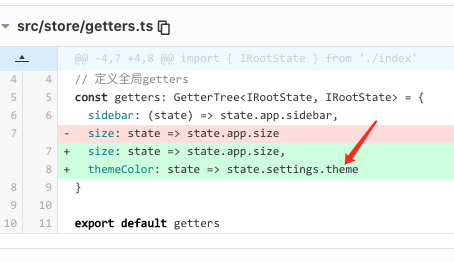
src/store/getters.ts
import { GetterTree } from 'vuex'import { IRootState } from './index'// 定义全局gettersconst getters: GetterTree<IRootState, IRootState> = {sidebar: (state) => state.app.sidebar,size: state => state.app.size,themeColor: state => state.settings.theme}export default getters
2-6 主题生成逻辑
最开始需要在App.vue中调用生成主题hooks useGenerateTheme ThemePicker组件里也要调用 useGenerateTheme 更好选择的主题颜色 生成主题
src/App.vue
<template><div id="app"><router-view /></div></template><script lang="ts">import { defineComponent } from 'vue'import { useGenerateTheme } from '@/hooks/useGenerateTheme'export default defineComponent({name: 'App',setup() {// 根据此时store中主题色生成useGenerateTheme()}})</script><style>#app {height: 100%;}</style>
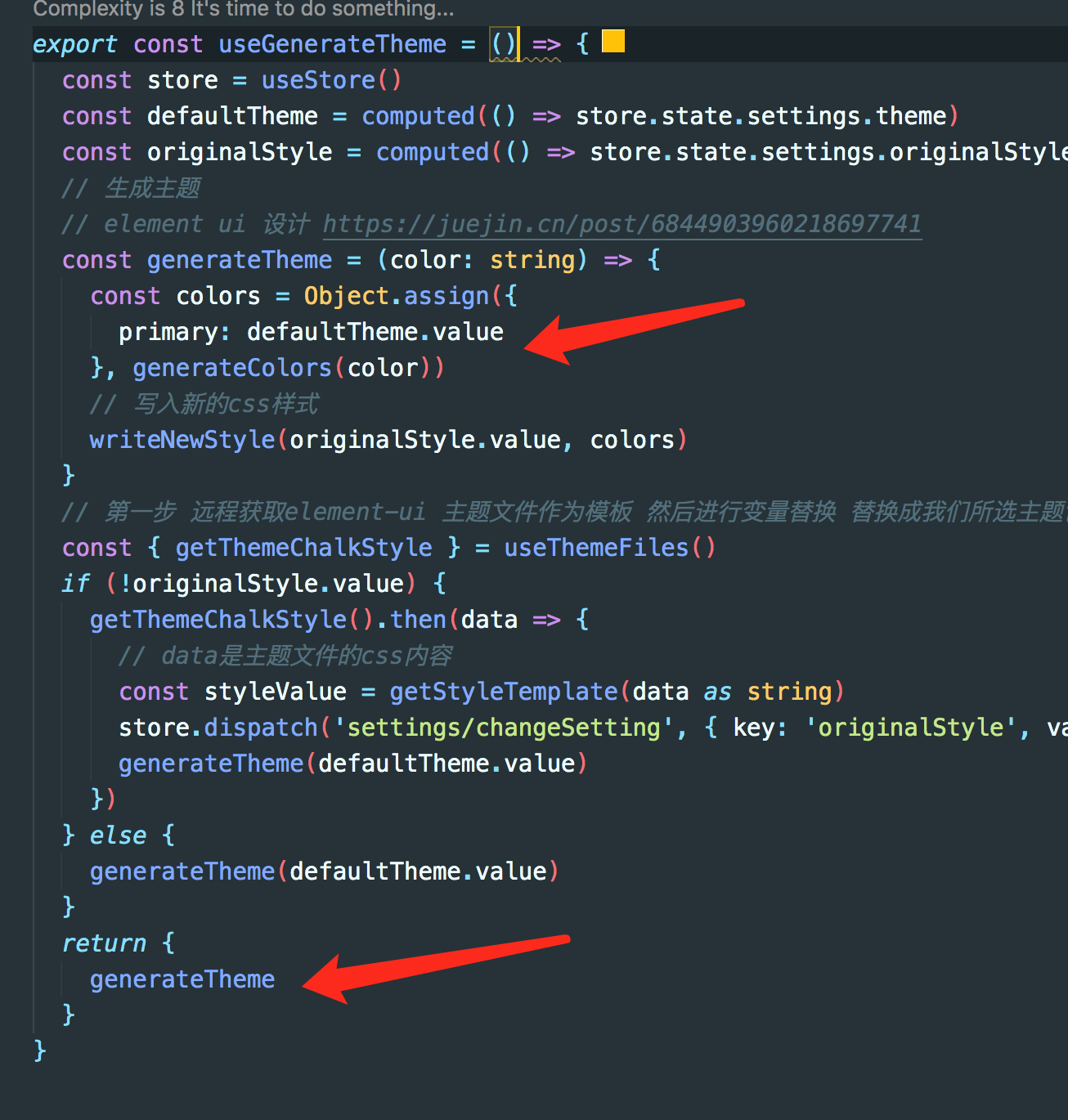
创建useGenerateTheme Hook函数
src目录下创建hooks文件夹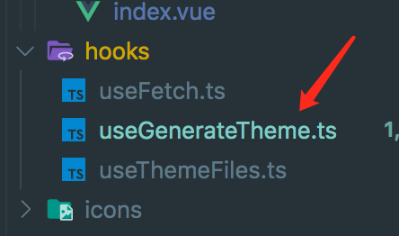
src/utils/useGenerateTheme.ts
import { computed } from 'vue'import { useThemeFiles } from '@/hooks/useThemeFiles'import { getStyleTemplate } from '@/utils/getStyleTemplate'import { generateColors } from '@/utils/color'import { writeNewStyle } from '@/utils/writeNewStyle'import { useStore } from '@/store'export const useGenerateTheme = () => {const store = useStore()// 从store获取中获取 theme主题色const defaultTheme = computed(() => store.state.settings.theme)// 获取element-ui 主题文件内容 通过axios获取的 作为变量替换模板const originalStyle = computed(() => store.state.settings.originalStyle)// 生成主题// 了解element ui 设计 https://juejin.cn/post/6844903960218697741const generateTheme = (color: string) => {const colors = Object.assign({primary: defaultTheme.value}, generateColors(color))// 写入新的css样式writeNewStyle(originalStyle.value, colors)}// 第一步 远程获取element-ui 主题文件作为模板 然后进行变量替换 替换成我们所选主题色const { getThemeChalkStyle } = useThemeFiles()// 如果主题模板不存在 就要发送请求获取if (!originalStyle.value) {// axios请求后去 主题模板getThemeChalkStyle().then(data => {// data是获取到主题文件的css内容// 生成样式模板 将里面css内容里默认主题颜色值 替换成变量标记 如 '#409eff' => 'primary',// 方便我们后续 把primary字符标记 换成我们的主题色const styleValue = getStyleTemplate(data as string)// 把模板保存到 store中缓存起来 不用每次重新获取store.dispatch('settings/changeSetting', { key: 'originalStyle', value: styleValue })// 根据主题色生成主题 插入到html中generateTheme(defaultTheme.value)})} else {generateTheme(defaultTheme.value)}return {generateTheme}}
创建useThemeFiles hooks函数
主要是为了远程获取 elment-ui theme index.css
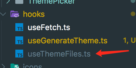
src/hooks/useThemeFiles.ts
import { useFetch } from './useFetch'import pkgJson from 'element-plus/package.json'// 获取element-plus版本const version = pkgJson.versioninterface ReturnFn {getThemeChalkStyle: () => Promise<unknown>}export const useThemeFiles = ():ReturnFn => {const getThemeChalkStyle = async (): Promise<unknown> => {// 返回获取到的指定版本的element主题css内容// return await useFetch('//unpkg.com/element-plus@1.0.2-beta.33/lib/theme-chalk/index.css')return await useFetch(`//unpkg.com/element-plus@${version}/lib/theme-chalk/index.css`)}return {getThemeChalkStyle}}
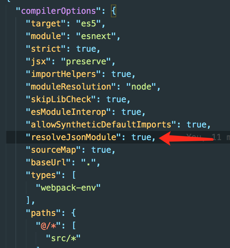
上面ts中导入了json文件 需要配置tsconfig
添加”resolveJsonModule”: true即可
创建useFetch请求hook函数
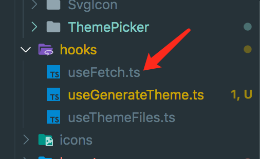
src/hooks/useFetch.ts
import axios from 'axios'const useFetch = async (url: string): Promise<unknown> => {return await new Promise((resolve, reject) => {axios({url,method: 'get'}).then(res => {if (res.status === 200) {resolve(res.data)} else {reject(new Error(res.statusText))}}).catch(err => {reject(new Error(err.message))})})}export {useFetch}
生成最终的样式模板
主要就是把获取到默认主题css内容 替换成变量标记,后续作为模板替换为我们想要的主题色和渐变色
export interface IObject {[prop: string]: string}// element ui 关于以下颜色设计阅读资料// https://juejin.cn/post/6844903960218697741// 官方文档说明// https://element-plus.gitee.io/#/zh-CN/component/custom-theme// element-plus ui每套主题 共用到以下多种颜色 根据根据白色和主题色进行混合生成渐变色// Mix 函数是将两种颜色根据一定的比例混合在一起,生成另一种颜色// $--color-primary: #409EFF !default;// $--color-primary-light-1: mix($--color-white, $--color-primary, 10%) !default; /* 53a8ff */// $--color-primary-light-2: mix($--color-white, $--color-primary, 20%) !default; /* 66b1ff */// $--color-primary-light-3: mix($--color-white, $--color-primary, 30%) !default; /* 79bbff */// $--color-primary-light-4: mix($--color-white, $--color-primary, 40%) !default; /* 8cc5ff */// $--color-primary-light-5: mix($--color-white, $--color-primary, 50%) !default; /* a0cfff */// $--color-primary-light-6: mix($--color-white, $--color-primary, 60%) !default; /* b3d8ff */// $--color-primary-light-7: mix($--color-white, $--color-primary, 70%) !default; /* c6e2ff */// $--color-primary-light-8: mix($--color-white, $--color-primary, 80%) !default; /* d9ecff */// $--color-primary-light-9: mix($--color-white, $--color-primary, 90%) !default; /* ecf5ff */// 根据样式内容生成样式模板export const getStyleTemplate = (data: string): string => {// 这些是我们要把key也就是css内容中颜色值 替换成右边value作为变量标记 后续我们之关系右边value这些变量标记const colorMap: IObject = {'#3a8ee6': 'shade-1','#409eff': 'primary','#53a8ff': 'light-1','#66b1ff': 'light-2','#79bbff': 'light-3','#8cc5ff': 'light-4','#a0cfff': 'light-5','#b3d8ff': 'light-6','#c6e2ff': 'light-7','#d9ecff': 'light-8','#ecf5ff': 'light-9'}Object.keys(colorMap).forEach(key => {const value = colorMap[key]// 将key对应的颜色值 替换成 右边对应value primary list-1这些 后续生成主题 作为替换变量标记使用data = data.replace(new RegExp(key, 'ig'), value)})return data // 返回css字符串模板 之后主要靠它用我们所选的主题色 渐变色 把里面 变量标记替换掉生成主题css}
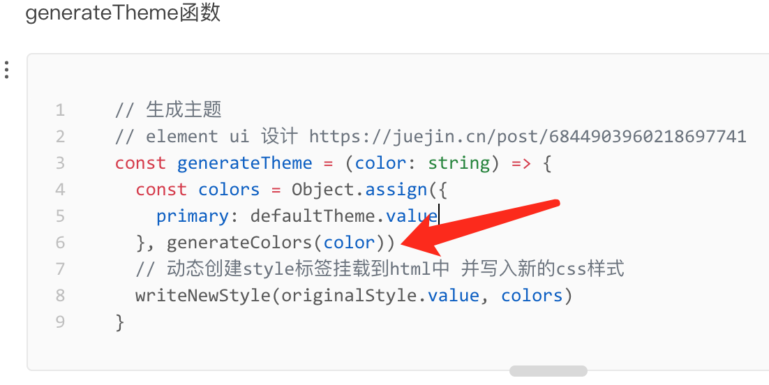
generateTheme生成主题函数
这个函数直接定义在了useGenerateTheme Hook中 并返回到外面 供其他组件使用
generateTheme函数
// 生成主题// element ui 设计 https://juejin.cn/post/6844903960218697741const generateTheme = (color: string) => {const colors = Object.assign({primary: defaultTheme.value}, generateColors(color))// 动态创建style标签挂载到html中 并写入新的css样式writeNewStyle(originalStyle.value, colors)}
src/utils/useGenerateTheme.ts
import { computed } from 'vue'import { useThemeFiles } from '@/hooks/useThemeFiles'import { getStyleTemplate } from '@/utils/getStyleTemplate'import { generateColors } from '@/utils/color'import { writeNewStyle } from '@/utils/writeNewStyle'import { useStore } from '@/store'export const useGenerateTheme = () => {const store = useStore()const defaultTheme = computed(() => store.state.settings.theme)const originalStyle = computed(() => store.state.settings.originalStyle)// 生成主题// element ui 设计 https://juejin.cn/post/6844903960218697741const generateTheme = (color: string) => {const colors = Object.assign({primary: defaultTheme.value}, generateColors(color))// 写入新的css样式writeNewStyle(originalStyle.value, colors)}// 第一步 远程获取element-ui 主题文件作为模板 然后进行变量替换 替换成我们所选主题色const { getThemeChalkStyle } = useThemeFiles()if (!originalStyle.value) {getThemeChalkStyle().then(data => {// data是主题文件的css内容const styleValue = getStyleTemplate(data as string)store.dispatch('settings/changeSetting', { key: 'originalStyle', value: styleValue })generateTheme(defaultTheme.value)})} else {generateTheme(defaultTheme.value)}return {generateTheme}}
generateColors函数
generateTheme函数 里会调用此函数
src/utils/color.ts
import color from 'css-color-function'import { formula, IObject } from './constants'// 转换成不同色调的rgb颜色值// https://www.w3cplus.com/css/the-power-of-rgba.htmlexport const generateColors = (primary: string): IObject => {const colors = {} as IObjectObject.keys(formula).forEach(key => {// element ui 主题色 渐变色设计 https://juejin.cn/post/6844903960218697741// 根据主题色生成渐变色 将formula对象中字符primary 替换成我们所选的主题色const value = formula[key].replace(/primary/g, primary)colors[key] = color.convert(value) // 转换成rgba颜色值})return colors}// 主题色的渐变色设计 https://juejin.cn/post/6844903960218697741// color-mod css颜色函数// https://www.w3cplus.com/css4/color-mod.html// export const formula: IObject = {// 'shade-1': 'color(primary shade(10%))',// 'light-1': 'color(primary tint(10%))',// 'light-2': 'color(primary tint(20%))',// 'light-3': 'color(primary tint(30%))',// 'light-4': 'color(primary tint(40%))',// 'light-5': 'color(primary tint(50%))',// 'light-6': 'color(primary tint(60%))',// 'light-7': 'color(primary tint(70%))',// 'light-8': 'color(primary tint(80%))',// 'light-9': 'color(primary tint(90%))'// }
constants变量
src/utils/constants.ts
export interface IObject {[prop: string]: string;}// 主题色的渐变色设计 https://juejin.cn/post/6844903960218697741// color-mod css颜色函数// https://www.w3cplus.com/css4/color-mod.htmlexport const formula: IObject = {'shade-1': 'color(primary shade(10%))','light-1': 'color(primary tint(10%))','light-2': 'color(primary tint(20%))','light-3': 'color(primary tint(30%))','light-4': 'color(primary tint(40%))','light-5': 'color(primary tint(50%))','light-6': 'color(primary tint(60%))','light-7': 'color(primary tint(70%))','light-8': 'color(primary tint(80%))','light-9': 'color(primary tint(90%))'}
writeNewStyle函数
generateTheme函数 里会调用此函数 插入style到html中

src/utils/writeNewStyle.ts
import { IObject } from './constants'// 写入新的css样式export const writeNewStyle = (originalStyle: string, colors: IObject): void => {Object.keys(colors).forEach(key => {// 根据模板将之前变量标记替换成颜色值const reg = new RegExp('(:|\\s+)' + key, 'g')originalStyle = originalStyle.replace(reg, '$1' + colors[key])})// 之前有插入过id名为chalk-theme-style style元素就直接重新里面内容 没有就动态创建style并加上idconst chalkStyle = document.getElementById('chalk-theme-style')if (!chalkStyle) {const style = document.createElement('style')style.innerText = originalStylestyle.id = 'chalk-theme-style'// 插入到head中document.head.appendChild(style)} else {(chalkStyle as HTMLElement).innerText = originalStyle}}
2-7 修改tagviews组件使用主题色
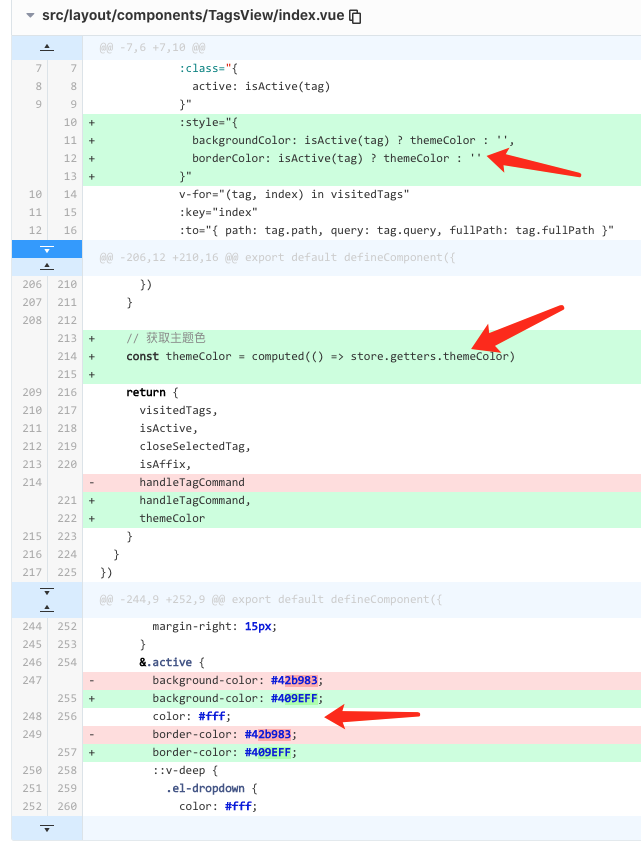
src/layout/components/TagsView/index.vue
<template><div class="tags-view-container"><scroll-panel><div class="tags-view-wrapper"><router-linkclass="tags-view-item":class="{active: isActive(tag)}":style="{backgroundColor: isActive(tag) ? themeColor : '',borderColor: isActive(tag) ? themeColor : ''}"v-for="(tag, index) in visitedTags":key="index":to="{ path: tag.path, query: tag.query, fullPath: tag.fullPath }"tag="span"><el-dropdowntrigger="contextmenu"@command="command => handleTagCommand(command, tag)"><span>{{ tag.meta.title }}<!-- affix固定的路由tag是无法删除 --><spanv-if="!isAffix(tag)"class="el-icon-close"@click.prevent.stop="closeSelectedTag(tag)"></span></span><template #dropdown><el-dropdown-menu><el-dropdown-item command="refresh">刷新</el-dropdown-item><el-dropdown-item command="all">关闭所有</el-dropdown-item><el-dropdown-item command="other">关闭其他</el-dropdown-item><el-dropdown-item command="self" v-if="!tag.meta || !tag.meta.affix">关闭</el-dropdown-item></el-dropdown-menu></template></el-dropdown></router-link></div></scroll-panel></div></template><script lang="ts">import path from 'path'import { defineComponent, computed, watch, onMounted, nextTick } from 'vue'import { useRoute, RouteRecordRaw, useRouter } from 'vue-router'import { useStore } from '@/store'import { RouteLocationWithFullPath } from '@/store/modules/tagsView'import { routes } from '@/router'import ScrollPanel from './ScrollPanel.vue'// 右键菜单enum TagCommandType {All = 'all',Other = 'other',Self = 'self',Refresh = 'refresh'}export default defineComponent({name: 'TagsView',components: {ScrollPanel},setup() {const store = useStore()const router = useRouter()const route = useRoute()// 可显示的tags viewconst visitedTags = computed(() => store.state.tagsView.visitedViews)// 从路由表中过滤出要affixed tagviewsconst fillterAffixTags = (routes: Array<RouteLocationWithFullPath | RouteRecordRaw>, basePath = '/') => {let tags: RouteLocationWithFullPath[] = []routes.forEach(route => {if (route.meta && route.meta.affix) {// 把路由路径解析成完整路径,路由可能是相对路径const tagPath = path.resolve(basePath, route.path)tags.push({name: route.name,path: tagPath,fullPath: tagPath,meta: { ...route.meta }} as RouteLocationWithFullPath)}// 深度优先遍历 子路由(子路由路径可能相对于route.path父路由路径)if (route.children) {const childTags = fillterAffixTags(route.children, route.path)if (childTags.length) {tags = [...tags, ...childTags]}}})return tags}// 初始添加affix的tagconst initTags = () => {const affixTags = fillterAffixTags(routes)for (const tag of affixTags) {if (tag.name) {store.dispatch('tagsView/addVisitedView', tag)}}}// 添加tagconst addTags = () => {const { name } = routeif (name) {store.dispatch('tagsView/addView', route)}}// 路径发生变化追加tags viewwatch(() => route.path, () => {addTags()})// 最近当前router到tags viewonMounted(() => {initTags()addTags()})// 当前是否是激活的tagconst isActive = (tag: RouteRecordRaw) => {return tag.path === route.path}// 让删除后tags view集合中最后一个为选中状态const toLastView = (visitedViews: RouteLocationWithFullPath[], view: RouteLocationWithFullPath) => {// 得到集合中最后一个项tag view 可能没有const lastView = visitedViews[visitedViews.length - 1]if (lastView) {router.push(lastView.fullPath as string)} else { // 集合中都没有tag view时// 如果刚刚删除的正是Dashboard 就重定向回Dashboard(首页)if (view.name === 'Dashboard') {router.replace({ path: '/redirect' + view.fullPath as string })} else {// tag都没有了 删除的也不是Dashboard 只能跳转首页router.push('/')}}}// 关闭当前右键的tag路由const closeSelectedTag = (view: RouteLocationWithFullPath) => {// 关掉并移除viewstore.dispatch('tagsView/delView', view).then(() => {// 如果移除的view是当前选中状态view, 就让删除后的集合中最后一个tag view为选中态if (isActive(view)) {toLastView(visitedTags.value, view)}})}// 是否是始终固定在tagsview上的tagconst isAffix = (tag: RouteLocationWithFullPath) => {return tag.meta && tag.meta.affix}// 右键菜单const handleTagCommand = (command: TagCommandType, view: RouteLocationWithFullPath) => {switch (command) {case TagCommandType.All: // 右键删除标签导航所有tag 除了affix为true的handleCloseAllTag(view)breakcase TagCommandType.Other: // 关闭其他tag 除了affix为true的和当前右键的taghandleCloseOtherTag(view)breakcase TagCommandType.Self: // 关闭当前右键的tag affix为true的tag下拉菜单中无此项closeSelectedTag(view)breakcase TagCommandType.Refresh: // 刷新当前右键选中tag对应的路由refreshSelectedTag(view)}}// 删除所有tag 除了affix为true的const handleCloseAllTag = (view: RouteLocationWithFullPath) => {// 对于是affix的tag是不会被删除的store.dispatch('tagsView/delAllView').then(() => {// 关闭所有后 就让切换到剩下affix中最后一个tagtoLastView(visitedTags.value, view)})}// 删除其他tag 除了当前右键的tagconst handleCloseOtherTag = (view: RouteLocationWithFullPath) => {store.dispatch('tagsView/delOthersViews', view).then(() => {if (!isActive(view)) { // 删除其他tag后 让该view路由激活router.push(view.path)}})}// 右键刷新 清空当前对应路由缓存const refreshSelectedTag = (view: RouteLocationWithFullPath) => {// 刷新前 将该路由名称从缓存列表中移除store.dispatch('tagsView/delCachedView', view).then(() => {const { fullPath } = viewnextTick(() => {router.replace('/redirect' + fullPath)})})}// 获取主题色const themeColor = computed(() => store.getters.themeColor)return {visitedTags,isActive,closeSelectedTag,isAffix,handleTagCommand,themeColor}}})</script><style lang="scss" scoped>.tags-view-container {height: 34px;background: #fff;border-bottom: 1px solid #d8dce5;box-shadow: 0 1px 3px 0 rgba(0, 0, 0, .12), 0 0 3px 0 rgba(0, 0, 0, .04);overflow: hidden;.tags-view-wrapper {.tags-view-item {display: inline-block;height: 26px;line-height: 26px;border: 1px solid #d8dce5;background: #fff;color: #495060;padding: 0 8px;box-sizing: border-box;font-size: 12px;margin-left: 5px;margin-top: 4px;&:first-of-type {margin-left: 15px;}&:last-of-type {margin-right: 15px;}&.active {background-color: #409EFF;color: #fff;border-color: #409EFF;::v-deep {.el-dropdown {color: #fff;}}&::before {position: relative;display: inline-block;content: '';width: 8px;height: 8px;border-radius: 50%;margin-right: 5px;background: #fff;}}}}}</style><style lang="scss">.tags-view-container {.el-icon-close {width: 16px;height: 16px;vertical-align: 2px;border-radius: 50%;text-align: center;transition: all .3s cubic-bezier(.645, .045, .355, 1);transform-origin: 100% 50%;&:before {transform: scale(.6);display: inline-block;vertical-align: -3px;}&:hover {background-color: #b4bccc;color: #fff;}}}</style>
2-8 修改sidebar使用主题色
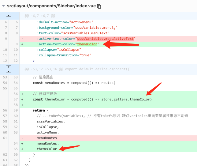
src/layout/components/Sidebar/index.vue
<template><div><el-menuclass="sidebar-container-menu"mode="vertical":default-active="activeMenu":background-color="scssVariables.menuBg":text-color="scssVariables.menuText":active-text-color="themeColor":collapse="isCollapse":collapse-transition="true"><sidebar-itemv-for="route in menuRoutes":key="route.path":item="route":base-path="route.path"/></el-menu></div></template><script lang="ts">import { defineComponent, computed } from 'vue'import { useRoute } from 'vue-router'import variables from '@/styles/variables.scss'import { routes } from '@/router'import SidebarItem from './SidebarItem.vue'import { useStore } from '@/store'export default defineComponent({name: 'Sidebar',components: {SidebarItem},setup() {const route = useRoute()const store = useStore()// 根据路由路径 对应 当前激活的菜单const activeMenu = computed(() => {const { path, meta } = route// 可根据meta.activeMenu指定 当前路由激活时 让哪个菜单高亮选中if (meta.activeMenu) {return meta.activeMenu}return path})// scss变量const scssVariables = computed(() => variables)// 展开收起状态 稍后放store 当前是展开就让它收起const isCollapse = computed(() => !store.getters.sidebar.opened)// 渲染路由const menuRoutes = computed(() => routes)// 获取主题色const themeColor = computed(() => store.getters.themeColor)return {// ...toRefs(variables), // 不有toRefs原因 缺点variables里面变量属性来源不明确scssVariables,isCollapse,activeMenu,menuRoutes,themeColor}}})</script>
2-9 element.ts
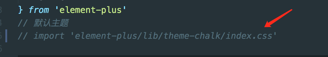
可以注释掉了,因为我们会根据store里默认theme值生成内联css
本节参考源码
这里注意 utils/useGenerateTheme.ts移到hooks目录里 文档中是正确的
https://gitee.com/brolly/vue3-element-admin/commit/1a074ecd1e6855241860a287cf1bede38006c684
移动commit
https://gitee.com/brolly/vue3-element-admin/commit/52195d3285cf0aa71919af1bbea34e22e53cc53b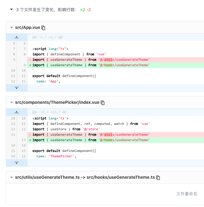

若有收获,就点个赞吧
0 人点赞
